Create with Connie and Mary-Valentine's Favors!

I am super excited for Valentine’s Day this year and I plan on spoiling some of my favorite Galentine’s with a super cute project! Valentine’s favors happen to be the theme for this week’s Create with Connie and Mary challenge!

Design Team.jpg
final 15.jpg

I was super excited about the Hearts & Kisses stamp set in the January to June catty as I loved the sentiments “Happy Galentine’s Day” and “You go, Girl!. I knew right away I wanted to make a special gift with this set.

I honestly think the stand out feature of this card is the True Love Designer Series Paper—don’t these hand trimmed flowers look AMAZING when paired agains the blended Flirty Flamingo background? This paper has unlimited potential as you can feature black & white imagery on literally anything or color this paper with thet variety of color tools we have at our disposal.

For the background, sentiment tag, and heart border (cut with the Floral Heart Dies) I used Flirty Flamingo ink with our new fabulous Blending Brushes.

I tied Blushing Bride twine around the front panel with a Heart Charm attached (LOVE!) and added some Matte Black Dots. This entire product suite is phenomenal!

final+%281%29+8.jpg

My coordinating Love You Always Treat Box is my favorite of this duo. I am going to fill this box with some of my Reese’s Valentines Surprise Cookies that I shared on my blog last Valentine’s Day! You can click this link to go to my recipe or click on my Lifestyle Tab and then Favorite Recipes and you will find it there! Your welcome in advance, these cookies are AMAZING!

I wrapped the box with another pattern from the DSP and added some more of the flowers that I hand trimmed from the paper. This time I also used my Blending Brush to add a pop of color with the Flirty Flamingo ink.

I added some Blushing Bride Metallic Ribbon and some sliver metallic thread to the back of my label. The sentiment is from the Always in my Heart stamp set and the tiny heart is cut using the Kangaroo dies.

I love this project combo and cannot wait to deliver these to some of my special Galentine’s this year!

I love this project combo and cannot wait to deliver these to some of my special Galentine’s this year!

To see what Melissa has created you can click BACK and to see what Connie designed this week you can go NEXT. I hope you hop the whole way through so you don’t miss anything!

Color Fusers-February 2021

Hello friends! Welcome to another Color Fusers Blog Hop! I am so excited to be hoping with this talented group of ladies for 2021, especially with these color combos forcing me out of my comfort zone!

The Color Challenge for February includes Gorgeous Grape, Magenta Madness, and Bermuda Bay—three very very bright colors! I was a little intimidated by this color combo!

02_2021 Graphic.jpg

Because these are such bold vibrant colors I new that I needed to begin on a pretty neutral base so I went with Basic White card stock for my base. I had some strips of these colors in my scrap bin which gave me an idea for incorporating them into the background.

The strips of card stock are actually all different random widths which I think helped achieved a whimsical background!

The strips of card stock are actually all different random widths which I think helped achieved a whimsical background!

I decided to use the Pretty Perennials Bundle on this card project as I haven’t had much of an opportunity to stamp with it quite yet. I stamped some of the images from the stamp set on the Magenta Madness and Gorgeous Grape strips on the coordinating ink color.

I really wanted the colors to be the focal point of this card so I used Basic White, Vellum and the new Pearlescent Specialty Paper to embellish the card with flowers and leaves from the Perennial Petals Dies.


The flower on the top right is on a Pearlescent base with Basic White layer on top and Opal Round.

The main flower is on a Basic White base with a Pearlescent layer on top and a large Opal Round in the center.

I cut apart the large vellum leaf/sprig to add in few more sprigs.

final 13.jpg

The word ‘Happy’ is stamped in White Craft Ink and embossed with White Embossing Powder on Bermuda Bay card stock. You will need to hand trim this word as the die set does not include a die to cut it out.

“Sending Lots of Happy” is stamped on another strip of Magenta Madness in the coordinating ink. Both of the sentiments are popped up with Dimensionals.

I hope you are inspired to create a fun project using this color combo yourself!

You can visit Melissa next to see her amazing creation! I know you will be wowed!

Create with Connie and Mary--Love is in the Air!

Can you believe it is the end of January already? Happy that this month is done as it hopefully it means we are another month closer to ‘normal’ life! Where I live, things are still pretty strict and we are in the middle of a cold snap, so its a bit of a rough patch. Luckily I have my stamping hobby to keep me occupied!

This week our theme is Love is in the Air so I wanted to make a card that has a ‘love’ theme but feels airy and light. I hope you enjoy what I designed!

Design Team.jpg
final (1) 4.jpg
 

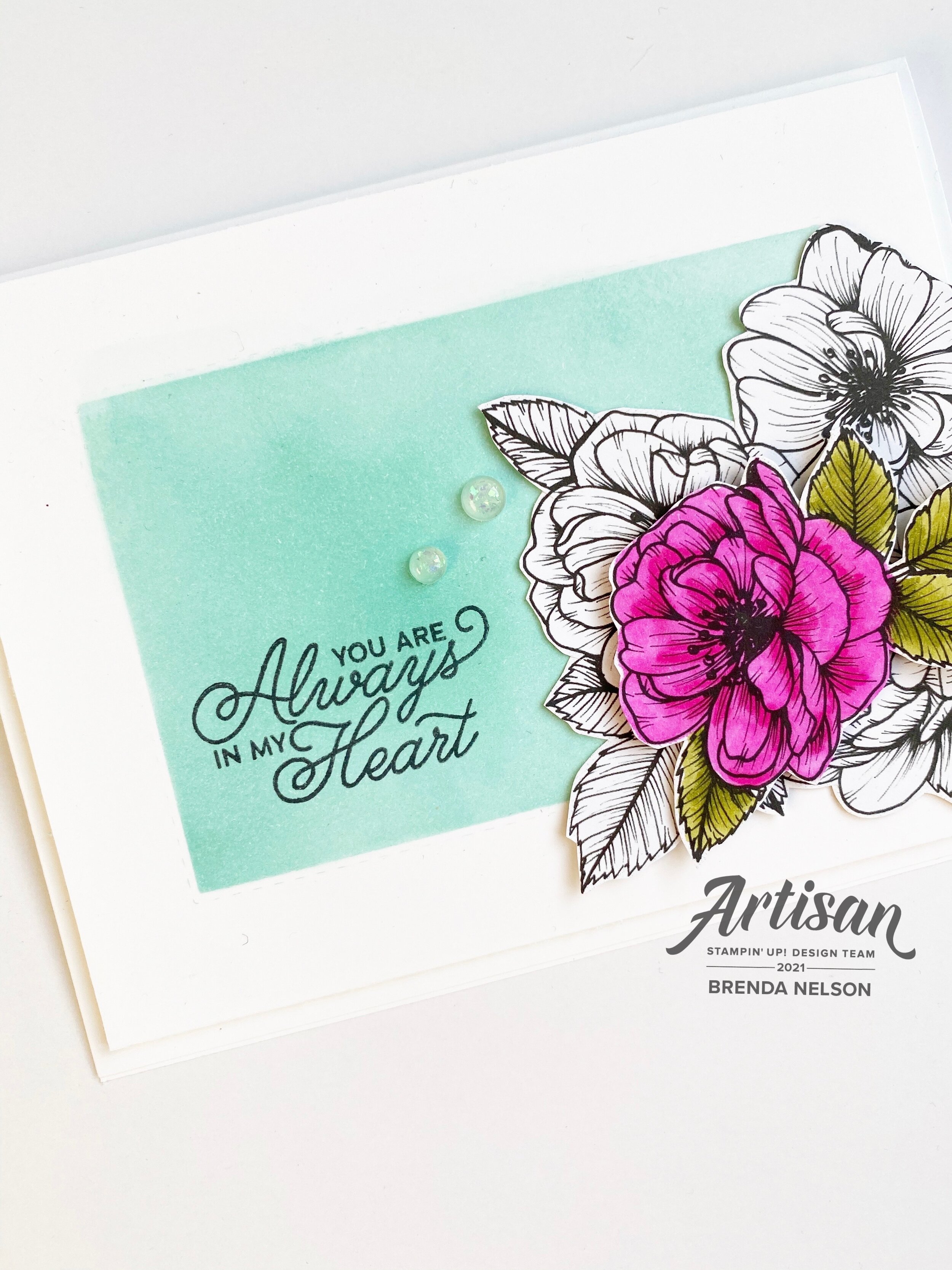
For my project this week I decided to experiment again with the new Blending Brushes. Playing around is honestly the best way to learn about a new product. The Blending Brushes are actually so user friendly, I am seriously impressed!

The only stamp on this card is from the Always in my Heart stamp set found in the January to June catalogue.

final (1) 5.jpg

The feature of this card is the box I created with my Blending Brush and stencil I made using two Stitched Rectangular dies to create the box/frame. I used Coastal Cabana for that ‘airy’ bright feel I was wanting. I used the Blending Brush to create the Coastal Cabana box. The sentiment is then stamped on top with Momento Ink.

final 10.jpg

The flowers on this card are from the True Love Designer Series paper. I cut them by hand and then isolated a second flower on top after coloring it with the Magenta Madness and Old Olive Stampin’ Blends.

I added in a few Opal Rounds as a finishing touch. I love how they are almost translucent but have a bit of flecking to them for interest.

I really really love how this card turned out and think its an awesome way to showcase off the Blending Brushes!

Can’t wait to see what Melissa has shared (you can go BACK) or what Connie has desgined (NEXT). Enjoy the upcoming month!

Artisan Design Team January Share!

OMG friends! I can’t believe I can actually TYPE the word ARTISAN…its literally been a dream of mine for the last few years and a GOAL (big difference) over the last 18 months. I started my blog with the purpose of having a platform to apply for the team and to create a digital archive of things I love. Scrapbook pages, recipes, cards and experiences. I joined some blog hops which has been exciting and has helped me grow and develop, meet deadlines, improve my photography and so much more! My blog is a place where I can be somewhat interactive with you (I love comments) and I am still learning and wanting to add more features!

So when I got the call on September 16th, yes I know the date as it was my 20th wedding anniversary, I cried. Like ugly cry and was so so happy. My daughter was in the car with me and had no idea what was going on!!! Haha! My biggest hope for my kids is they can set a goal, work and strive toward it with vision and purpose and achieve it. It is actually quite amazing. So I am SO HAPPY to be on the 2021 team and to share my creations with you!

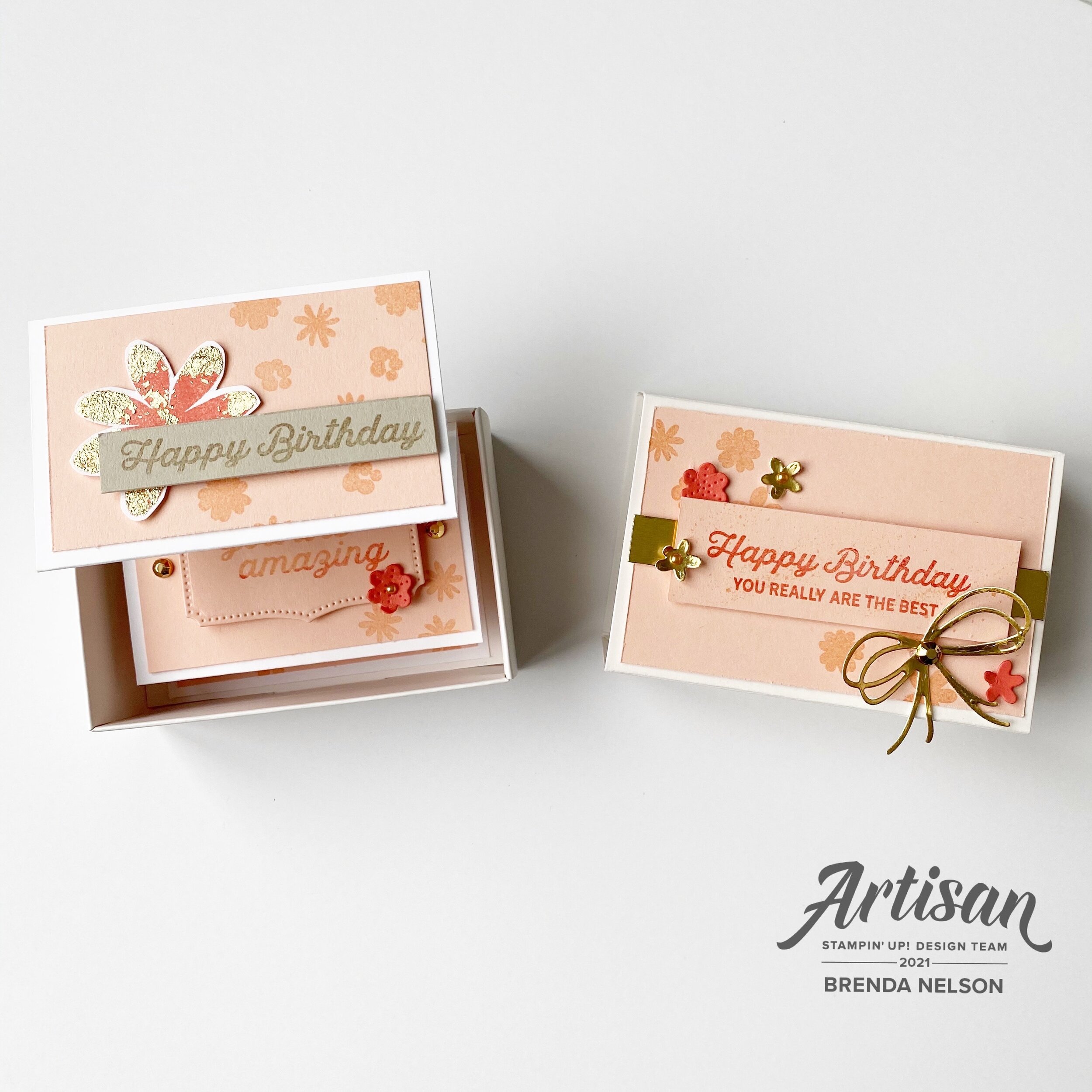
My very first Artisan project featured the In Bloom Bundle and Paper Blooms Designer Series Paper (from Sale-a-bration 2021).

My very first Artisan project featured the In Bloom Bundle and Paper Blooms Designer Series Paper (from Sale-a-bration 2021).

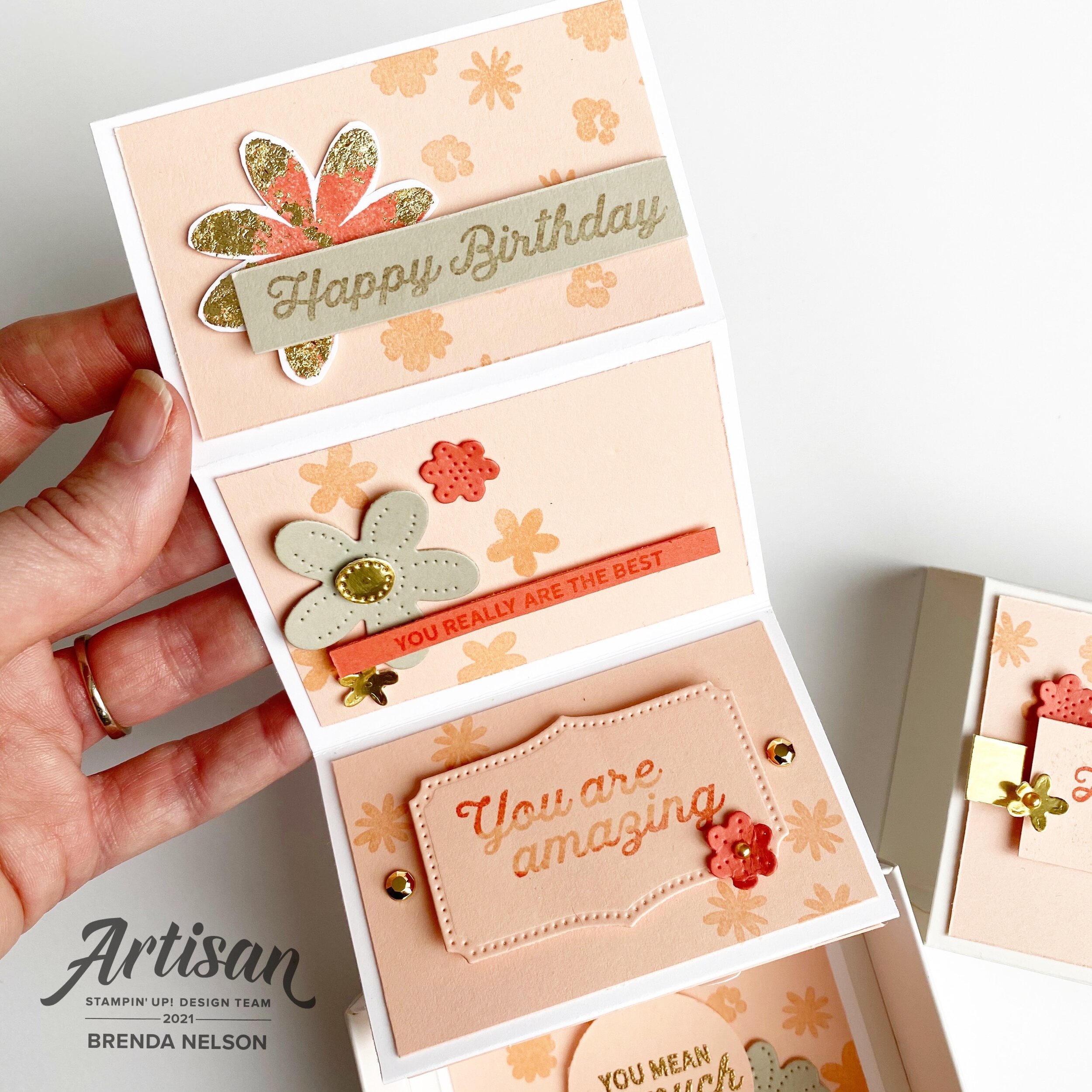
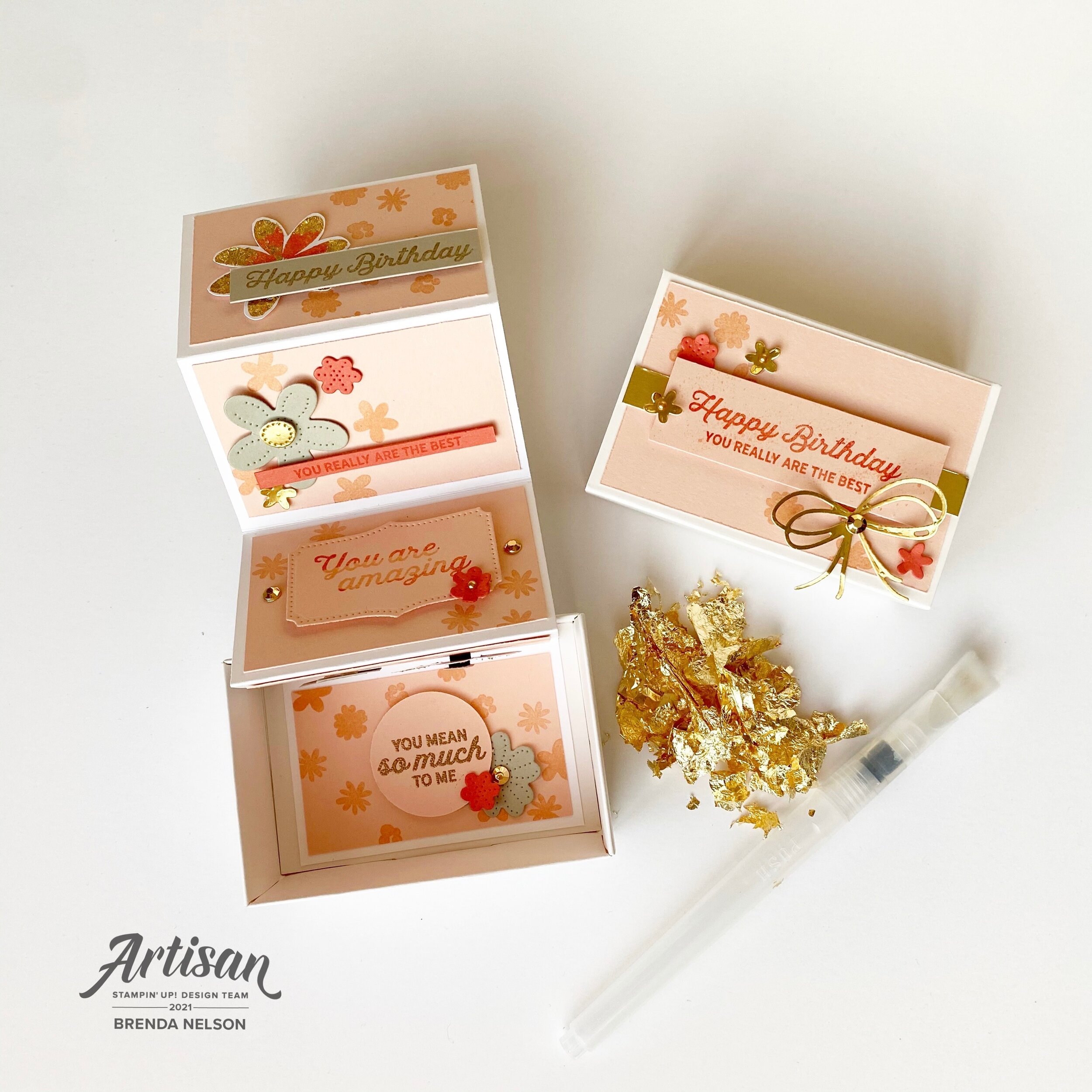
Let’s start with the fun pull out birthday card in the Love You Always Treat Boxes! As soon as I saw how these treat boxes worked I knew I wanted to create some kind of pull out project. I decided on a birthday card after seeing all the fantastic sentiments in the In Bloom stamp set.

The boxes are easy to assemble which is awesome. To create the pull out feature you need a piece of Basic White card stock measuring 3 1/2 x 11 1/4. Score at 2 1/4, 4 1/2, 6 3/4 and 9. Accordion fold it and add the Petal Pink panels on measuring 2 x 3 1/4. You need 5 panels.

Then you can stamp and embellish as desired!

The colors I used to create this pull out birthday card are Petal Pink, Calypso Coral, Sahara Sand, and Gold Foil accented with the Gilded Leafing. To add the Gilded Leafing to my flowers I used Heat’n Stick Powder with a finger dauber. The dauber allows you to have more control over where you want to apply the Heat’n Stick powder. Once you heat set the powder (do not over heat as it will lose the stickiness) press it into your Gilded Leafing and use the large Water Painter to brush off the excess and reveal the details.

Of course I also had to create a scrapbook page to feature this fantastic Paper Blooms Designer Series Paper and my sons 16th birthday!

Of course I also had to create a scrapbook page to feature this fantastic Paper Blooms Designer Series Paper and my sons 16th birthday!

I chose the dark pattern from the DSP because I thought the Night of Navy would really pop against a Basic White background. I flanked each side with strips of Calypso Coral card stock. I didn’t want to use 12x12 paper (I covet for page bases) so I cut the strips from 8 1/2 x 11 and pieced them together behind the photo mat. I also popped the Gold Foil photo mat up on Dimensionals.

You may notice some circles on the layout and those are cut with punches from the DSP.

I applied the same technique to the flowers on this page as the pull out birthday card with the Gilded Leafing.

final 3.jpg

This layout combines flowers cut using the Pierced Bloom dies, stamped flowers and flowers cut from the DSP. You will notice in this picture that I stamped the “You are Amazing” right on the circle cut from the DSP and embossed it in gold. I love this feature!

I used the new Resin Hearts, Gilded Gems and Gold Metallic Pearls as accents on the page. I love the fun bow cut with the dies and Gold Foil paper.

I hope you enjoyed my first official Artisan Design Team showcase projects! Make sure to check out Stampin’ Up!’s Facebook page to see everyone’s creations and follow me over on Instagram @stampwithbrenda

I hope you enjoyed my first official Artisan Design Team showcase projects! Make sure to check out Stampin’ Up!’s Facebook page to see everyone’s creations and follow me over on Instagram @stampwithbrenda

If you live in Canada and would love to create these projects yourself you can shop my Online Store or use the Hostess Code to have items sent direct to you! Just confirm it says “Shopping with Brenda Nelson” in the shopping bag :)

Create with Connie and Mary--Valentine's with a Twist!

Welcome friends! Thanks for checking in this week to see what we are creating! This week we are making valentines projects with a color twist or untraditional colors. I immediately thought of using the color blue as we have so many fabulous blue shades to choose from! And I felt like blues would lend themselves to making a more masculine feeling valentine.

Design Team.jpg

If you have been following along on my recent crafting journey (please follow me on Instagram—@stampwithbrenda) than you would know I have been having a lot of fun with our new fantastic Blending Brushes. I decided to use three shades of blue to create a background to cut with the Floral Heart Dies and unexpectedly ended up with an idea to create a partner card!

final (1) 15.jpg

My original idea was for the card on the left. I used my Blending Brushes with Seaside Spray, Balmy Blue and Misty Moonlight. Once I cut out the floral heart I was left with this amazing free floating heart that I couldn’t waste—so I used it to create the card on the right.

final 22.jpg

I ended up using a variety of products to create these two cards. I wanted smaller sentiments that wouldn’t take away from the floral or heart dies. The Valentine Keepsake stamp set was a perfect fit as the “Be Mine” and the “With Love” phrases fit perfectly in a 1 inch circle punch. Both sentiments are stamped on Balmy Blue card stock with Misty Moonlight ink.

final 23.jpg

I really wanted this card to showcase the Pearlescent Specialty Paper too. You can see how it looks when added to a white card base and the blended die cut background really pops on this clean canvas. The accent hearts on the bottom of the card are stamped in Seaside Spray and are found in the Always in My Heart stamp set.

final (2) 5.jpg

I made this second card because I had this amazing blended heart cut out and couldn’t waste it. This card base is Misty Moonlight with the same little hearts stamped along the bottom. The designer series paper layer is from the Flowers for Every Season collection. The floral heart die is used to cut out the Seaside Spray card stock and the banner on this card is also cut from the same die set using the Pearlescent Specialty Paper. I really love how both of these cards turned out!

I can’t wait to see what amazing creations Melissa and Connie have designed for this week. You can go BACK to visit Melissa if you are starting here and NEXT to continue on the hop and see what Connie has created.