Happy New Year 2022!

Hello everyone! Welcome to another amazing fantastic year! Yes, 2021 was a challenge. It was hard. I cried a lot, I worried about my kids and felt sad for what I thought they were missing out on but I have given up trying to make sense of things. I am however so blessed to have a fun supportive group of friends and a job/hobby that I truly love that helped give me purpose and direction!

I look forward to new creative direction and opportunity in 2022. I promise to always try something once! And maybe again if I find out I like it! You never know until you try (I am hearing my moms voice in my head at the moment, hahaha!).

So HAPPY NEW YEAR FRIENDS, let’s have some fun together this year!

Happy New Year friends! Blessing abound for you in 2022!

I created this card to mail out to some special friends and I thought it was a fun one to share! I have been loving my Blending Brushes lately and this is a fun technique that you can try with them—its known as the Bokeh Technique. In photography, Bokeh, is the aesthetic quality of the blur produced in ‘out of focus’ parts of an image. So we can imagine these ‘dots' or ‘circles’ as being out of focus on this card project. Fun right?

Here are the supplies you will need to create this card but keep in mind you can reproduce this Bokeh look with any colors! I just went for a color palette that felt like night time, when the clocks would turn over into a new year!

I used my trusty finger Daubers for the smaller circles and the Blending Brushes for the larger circles. You could always make yourself a stencil, but I didn’t feel the need because the Picture This Dies were so perfect! The die is easy to wipe off and move around the front of your card stock.

I started with Misty Moonlight card stock and use the die and Whisper White Craft Ink for the first layer. It is important to start with white dots and then build from there. I like to layer white over white too and have lots of overlap with the colors and dots. The other colors used were Misty Moonlight and Gorgeous Grape. It also looks more natural if you have a few dots off of the edge of the card stock too.

This is a really fun technique that gets you messy fingers and each card front will be unique!

Happy is die cut from the Christmas Cheer Dies and is from the Mother of Pearl 12 x 12 Specialty Paper. It is AMAZING! You can’t see the awesomeness of it in this photo, but trust me! It has a really solid texture and is so beautiful when it catches the light. I paired it up with ‘New Years’ which is from a set called A Wish for Everything, I tend to hang onto these sets that have more unique sentiments that we don’t see as often. I added a few random sequins from the Subtle Shimmer Sequins collection. They were the perfect touch!

I hope you will give this fun Bokeh technique a try and I wish you all the blessings of a year new. Lets go forward with the spirit of positivity and keep ourselves open to experiences new things!

Happy New Year!

If anything caught your eye please feel free to shop my online store by clicking any of the images below! Thank you in advance for letting me continue to love what I do!

Create with Connie and Mary--Blue Bayou!
This week the Design Team has been tasked with the theme of Blue Bayou or ‘shades of blue’. I actually love how many ‘blue’ options that Stampin’ Up! currently has available for us to craft with. Any guesses how many ‘blue’ tones we have? I will share the answer at the end of my post!

21DesignTeamBadge.png

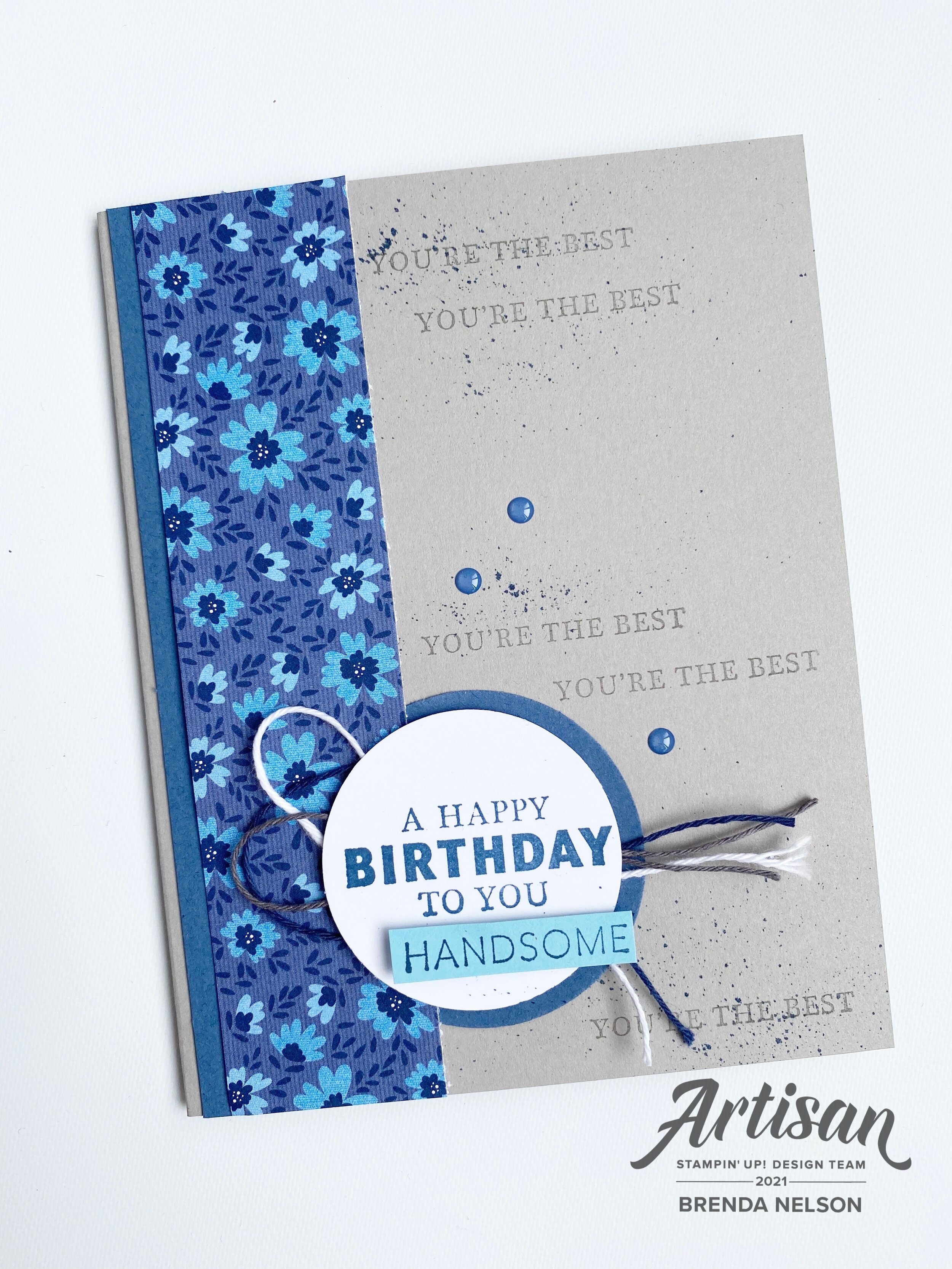
I decided to combine some of our ‘blue' colors with Smoky Slate as we have some really fantastic DSP right now that I wanted to incorporate and it blends these colors together. I also had not played with the Well Suited Suite so this design challenge felt like the perfect time to play!

final 11.jpg

I wanted this Well Suited DSP to be the stand out on this card which is why I did not make the card base ‘blue’. All of the blues in this strip of DSP have a grey base to them (in my opinion) and I wanted to pull that color in as well so that some of the fun elements would pop.

I added in another blue by using Misty Moonlight as my accent blue—you can see it along the strip of card stock tucked behind the DSP and the circle that is tucked behind the sentiment. The sentiment is also stamped in Misty Moonlight and I added the word ‘handsome’ to the sentiment by trimming this word from the large Father’s Day phrase in the stamp set. Handsome is stamped on Balmy Blue to add a little brightness to the card and play off the DSP.

I love how we can customize any of our projects by trimming specific words out and isolating them. It opens up a world of possibilities!

I added some MIsty Moonlight In Color Enamel Dots to the base after flicking my Misty Moonlight marker across the back and I used both of the Well Suited Twines and the Basic White Twine from the Snail Mail suite as well to accentuate my sentiment.

final 11.jpg
 

This card also has all of the components of #goodcarddesign that I have been sharing lately on my Instagram @stampwithbrenda (go give me a follow) and on my blog.

You can easily recreate this card using any of our DSP, stamp sets and embellishments. Watch for a future post with some #goodcarddesign samples!

And if you were wondering how many ‘shades of blue’ that Stampin’ Up! offers—I count 8!

I hope you have a lovely Saturday! Thank you so much for hoping by and if you want to go BACK you can see what Melissa has designed and if you click NEXT you can see what Connie has created for us!

Create with Connie and Mary--Valentine's with a Twist!

Welcome friends! Thanks for checking in this week to see what we are creating! This week we are making valentines projects with a color twist or untraditional colors. I immediately thought of using the color blue as we have so many fabulous blue shades to choose from! And I felt like blues would lend themselves to making a more masculine feeling valentine.

Design Team.jpg

If you have been following along on my recent crafting journey (please follow me on Instagram—@stampwithbrenda) than you would know I have been having a lot of fun with our new fantastic Blending Brushes. I decided to use three shades of blue to create a background to cut with the Floral Heart Dies and unexpectedly ended up with an idea to create a partner card!

final (1) 15.jpg

My original idea was for the card on the left. I used my Blending Brushes with Seaside Spray, Balmy Blue and Misty Moonlight. Once I cut out the floral heart I was left with this amazing free floating heart that I couldn’t waste—so I used it to create the card on the right.

final 22.jpg

I ended up using a variety of products to create these two cards. I wanted smaller sentiments that wouldn’t take away from the floral or heart dies. The Valentine Keepsake stamp set was a perfect fit as the “Be Mine” and the “With Love” phrases fit perfectly in a 1 inch circle punch. Both sentiments are stamped on Balmy Blue card stock with Misty Moonlight ink.

final 23.jpg

I really wanted this card to showcase the Pearlescent Specialty Paper too. You can see how it looks when added to a white card base and the blended die cut background really pops on this clean canvas. The accent hearts on the bottom of the card are stamped in Seaside Spray and are found in the Always in My Heart stamp set.

final (2) 5.jpg

I made this second card because I had this amazing blended heart cut out and couldn’t waste it. This card base is Misty Moonlight with the same little hearts stamped along the bottom. The designer series paper layer is from the Flowers for Every Season collection. The floral heart die is used to cut out the Seaside Spray card stock and the banner on this card is also cut from the same die set using the Pearlescent Specialty Paper. I really love how both of these cards turned out!

I can’t wait to see what amazing creations Melissa and Connie have designed for this week. You can go BACK to visit Melissa if you are starting here and NEXT to continue on the hop and see what Connie has created.

In the Pines

One of the amazing things about where I live, Edmonton, Alberta is how close to the Rocky Mountains I am and all of the beautiful forests. As soon as I saw this stamp set, In the Pines, in the catalogue I knew it needed to be on my first order! It reminds me of an Albertan Winter!

final.jpg

I used Misty Moonlight as my base and first layer. I stamped the little ‘dots’, which could be snow, around the perimeter of the card base layer. Notice the embossing folder? LOVE! It is called the Evergreen Forest 3D Embossing folder. It’s actually tucked away in the Handmade for You catty, so make sure you don’t miss it on page 35. It works perfectly with this bundle.

I decided to mix stamping and die cutting on this card. The stamped tree is in Just Jade, with the filler layer stamped off to achieve a slightly lighter tone of the ink. The wider of the two trees is cut out of Shaded Spruce card stock using the Pine Wood Dies. Shaded Spruce and Just Jade look so so good together. Its definitely a color combo I will be leaning into this holiday season! The smaller tree is cut with another die from Just Jade card stock.

final.jpg

The sentiment is stamped in Early Espresso on Crumb Cake and cut out with the Timeless Label punch—its looks different than its original form because the paper is only wide enough for the curved section of the punch! I love to use punches in a unique way!

The Night of Navy ribbon is from the Playing with Patterns Ribbon Combo Pack and was the perfect width and texture for this card.

You could easily turn this into a Christmas card by using the other phrase in the stamp set ‘Seasons Greetings’

You could easily turn this into a Christmas card by using the other phrase in the stamp set ‘Seasons Greetings’

Around the World with the NEW Catalogue!

This might be the most exciting Around the World on Wednesday blog hop in 2020 as we are all featuring things from the brand new catalogue! Its like an early Christmas! The suite that I was the most excited about was the Playing with Patterns suite on page 100. I absolutely loved the color pallet and after playing around with the Playing with Patterns Designer Series Paper I might go on record and saying is my favourite DSP of all time. That is quite the commitment but to me it is perfection!

91442295_10216484369808661_2887014979863576576_n.jpg
 

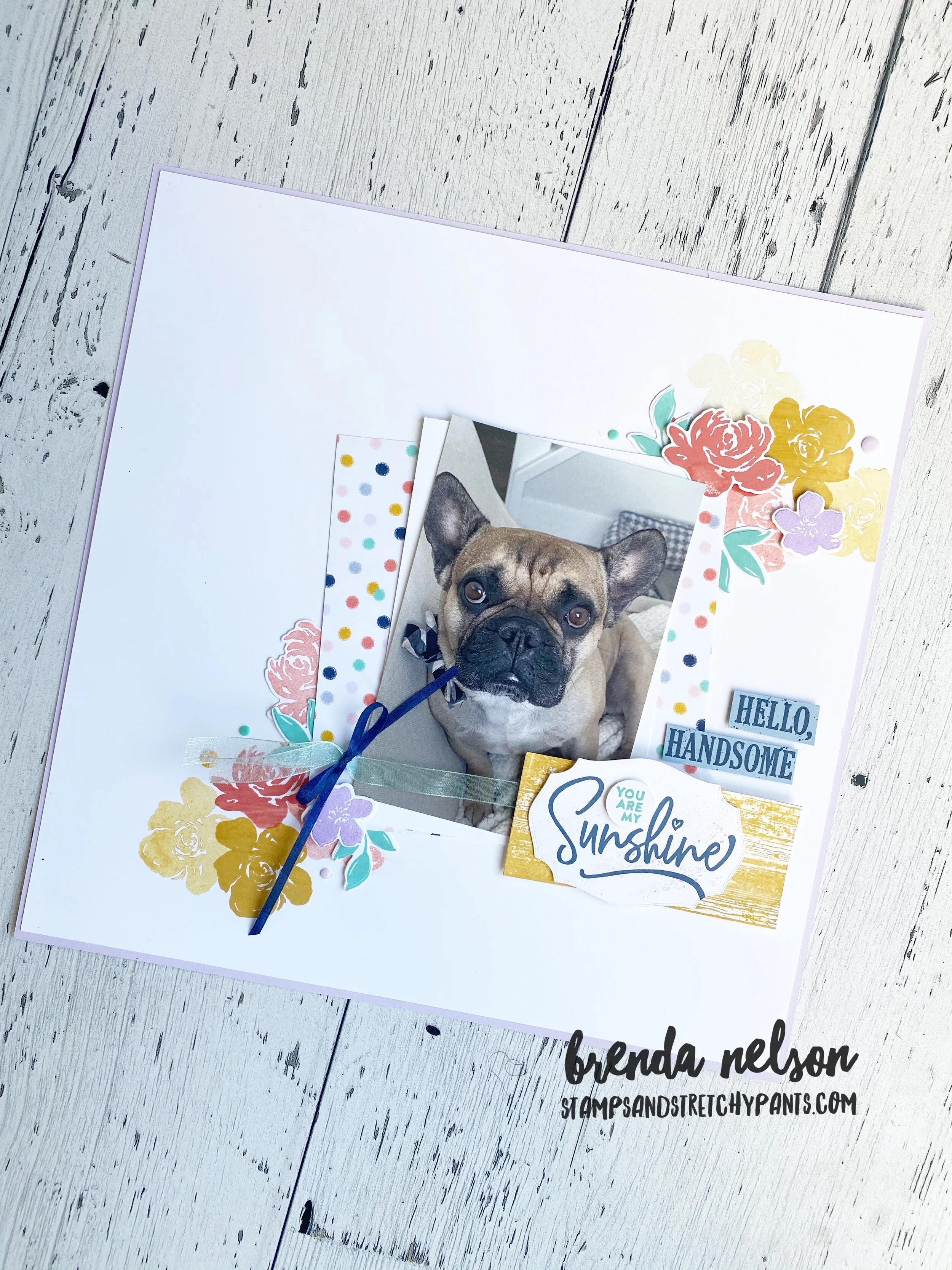
I knew right away I wanted to create a scrapbook page layout with this suite adding in a few other stamp sets I was excited about. I love a good floral set and I was drawn to the images and sentiments of this new bundle, All Things Fabulous on page 121.

And look at my subject matter! Could he be even cuter? Hawkins has been my faithful companion and my best buddy during the past few months. As soon as I saw the Pallet Thoughts stamp set with “Hello, Handsome” I knew it would be the perfect set to use when scrapbooking my dog, sons or husband! And I love the distressed wood stamp in this set as well. It is the perfect layering piece!

The whole page is designed around the colors of the Playing with Patterns suite—Purple Posy, Night of Navy (however, I substituted our new In Color Misty Moonlight), Coastal Cabana (my favourite color of all time), Crushed Curry (once again I substituted Bumblebee), and Calypso Coral.

final.jpg
fullsizeoutput_11f66.jpeg
I really love the flowers on this page combined with the soft colors.  The enamel dots are an awesome finishing touch that helps add dimension to the page. I like my pages to have lots of layers and textures.  I used the largest Water Painter brush …

I really love the flowers on this page combined with the soft colors. The enamel dots are an awesome finishing touch that helps add dimension to the page. I like my pages to have lots of layers and textures. I used the largest Water Painter brush to swipe over top of the Bumblebee flowers right after I stamped them. I did the same thing on the barn wood piece to soften things a bit and spread out the color slightly. I also stamped the flowers multiple times to give a gradient look to them as well. That is one of the easiest ways to create different colours. Ink once and stamp repeatedly!

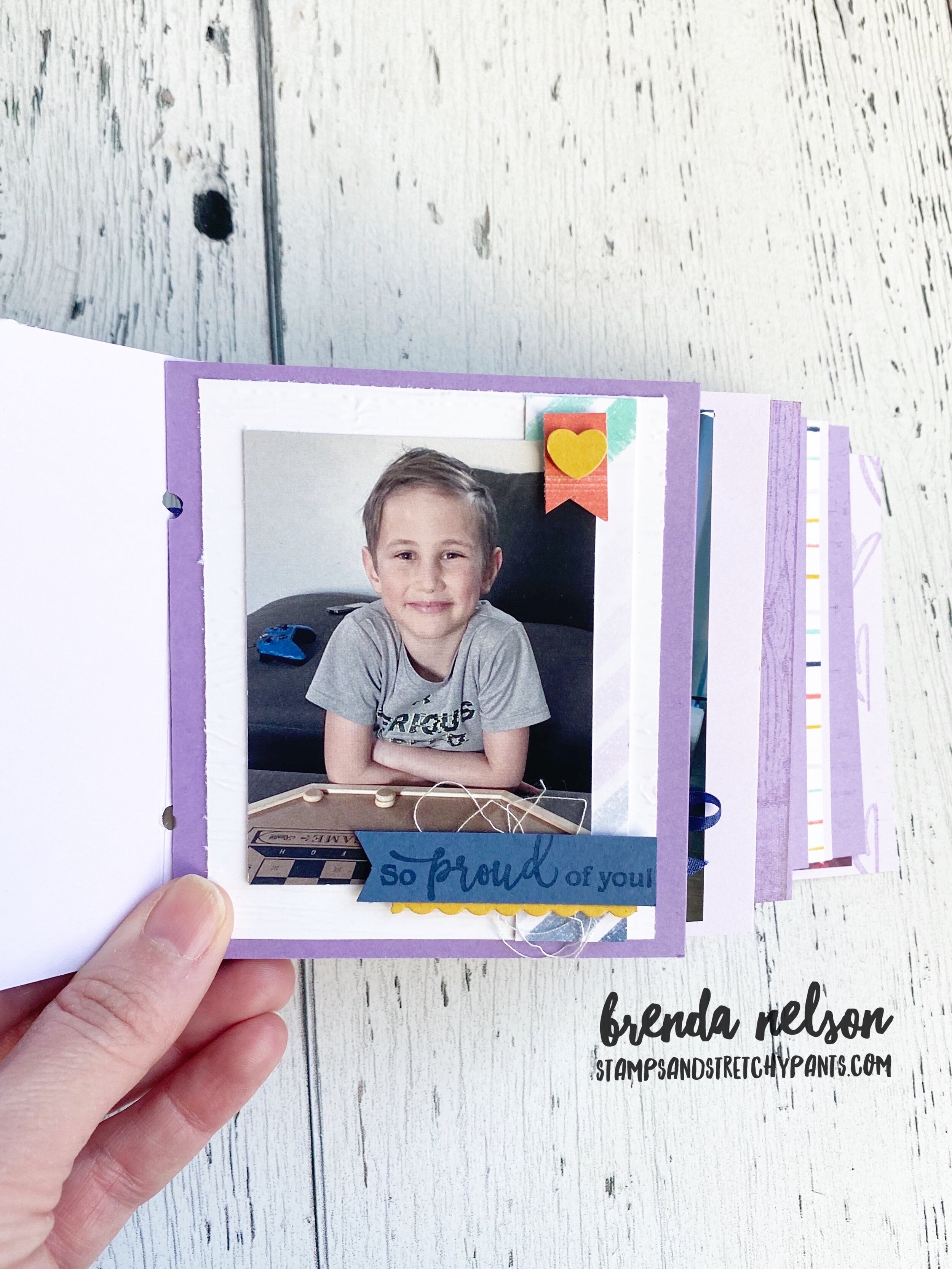
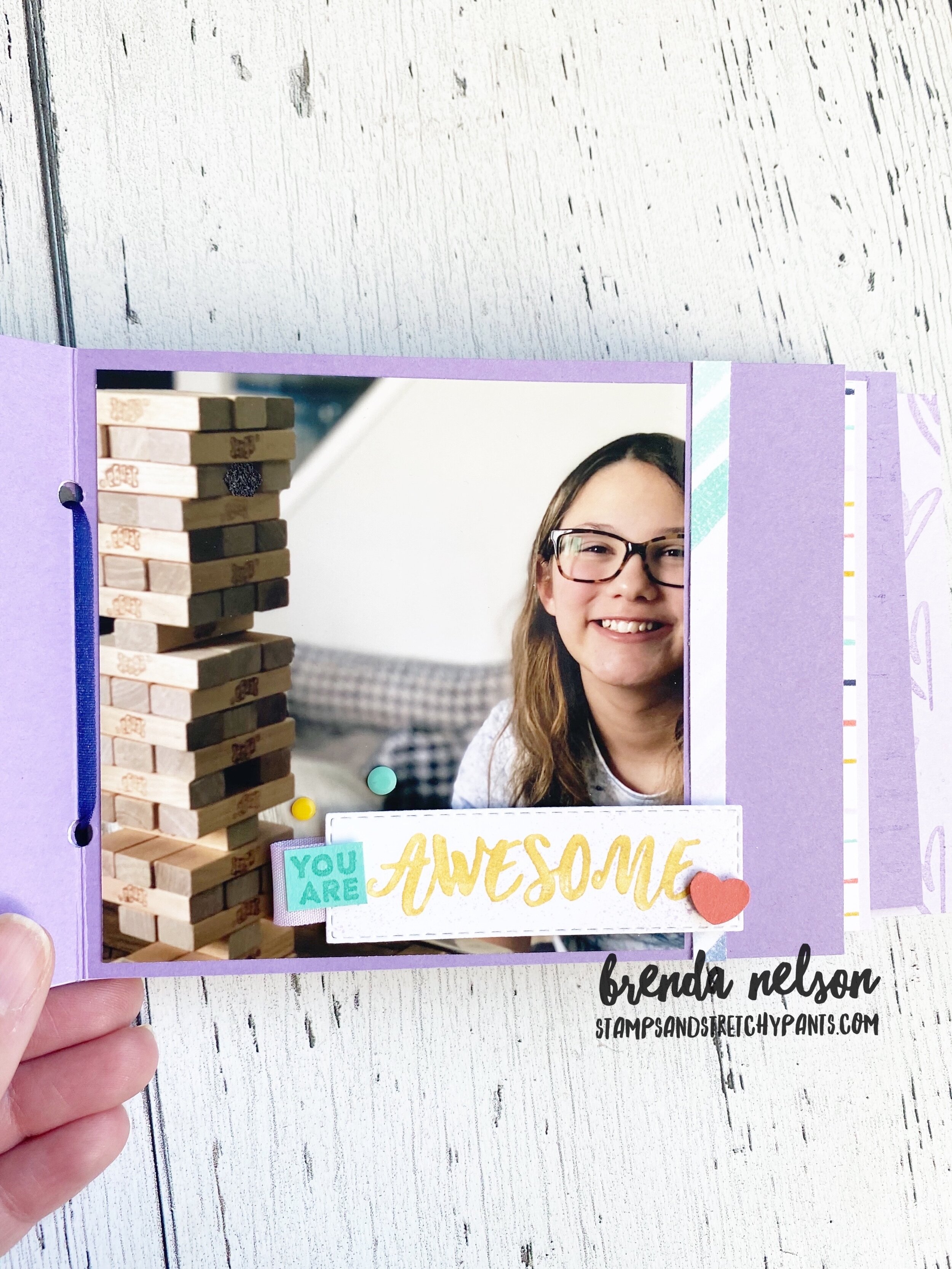
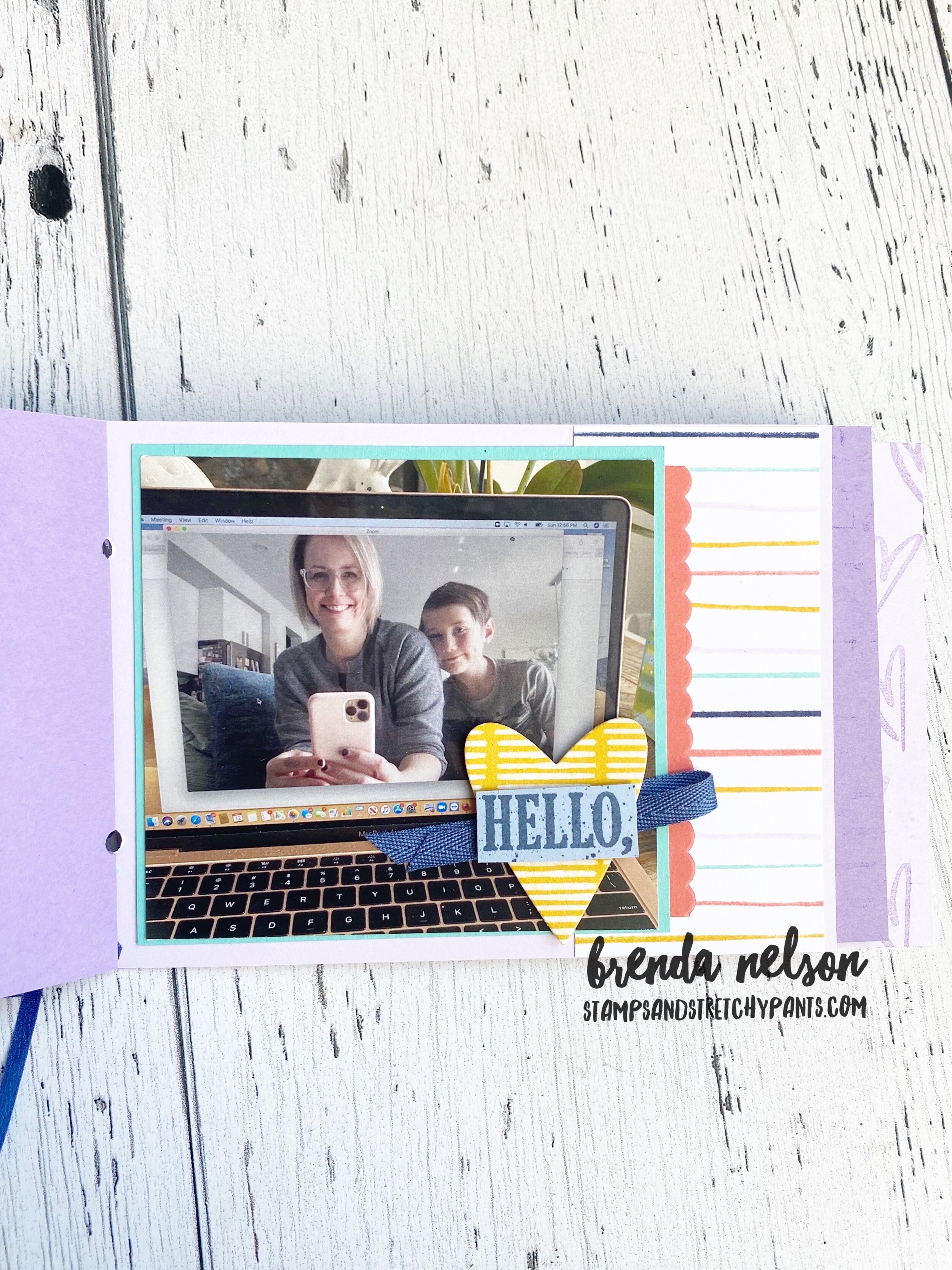
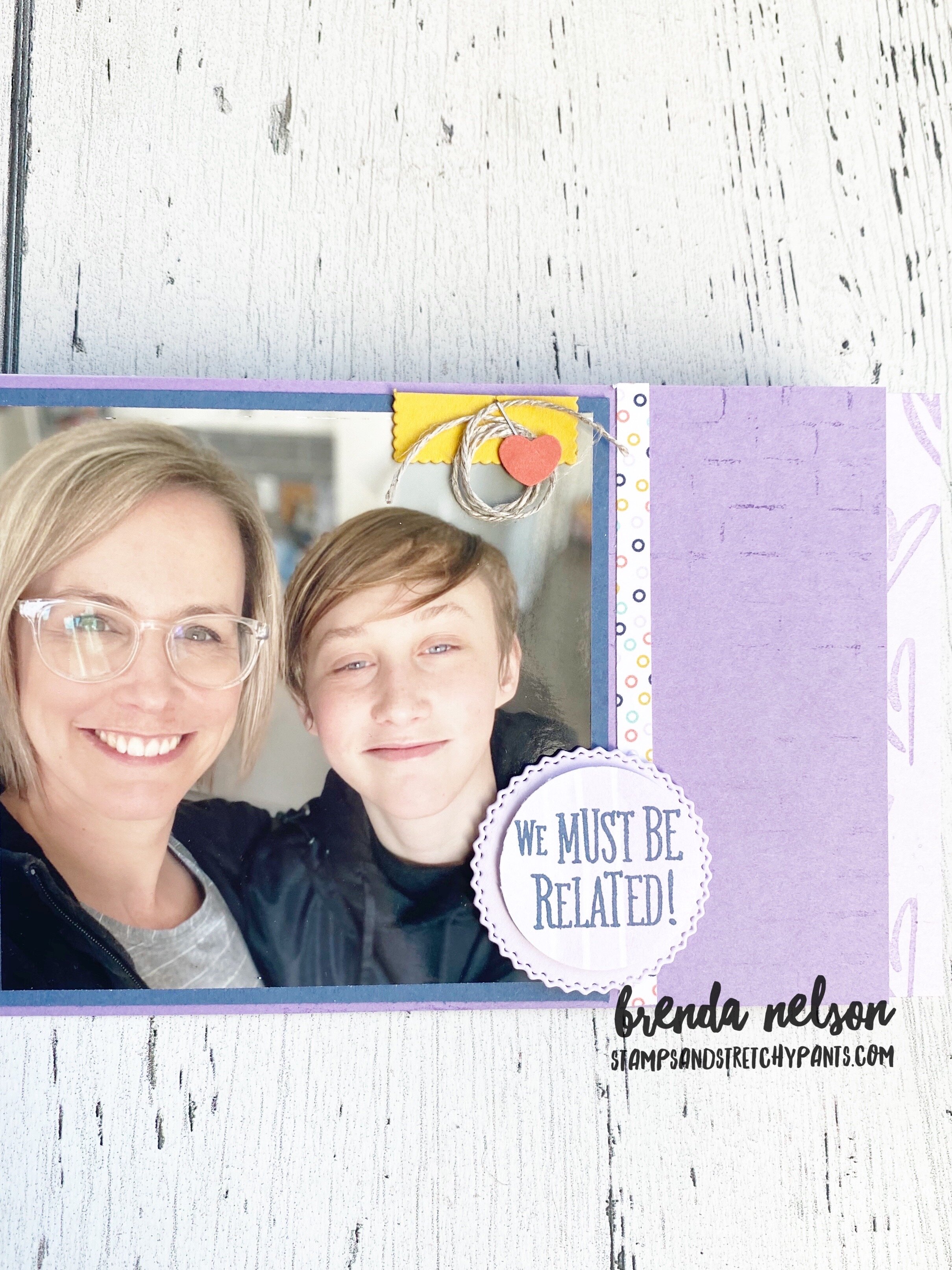
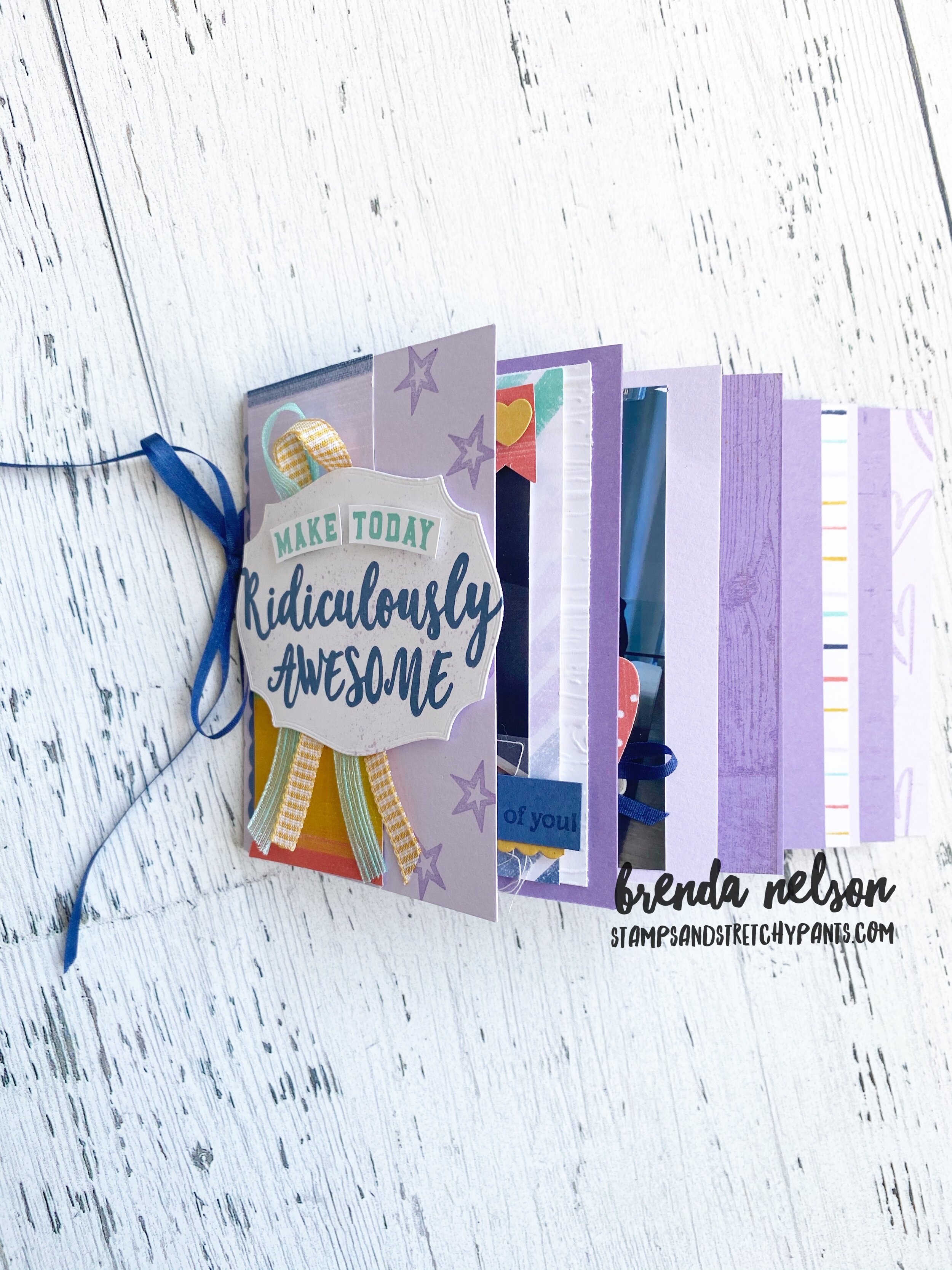
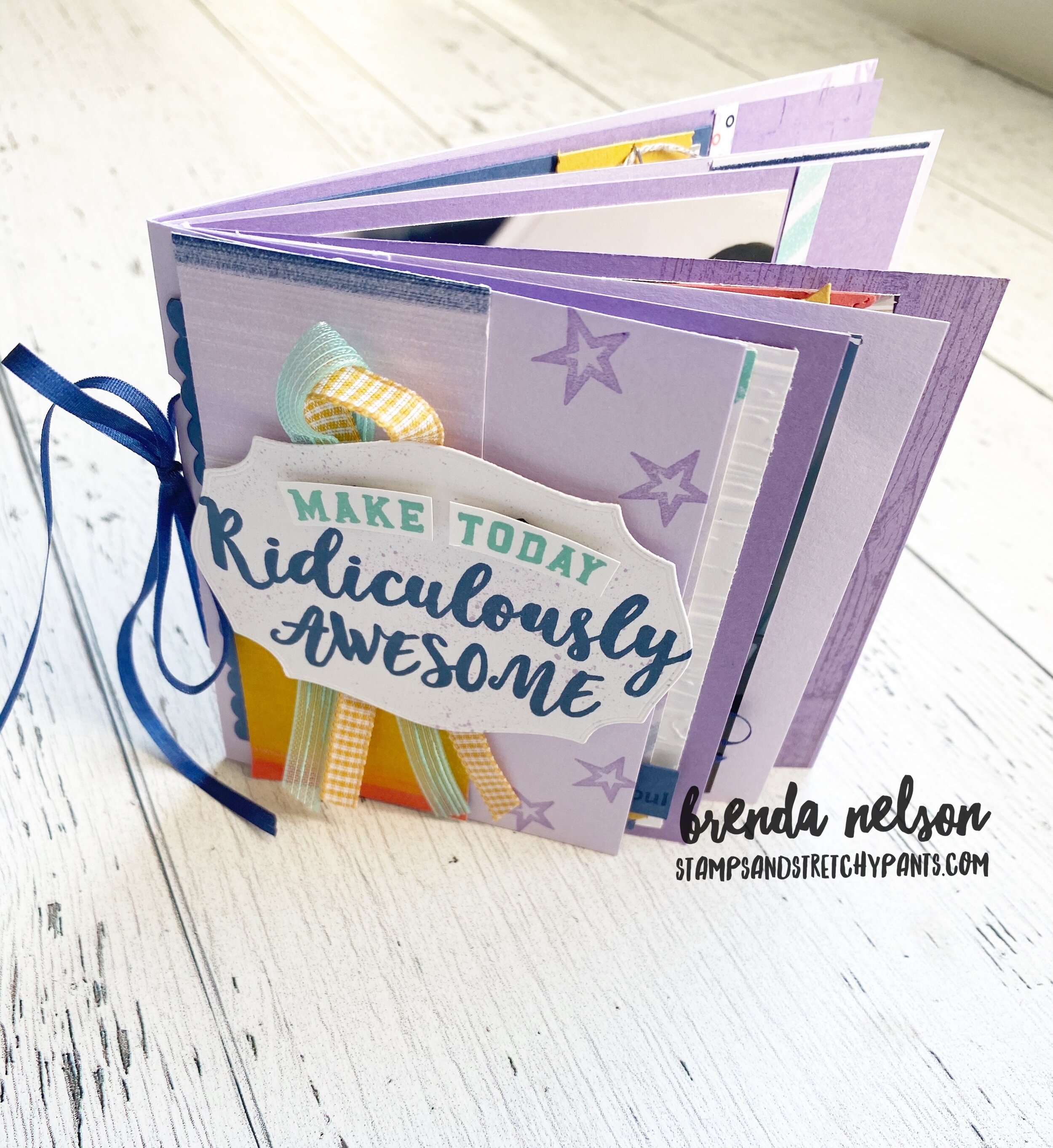
I was so excited and inspired by this page layout that I took all of the same elements to create this adorable mini album. I used photos of our ‘quarantine times at home’ as my subject matter. Ridiculously Awesome is a new mlllion dollar achiever se…

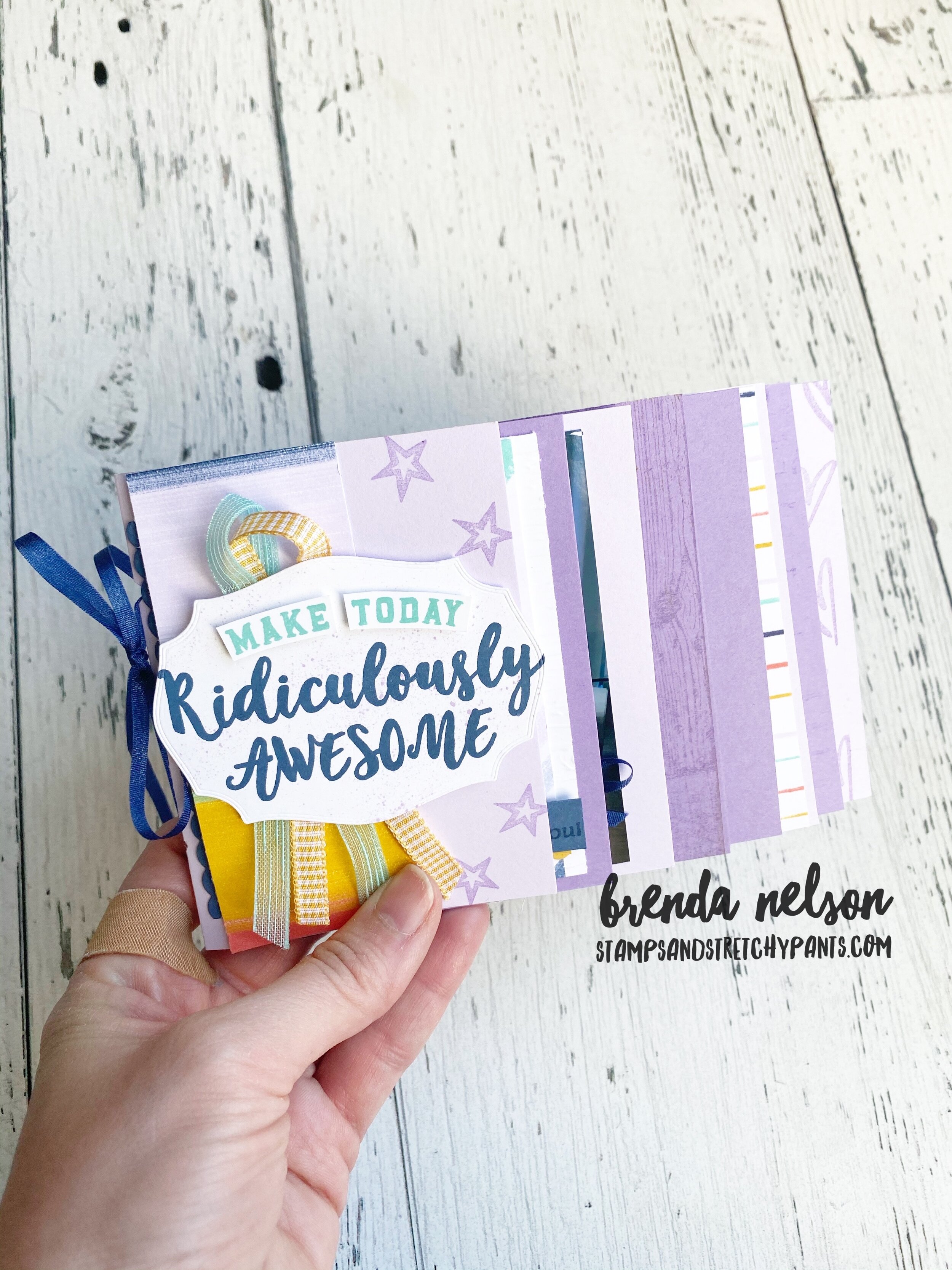
I was so excited and inspired by this page layout that I took all of the same elements to create this adorable mini album. I used photos of our ‘quarantine times at home’ as my subject matter. Ridiculously Awesome is a new mlllion dollar achiever set co-designed by Ronda Wade with artwork contributed by Sean Douglass. I LOVE the oversized fonts which makes this a dream set for memory keeping!

For the album shown below, I used all of the same products (minus the flowers) to create this project. I also added in the stamp set A Grand Kid. I love the phrases in it and can see myself using it a lot even though I don’t have ‘grand kids’. Its definitely not a set to be overlooked because of the title.

Click through these photos to see some different views of this fun mini album :)

The next stop on our awesome blog hop of 24 participants is Cindy Schuster from Nutmeg creations! Cindy works at Stampin’ Up! and is one of the amazing co-founders of Stampin’ Through the Catalogue. You can follow them on the Gram @stampinthroughthecatalog