Around the World On Wednesday--CASE the Designer

Hello friends! Welcome to another fantastic blog hop! I love this hop because the talent of this group is so outstanding and this month our theme is to CASE (Copy and Share Everything) one of the Designers in the hop. I am happy that I am casing Tricia Butts from Colorado! It was actually really hard to pick a card to CASE as she had so many great designs to choose from!

91442295_10216484369808661_2887014979863576576_n.jpg

I decided to pick a project of Tricia’s to case that had stamping, coloring and used the Stamp Cut & Emboss machine. Tricia created a really beautiful card that featured Polished Pink and the Hand Penned Bundle, two brand new products that I just love. It came me the idea to create a card that featured a new Christmas Floral stamp set and embossing folder.

IMG_9744.jpg

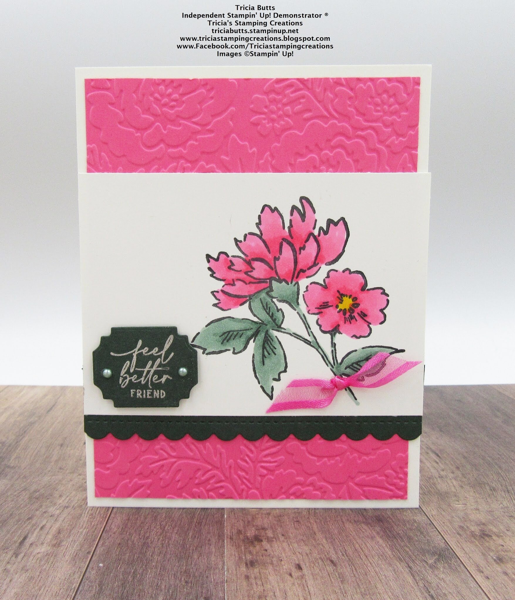
I decided to keep as many elements of Tricia’s card in my design as well. So I started with a Basic White card base and a Poppy Parade layer that I ran through a new folder called Timeworn Type to mimic her Polished Pink embossed layer.

I love how Tricia used a scallop edge on her card design as an accent. It is one of my favorite things to do too! The one I chose is from the Peony Dies and Tricia used the Hand Penned Dies.

I love how Tricia used a scallop edge on her card design as an accent. It is one of my favorite things to do too! The one I chose is from the Peony Dies and Tricia used the Hand Penned Dies.

The central image on my card is from the Words of Cheer stamp set which is coming out in the new July-January (JJ) catalogue. This catalogue features Fall, Halloween and Christmas and you are going to LOVE IT! If you live in Canada and would like one, leave me a comment and I will make sure to get you one!

I colored this large poinsettia image with my Stampin’ Blends. The poinsettia is colored with Cherry Cobbler and the berries are with Poppy Parade. The greenery is colored with Old Olive. I added Wink of Stella over top of the poinsettia flowers too!

final (27).jpg

I loved how Tricia stamped her sentiment in White Craft Ink and embossed it so I decided to do the same with my sentiment “Wishing you a Joyful Christmas”. I wanted to bring a little gold into my card to accentuate the gold from the Wink of Stella so I added some gold metallic twine behind my sentiment.

A little strip of Gold Foil paper along the top was a little finishing touch to bring in a bit more gold.

I think this is SUCH a #goodcarddesign that can be repeated using any embossing folder and stamp set! I think you should give it a try yourself! Just make sure to give Tricia the design credit :)

To continue on the hop you are actually going to go and visit Tricia’s blog yourself! Just click on the link below! Thank you so much for coming by today! I hope you have to visit everyone on the hop for some fantastic inspiration!


Color Fusers--July 2021 Blog Hop

Hello friends! I really appreciate you taking the time to pop by and enjoy our Color Fusers Blog Hop! I love color challenges as they help stretch my creativity! This month’s color challenge is amazing and I am so excited with the project I designed using Basic White, Basic Black, Petal Pink and Gold!

IMG_9468.jpg

When I was mentally toying around with this color palette, I had the idea to create something with stripes. I ended up including them but on the diagonal to create a focal point for my scrapbook page!

I also chose this particular picture because my mom and daughter are wearing black and white and call me crazy, but my photos have to coordinate somewhat with my page designs. In fact I hardly EVER create a page without my pictures first. I can make exceptions for specific holidays, like Father’s or Mother’s Day, but typically I always chose my picture first!

I also chose this particular picture because my mom and daughter are wearing black and white and call me crazy, but my photos have to coordinate somewhat with my page designs. In fact I hardly EVER create a page without my pictures first. I can make exceptions for specific holidays, like Father’s or Mother’s Day, but typically I always chose my picture first!

I decided to start off with a Basic White background for my scrapbook page and I added a spray of black using my Stampin’ Blends marker. I flicked the Blend across my page where I was intending to add in some flowers.

The flowers are from the Blossoms in Bloom stamp set and are stamped in Petal PInk. I pinched up the edges to give them a little more interest and depth. This page is quite minimalist for me but I am so happy with how it turned out!

final (22).jpg

The best part of this whole page is this 4 x 10 diagonal panel that I created to bring in the Basic Black, Petal Pink and Gold colors of this challenge. I cut a separate piece of Basic White card stock to 4 x 10. I then covered it with Tombow Glue—I think this is key, because there is wiggle time with this glue to get things perfect unlike Stampin’ Seal. I added in my strips which are 1 1/4 wide. Once I had them in place, I flipped over the Basic White and trimmed off the excess to create this fun panel.

The sentiment “Love is What Makes Us Family” is from the stamp set Lovely You.

I also added in a few Gilded Gems for a little extra pop of gold.

final (21).jpg

The sentiment “I like you a lot” is from the Blossoms in Bloom stamp set.

I cannot wait to see what the others in the Hop create with this color combo. If I am your first stop make sure you Hop all the way around and leave a comment! If you live in Canada you can shop with me using my Hostess Code or visiting my online store :)

You can go back to see what amazing project Melanie has created by clicking below,

To see what my fellow Artisan Design Team member Tami has designed please click below

Thank you so much and hope you all have an amazing JULY! Happy Stamping!

Love Your Colors!

Recently in our Artisan Team group chat we were talking about colors that we rarely use and don’t ‘love’ as much as some others. The idea was born to create a project using that color that tends to be left out and launch a campaign to #loveyourstampinupcolors

We hope you will share this hashtag too and create a project that features a color that can feel a little lonely in your collection.

IMG_8056 2.JPG
final (13).jpg

Can you tell what color was my focus? Merry Merlot! I don’t know why but it isn’t a color that I reach for very often, but after making this card I think I have developed a little more love for it. Doesn’t it look beautiful and elegant paired with the Shaded Summer stamp set and some gold accents?

The base of my card is Merry Merlot and I cut a 2 x 5 1/2 strip that I ran through the Pretty Flowers embossing folder and added to the bottom of my card.

I cut a layer of Basic White and ran the bottom through the one of the Basic Borders Dies…if you do not have these yet, hit ADD TO CART now :)

final (10).jpg

I decided to pull out the Gilded Leafing to add an elegant touch to my card. I thought it would look so pretty with Merry Merlot. I used the wide tip of my Tombow Multi Adhesive Glue to spread some glue in random spots along the edge. You can then press the panel into the Gilded Leafing and dust off the excess. It is such as easy way to add this product on.

I flicked my Merry Merlot marker across the card base too. I love adding a little flecking of color to my projects and this technique is so easy.

final (11).jpg

I used my Stampin’ Write Markers in Merry Merlot and Mossy Meadow to color both of the large floral images in the Shaded Summer stamp set. I then hand trimmed this out and added them to my project to appear like one larger floral.

I also selected a couple flowers to color again and cut out to add on top of the image to give a little more height and dimension.

I added a little strip of Gold Foil Paper along the top edge as well for a little more glam. And finally finished it off with some classic Pearls! Can’t get any more elegant than pearls right?

final (17).jpg

I love how this card turned out and I am so happy I have sparked a little more love for this rich lovely color. I hope you will pull Merry Merlot off of your shelf and create something with it too. Make sure to use the hashtag #loveyourstampinupcolors

Create with Connie and Mary--Pastel Techniques

Hello friends! I am really excited to share a pastel technique with you today. As well this is my final blog post as a Designer for the Create with Connie and Mary Blog Hop. I have really enjoyed participating in these weekly challenges for the past year + and have learned so much! I have appreciated the comments and encouragement along the way. I will be continuing to share here and on my Instagram so I hope you will continue to follow along with me on my creative journey!

21SUSatHopWelcome.png

Have you played with our new Stampin’ Pastels yet? I have made so many fun things with them! I have been stamping long enough that I remember way way back when Stampin’ Up! had them in the annual catalogue. So I was able to draw on a few of those long forgotten techniques plus play around and experiment with some new ones as these pastels are different than what we offered in the past.

TOP TIP: In order to get the ‘chalk’ off of the pastel, use the scraper tool attachment of the Pick a Tool to scrape the coating from the outside of the pastel. If you were to open your package and rub your finger over the chalk, you would notice nothing would be on your finger. However, after you scrape the chalk it will easily rub off on your finger!

final (1).jpg

Along with using the new pastels I wanted to use another new product we have which are the Plenty of Patterns Decorative Masks. I love masks because you can use them with so many other products we sell. Embossing Paste, Blending Brushes, Finger Daubers, Spritzers and the list can go on!

final (2).jpg
 

I started by selecting my Decorative Mask and pastel color. For this project I used the pastel that looks like Coastal Cabana.

I placed my mask over top of my Basic White card stock and simply rubbed my chalk over top of the mask.

The ridges from the mask will help shave or release the chalk from the stick.

I removed the mask and with gentle pressure you can remove the excess chalk with your Blending Brush. You do not want to press too hard to lose the design from the Decorative Mask.

I really love this technique as its quite simple but creates a really wonderful background for your project.

To embellish and decorate the rest of my card I used the Flowers of Friendship Bundle. I stamped the flowers with Momento Black Ink and then I colored them with a Water Painter. I applied the tip of my Water Painter DIRECT to my pastel and colored! It is another fun way to use this product. And using a Water Painter gives the finished look a ‘watercolor’ feel which I love!

final (4).jpg

I hope you will add the Pastels to your next order as they are inexpensive and so fun to experiment with! I will continue to share projects with the Pastels over the summer so keep checking back in!

To continue on with the Hop you can go BACK to see what Melissa made this week or NEXT to see what Connie has designed. Please feel free to leave a comment or use my Host Code if you are inspired and live in Canada!

Artisan Design Team--June Share!

Hello friends! I cannot believe that this month marks the halfway point of this amazing journey and experience! I have learned so much along the way but the best part has been the amazing new friendships I have developed with the other team members!

The Artisan Design Team is broken up into 3 groups as we have the largest team to date and my group was given the assignment of creating with the Art in Bloom bundle which features the new Bloom Hybrid embossing folder!

pictapgo-output (10).jpg

I couldn’t resist the opportunity to create a page with this little cutie’s smiling face, especially because he is now 16! But his eyes have not lost their sparkle and his face still lights up the room. And I also want people to feel ok about scrapbooking their sons, nephews, husbands, etc with flowers and pinks and other bright fun colors!

I started with a 12x12 base on a sheet of DSP from the Expressions in Ink Specialty Designer Series Paper. This gave me the foundation to add in these bright pink accents.

I used this new Hybrid Embossing Folder in two ways on this page—-one is the traditional way in the sense of I ran some Basic White card stock through the Stamp Cut & Emboss Machine to create two accent panels to flank my photo. The second way is that I used some Gold Foil Paper to emboss and cut the flowers out. This is what makes this folder so unique—it does both at the same time!! You place your paper in the folder and add the dies on top (they will nestle inside).

I also stamped out some flowers and colored them with the Pale Papaya Stampin’ Blends and then used the dies to cut out the flowers.

pictapgo-output (11).jpg

My favorite element in the Bloom Dies is the shape that cuts out the ‘ticket’…I just love it and think its a great way to add interest or to cut out with a sentiment. On my card I used it as an accent piece.

My tip to accompany this project is a classic one—using your Stampin’ Write Marker to isolate specific words to change how a sentiment is presented. You can see here that the sentiment in its original form is ‘long’ and I wanted something that would fit into a circle. So I just used the marker to isolate the words and stamp them in the shape I wanted.

Notice the ink spray in the background? One of my favorite things of all time—-use your Stampin’ Write Marker or even a Stampin’ Blend to flick or spray ink across your project. I do this ALL THE TIME. It just helps take away the ‘white’ space on a project.

If my projects have inspired you in any way and you would like to place an order you can hit the button below that will take you directly to my online store. Or you can use the HOST code on the main sidebar on my page. I truly appreciate it as I hope to keep loving what I do for as long as possible!