Color Fusers--Black & White!
/Welcome to the Color Fusers Blog Hop for July! This month the team is crafting with Black, White and a color of our choice. I picked Pretty in Pink as my color!
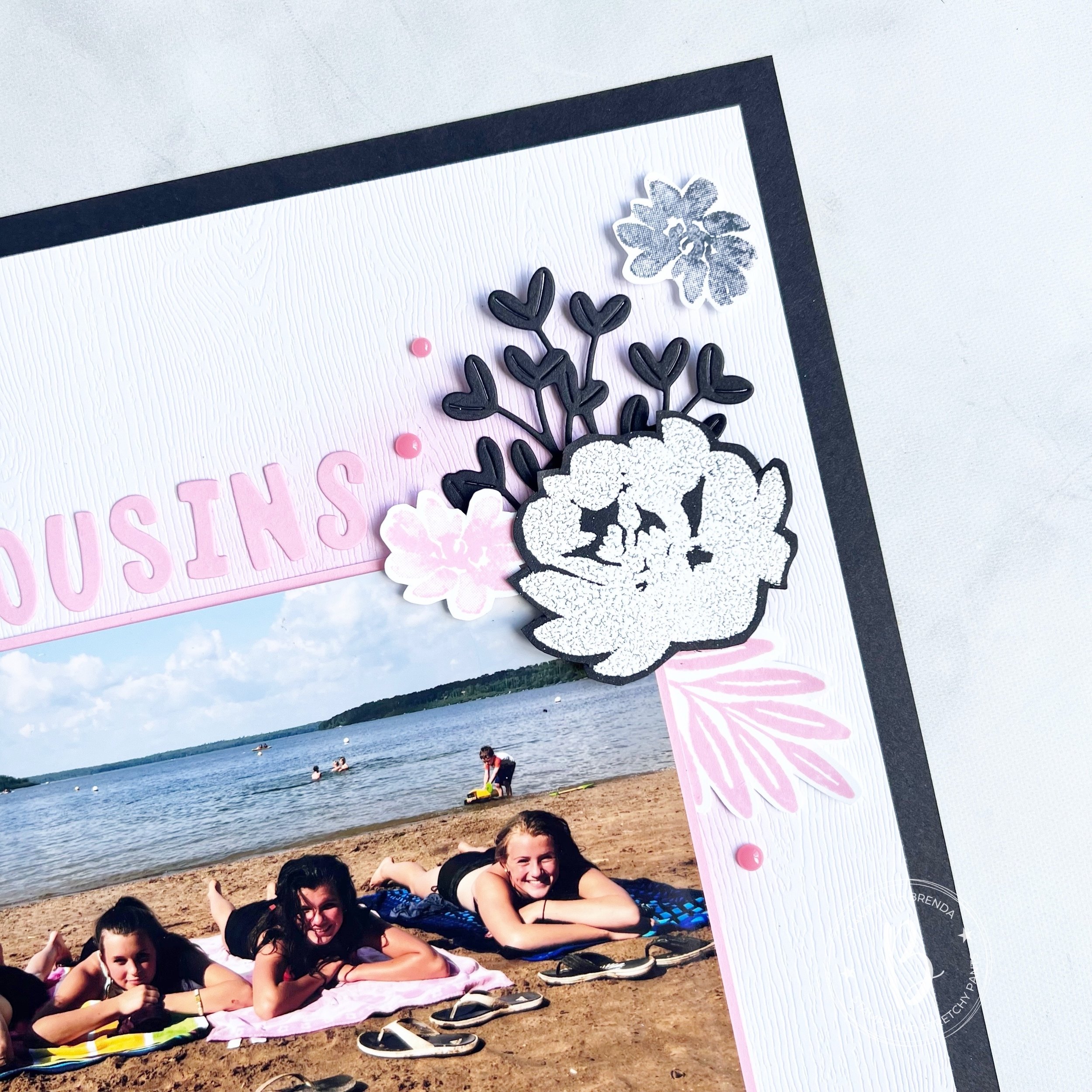
I decided to use one of my 12 x 12 Basic Black card stock sheets that I have been hoarding. I am hoping these will be available again in the fall for Halloween crafting—fingers crossed!
I layered the new awesome Wood Textured Specialty paper over top that I blended with some Pretty in Pink ink. This paper is a hidden gem in the Annual Catalogue and is definitely going to replace Basic White in some of my scrapbook designs!

This is one of my favorite pictures of Reese and my 3 nieces at Greenwater Lake—an annual trip we do each summer. There is nothing like a day by the water side enjoying some time with family.
I love how the blending of ink accentuates the wood grain tone in the paper! Its such a subtle wow!
I used the Mini Alphabet Dies to spell ‘cousin’s’ in Pretty in Pink cardstock. This is such a great die because you can easily cut the whole alphabet at one time or use little scraps of paper the isolate the letters you want.
I couldn’t resist adding in something completely NEW so I used the Golden Greenery Dies to cut out these sprig shapes in Basic Black card stock. I love how these do not look ‘holiday’ at all! Another great reason to #addtocart!
Along with the new, I added in florals from the Textured Floral stamp set. One that I have used many many times in my crafting. If you are new to this hobby, I would definitely recommend adding this to your collection.
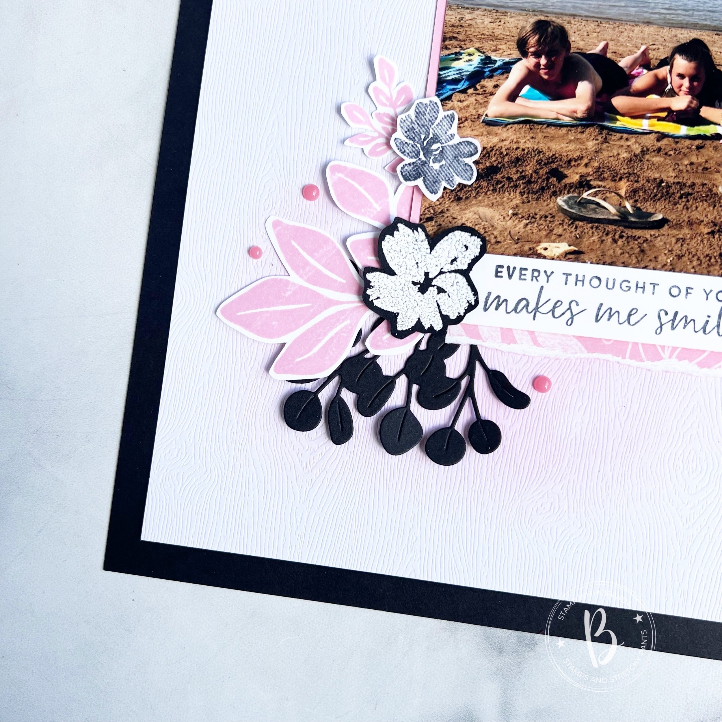
The flowers are stamped with Basic White Craft Ink on Basic Black card stock and sprinkled with embossing powder. Remember to heat from the bottom to get a better looking finished embossed image.
I also stamped the smallest flower from the stamp set in Memento Ink and Pretty in Pink ink.
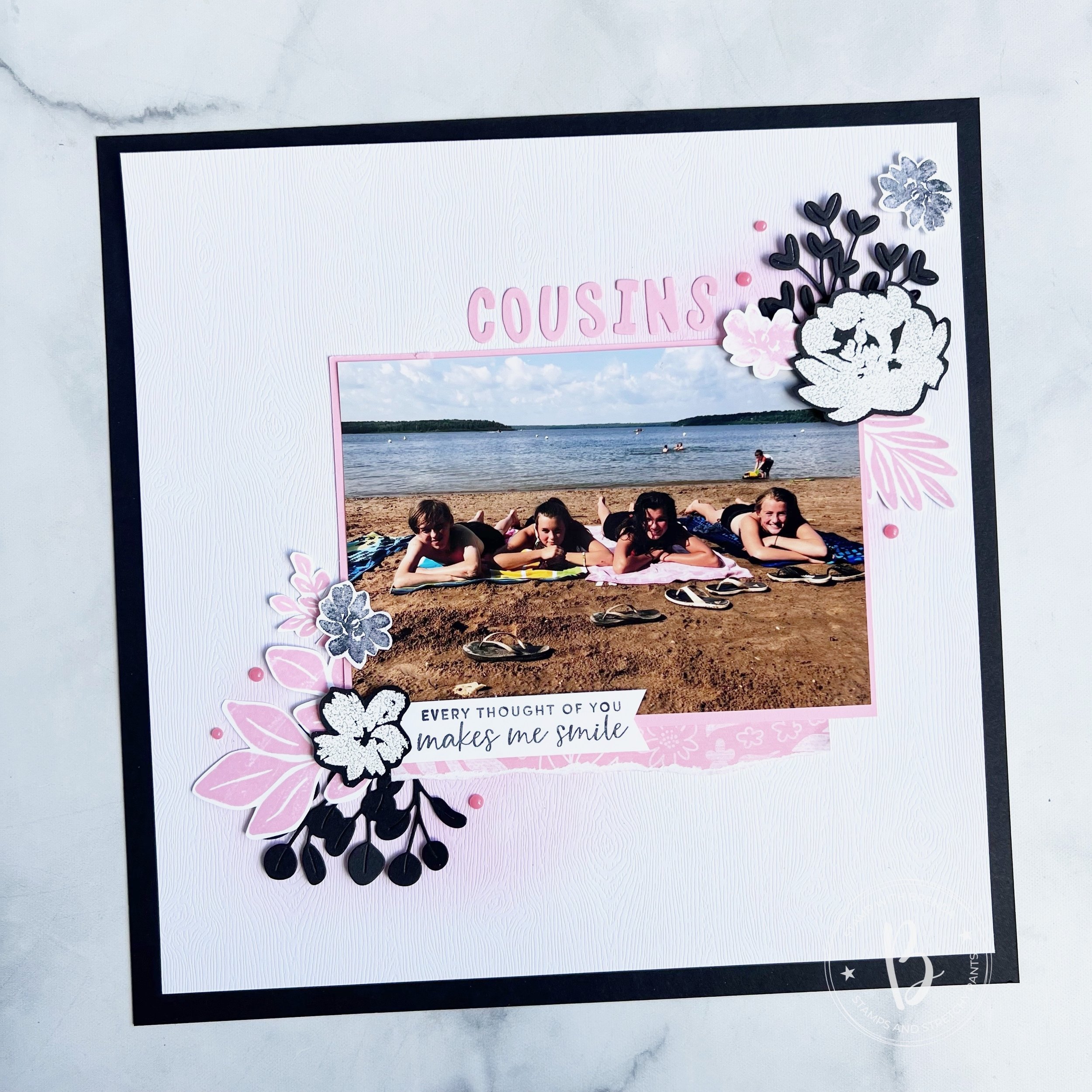
The leaves are from the large Leaf Collection background stamp. I trimmed them into separate images and added them around the page. I cut a strip of 6x6 DSP and tore the edge to tuck underneath the photo which is on a Pretty in Pink photo mat. To me this DSP from the In Color collection feels just like the Leaf Collection stamp.
The sentiment is from the Textured Floral stamp set. I added a few pink embellishments from the Adhesive Backed Dots for Days collection.
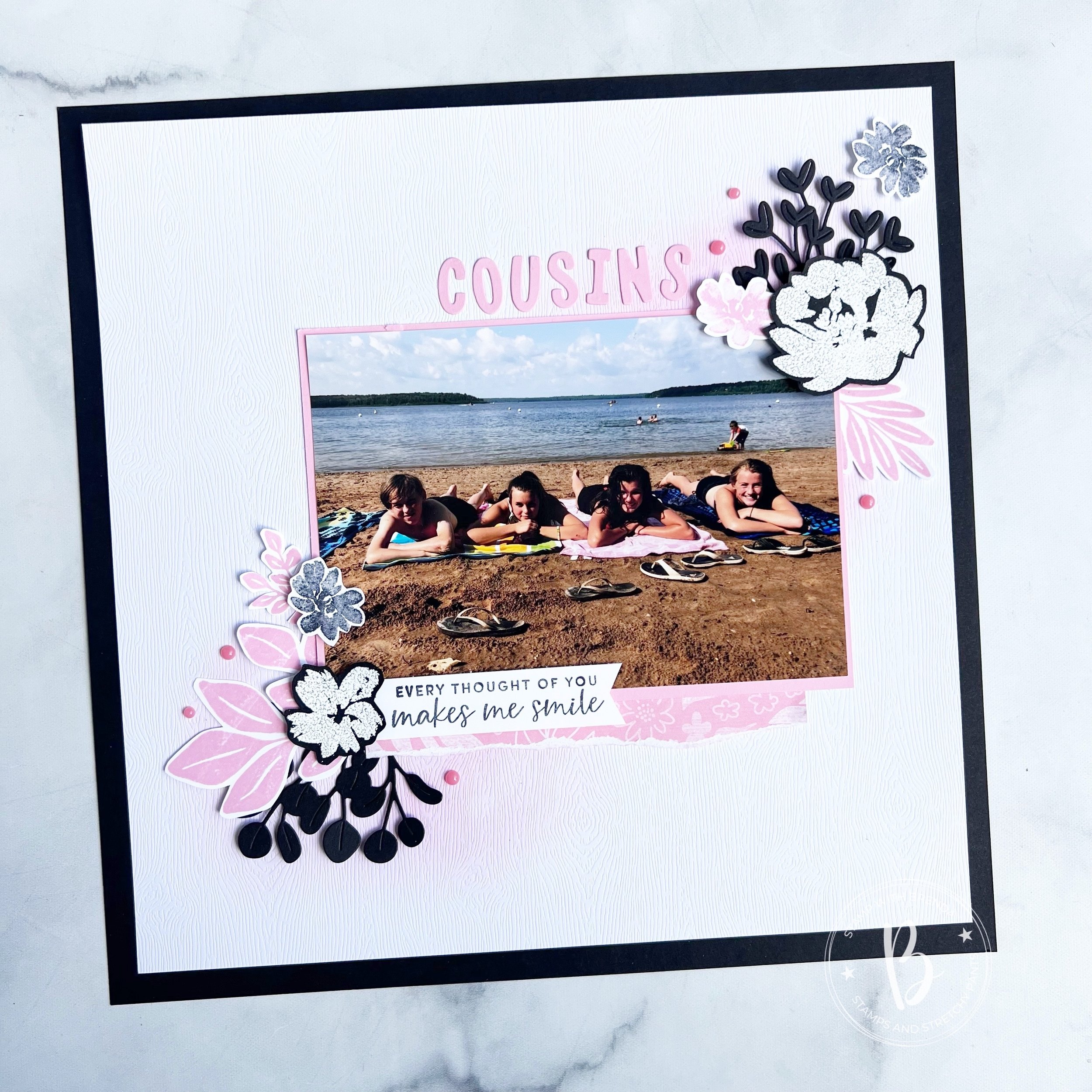
I really love how this page turned out. It is a design that you can easily replicate with using different stamp sets and dies. We have so many to chose from!
Next up on the Hop is Melissa Kerman—I know she has created something awesome and I can’t wait to see what color she picked to add to Black and White!

If you want to go in reverse, or if the hop has a broken link, you can always go back to see what the amazing Sue Vine has created too.
Regardless, I hop you visit everyone on the hop to see what color they chose to add to the Black and White theme!

Thank you for visiting my blog today! Please leave me any feedback and if you are inspired, consider shopping my store so I can continue to do what I love!
Click any image to shop my store
Product List


 Specialty Paper")
 Designer Series Paper")


")


")


 Designer Series Paper")
 Specialty Paper")


