Color Fusers--June--New In Colors!
/Hi friends! I am so excited to be sharing a project, a scrapbook page, with the new 2024-2026 In Colors! I am absolutely in love with this new collection—I dare say, its my favorite yet! Definitely in the last decad!

I new I had to make a scrapbook page with these colors and they literally pop off the page when added to a Basic White base. Do you have a favorite of the 5? Mine seems to switch with each new project I create, however, the fact that all of these colors work so well as a family, makes me so happy!
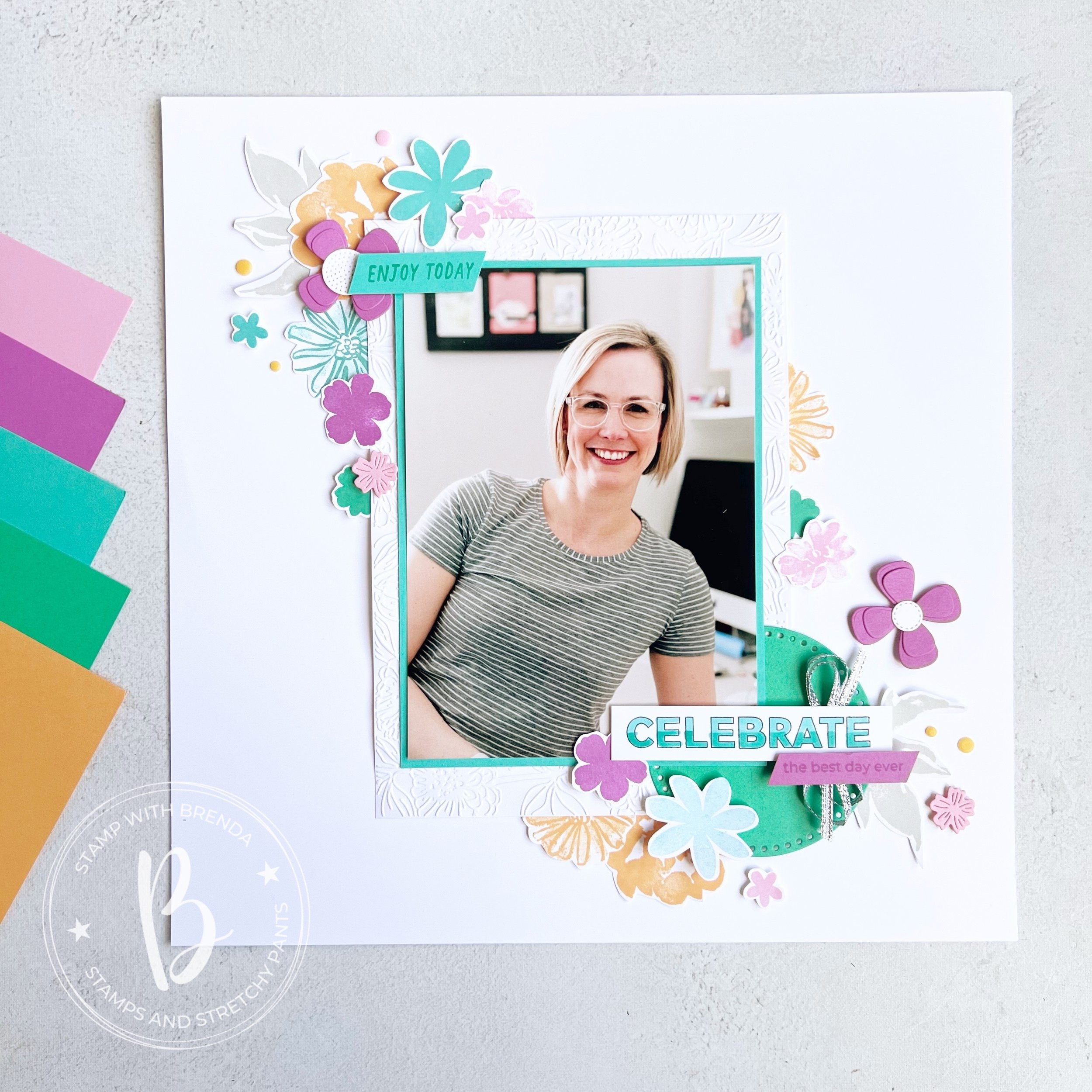
I decided to scrapbook myself, because really—who else is going to do it? I started with a 5x 7 picture that I matted with Summer Sky and then on a larger piece of Basic White that I ran through the Zinnia folder for some texture.
This page is a mashup of some of my favorite stamp sets, past and present! Because I was making this page for myself, to hang in my craft room, I didn’t work about things all being ‘current’. My very first Artisan Assignment in 2021 featured the In Bloom Bundle. It is still one of my favorites! I also used Color & Contour which is retired and the Paper Florist Dies (I was so so sad when they retired them, I will not quit using them!).
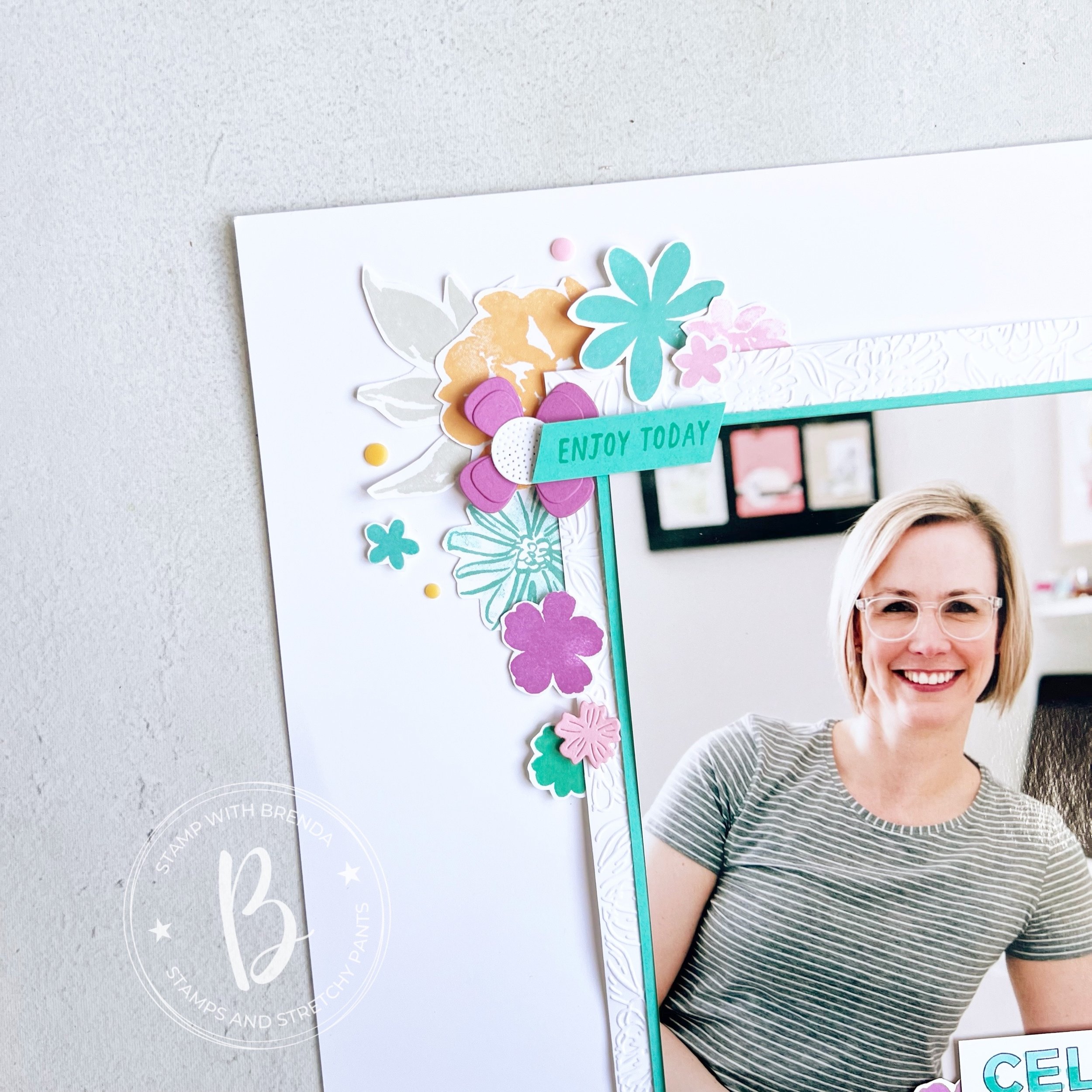
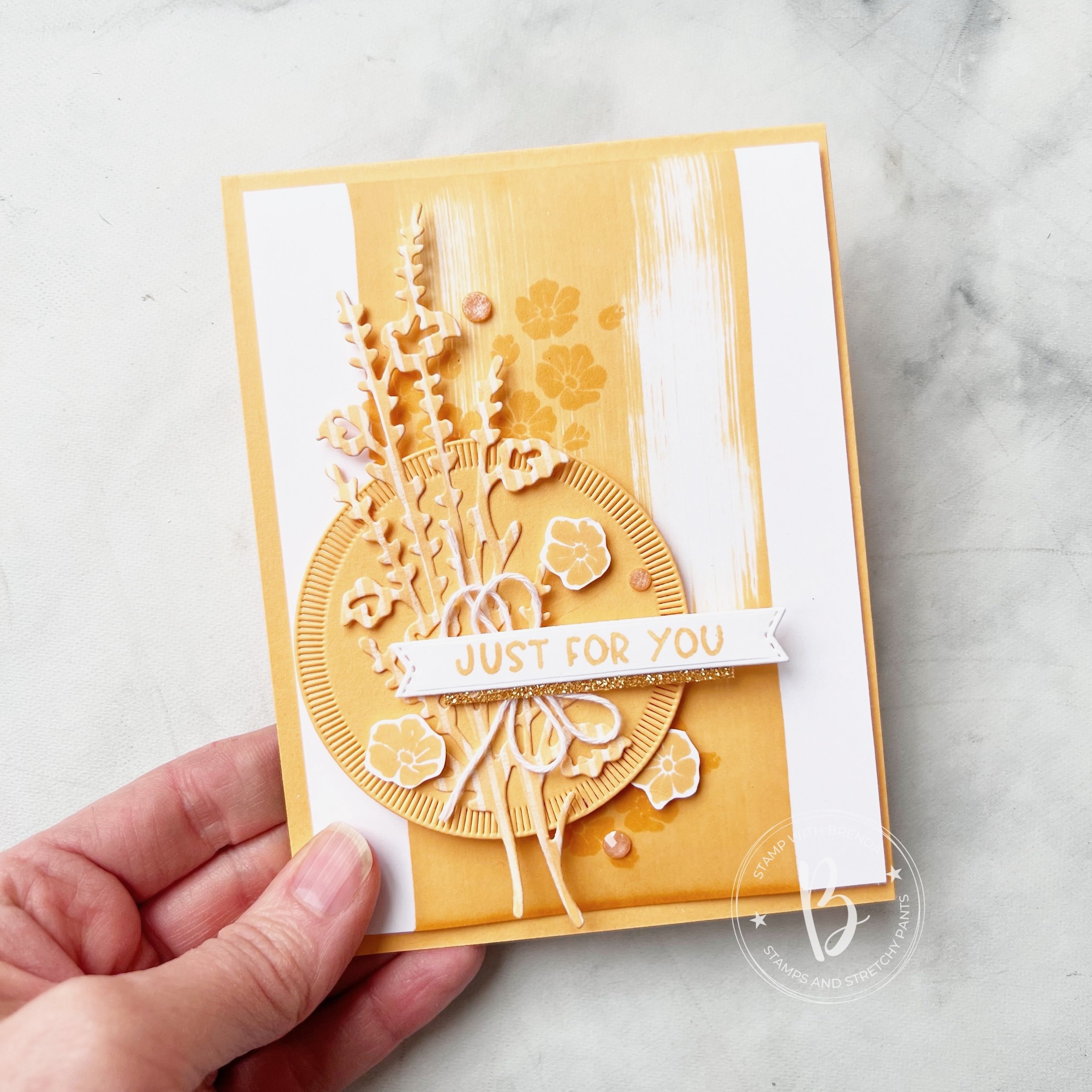
I love mixing and matching stamp set and dies and I used all five of the new colors on this layout—either in stamped or die cut form!
Many of these stamps actually have dies, but sometimes I like to just sit in one spot and be creative so I actually don’t use the Stamp Cut & Emboss Machine—gasp!
I like to layer images on top of each other and have things tucked in and behind and right on top of my photo too.
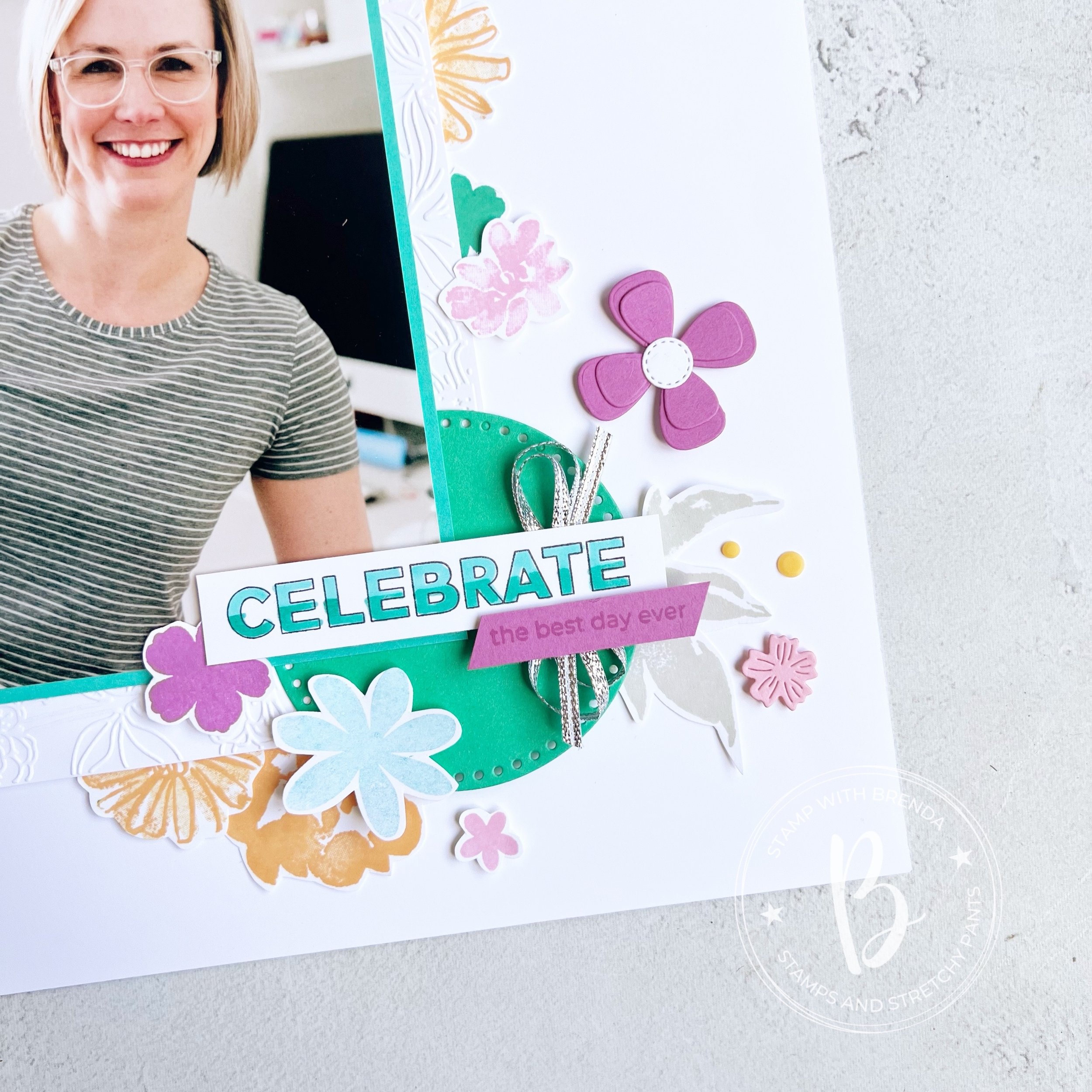
I created a really easy ombre effect on ‘Celebrate’ with my Stampin’ Blends markers which I think makes things a little more interesting. I also used the Everyday Details behind the ‘Celebrate’ to help it pop.
I didn’t want to favor a specific color so I used some of the silver ribbon from the Gold & Silver Trim Combo Pack.
I also stamped a few neutral leaves in Grey Granite so that they almost blend into the background.
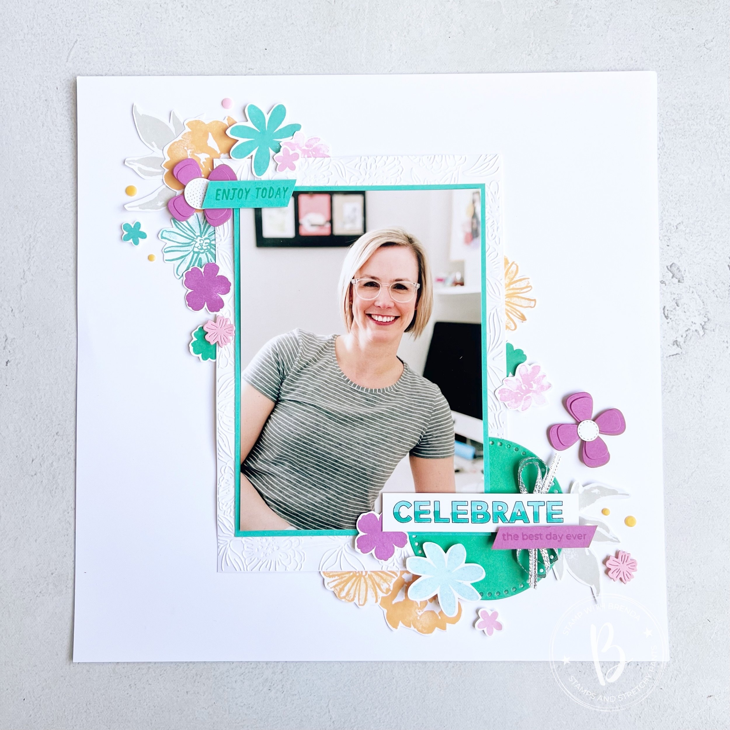
I think this layout is one that you can also recreate by mixing up colors, stamp sets and die cuts. I love how the flowers frame my photo making it the feature of my page. I never think your picture should compete with the elements on your scrapbook layout.
I can’t wait to see if the rest of the Color Fusers team focused on a specific color or created a project that combined all of the colors like mine. I am so happy with how it turned out and I am excited to have it up in my craft room.
Up next on the Hop is Janneke, a former Artisan teammate! I know you will love what she has created.

If the hop links get broken or you want to go backwards, you will be visiting another former Artisan teammate, Tami’s blog! I love everything she makes so I know you will be inspired too!

If you are inspired by my design and need a few things, please hit #addtocart by shopping my online store! I would love to keep doing what I love!
Click any link to shop my store!
Product List")
")


 Cardstock")


 Trim Combo Pack")


")


 Designer Series Paper")
 Specialty Paper")


