Create with Connie and Mary--strip it down!

This was actually a really good challenge for me this week as I am not someone who typically does simple stamping or one layer cards! SO I had to get creative to see what I could come up with!

Design Team.jpg

I almost always have a card base with a least one layer of card stock on top. Sometimes there is another layer of Designer Series Paper on top too! So I knew that the first thing to go with my ‘strip it down’ challenge was to stamp direct to my Basic White card base.

final (1) 4.jpg

I decided to create a fun background using our new Blending Brushes and the Curvy Dies (available in the JJ Catty). I used Coastal Cabana Ink to blend the background and then tapped some water on top with my large Water Painter brush. I was just playing around and am happy with how it turned out. The water acts as an ‘eraser’ and makes the ink disappear. You can see it happen before your eyes!

This is the template I used to create my blended area

This is the template I used to create my blended area

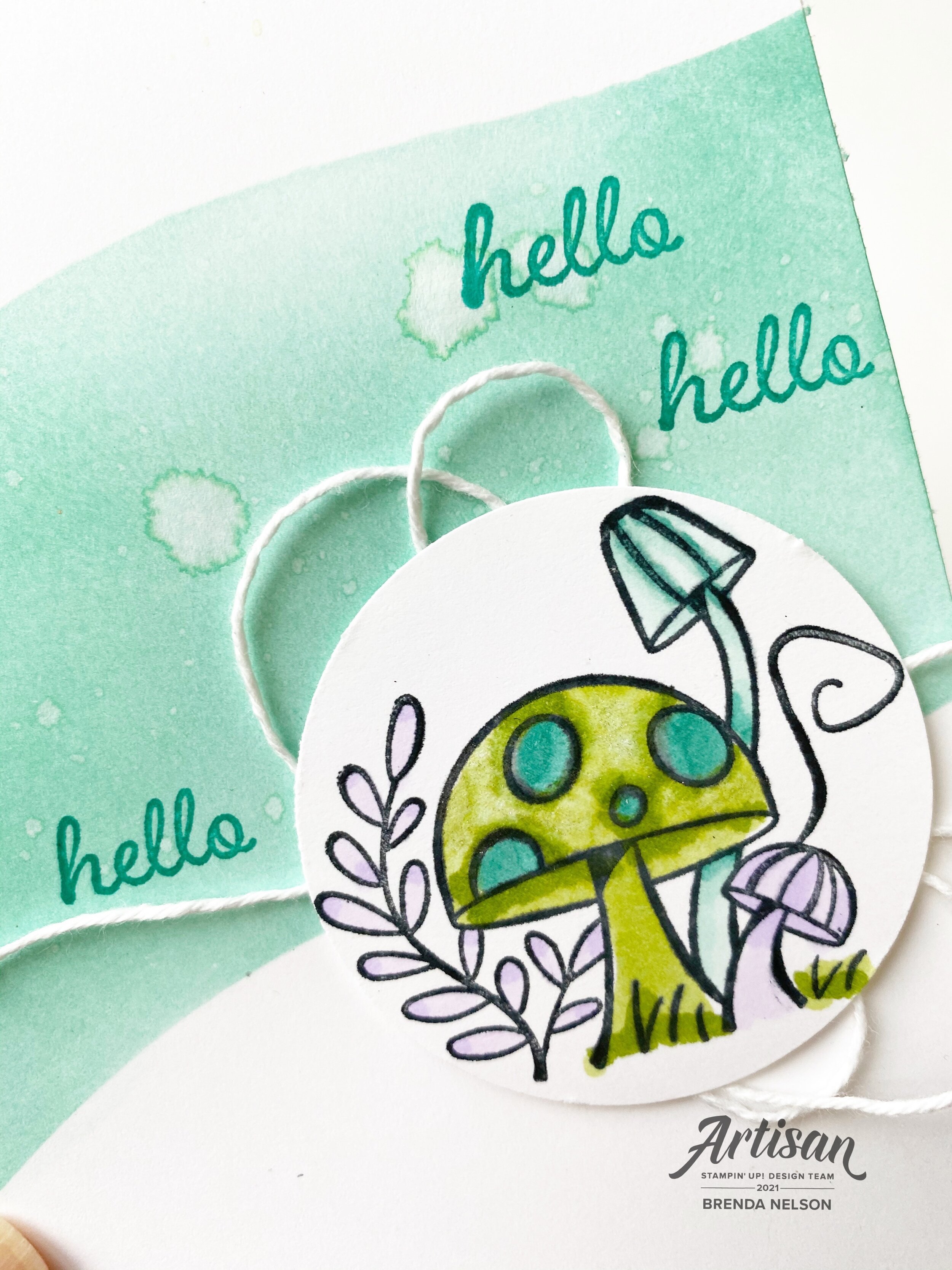
Once I had my fun area blended, straight to the card base, I reached for the Snail Mail stamp set. I just love the little mushroom image! I used my Stampin’ Blends in Granny Apple Green, Pool Party, Bermuda Bay and Purple Posey.

Adding in a bit of white twine added a little something, but I still feel like for my stampin’ style this card is pretty stripped down!


I stamped the sentiment, Hello, straight onto the area I blended and I resisted every temptation to add some bling or anything else to this card.

And you know what? I actually love this clean and simple finished card!

I can’t wait to see what the other gals create this week! You can go BACK to see Melissa or NEXT to see Connie!

Please feel free to leave a comment!

final 7.jpg

Around the World on Wednesday--Favorite Inspiration

This month we are exploring where we get our inspiration from which I think is super interesting. Sometimes I have an idea, or want to use a specific color, but get stuck thinking about what other colors might coordinate. My number one go to tool are the Color Coach cards that Stampin’ Up! has developed. I know everyone who is participating in the Hop this month will have some fantastic tips and inspiration for us to get inspired when we are feeling stuck!

91442295_10216484369808661_2887014979863576576_n.jpg

The Color Coach cards are a Demonstrator resource found in the Printing Place. I am sure if you ask your own local demo she/he would be more than happy to share them with you. As a demo myself I have offered this as class project. We organized all of our Color Coach cards into one of our 6 x 8 albums with a card stock sample. I reference this book ALL THE TIME. Sometimes I just need a bit of color inspiration!

IMG_2295.jpg

So for our project today, I opened up my Color Coach and selected a Calypso Coral Color Coach Card (say that 5x fast!) and used the 3 colors to create my project—Calypso Coral, Petal Pink and Sahara Sand. I used gold as my accent color to add that glitz aspect.

IMG_2293.jpg

We have so many options to add gold to our projects—we can emboss with gold embossing powder, add gold foil paper to our projects, gold embellishments (so many options) or our brand new gold Gilded Leafing embellishment. The Gilded Leafing has a bit of a different look to it than gold embossing and I wanted to play around with it on this project.

final+%282%29+2.jpg

Because I wanted to incorporate all three colors from the Color Coach Card onto my project I reached for my Blending Brushes which are a brand new tool being offered by Stampin’ Up!. I started by blending the Petal Pink color first because I was then able to use the SAME brush to add in the Calypso Coral! These brushes are totally amazing.

The Petal Pink is blended across the mid section of the card. I then added in the Calypso Coral along the bottom left corner and brought the Sahara Sand in from the top right. The Sahara Sand just gives our paper a subtle color but you can see the difference when you add the sentiment which is on Whisper White/Basic White card stock.

The sentiment is from the stamp set Always in my Heart

The sentiment is from the stamp set Always in my Heart

I continued the gold theme by accenting my sentiment with some Gold Foil paper cut with the scallop die from the Peony die set and some Gold Metallic Pearls.

I stamped both opposite corners using the Sale-a-bration stamp set Corner Bouquet. To apply the Gilded Leafing to my image I started by stamping it with Versamark and then adding Heat’n Stick Powder over top.

HOT TIP: To use your Heat’n Stick Powder successfully only heat it until it starts to glisten. Once this happens it has become sticky and you can add another ingredient on top. If you over heat or cook it too long, it actually loses its stickiness

After heating the powder you can add your Gilded Leafing. I have dumped out my jar (which will explode in volume) into a large container. You can press your card right into the leafing in the bin or you can add it with tweezers. Either method works but I prefer pressing it into the container. Once you have it attached it, it will look like a hot mess (trust me you are going to look at this and think ‘this ain’t pretty'), you need to use either a Stampin’ Sponge or the large Water Painter brush to brush away the excess and bring the detail to life. I was able to apply extra Gilded Leafing to my project in areas where I didn’t feel there was enough. You can use your finger to rub it with some pressure to your project as well.

In the end, I think it turned out pretty spectacular!

final (1) 3.jpg

I am so curious to see where everyone else gets their inspiration from. I hope you enjoy our hop this month and if you live in Canada you can shop with me anytime by using the hostess code. Gratitude and thanks in advance! Up next on the hop is the amazing Tricia Butts from the United States!


Create with Connie and Mary--Pile it on!

Hello friends! This week our theme is “Pile it on” which means layers and embellishments and all the stuff you can possibly pile onto one card! I was excited about this challenge and knew that I wanted to use the new Sweet Ice Cream bundle.

Design Team.jpg

Being on the Design Team is tons of fun as it challenges me to create new things and play around each week. I knew I wanted to create a soft background as my first layer so used the new Blending Brush with Seaside Spray ink.

final.jpg

After I had the background a nice light blue I stamped “Treat Yourself” in the same ink color (Seaside Spray) and then took my ink pad and water painter to create a spray of ink. I really piled on the elements for this first layer!

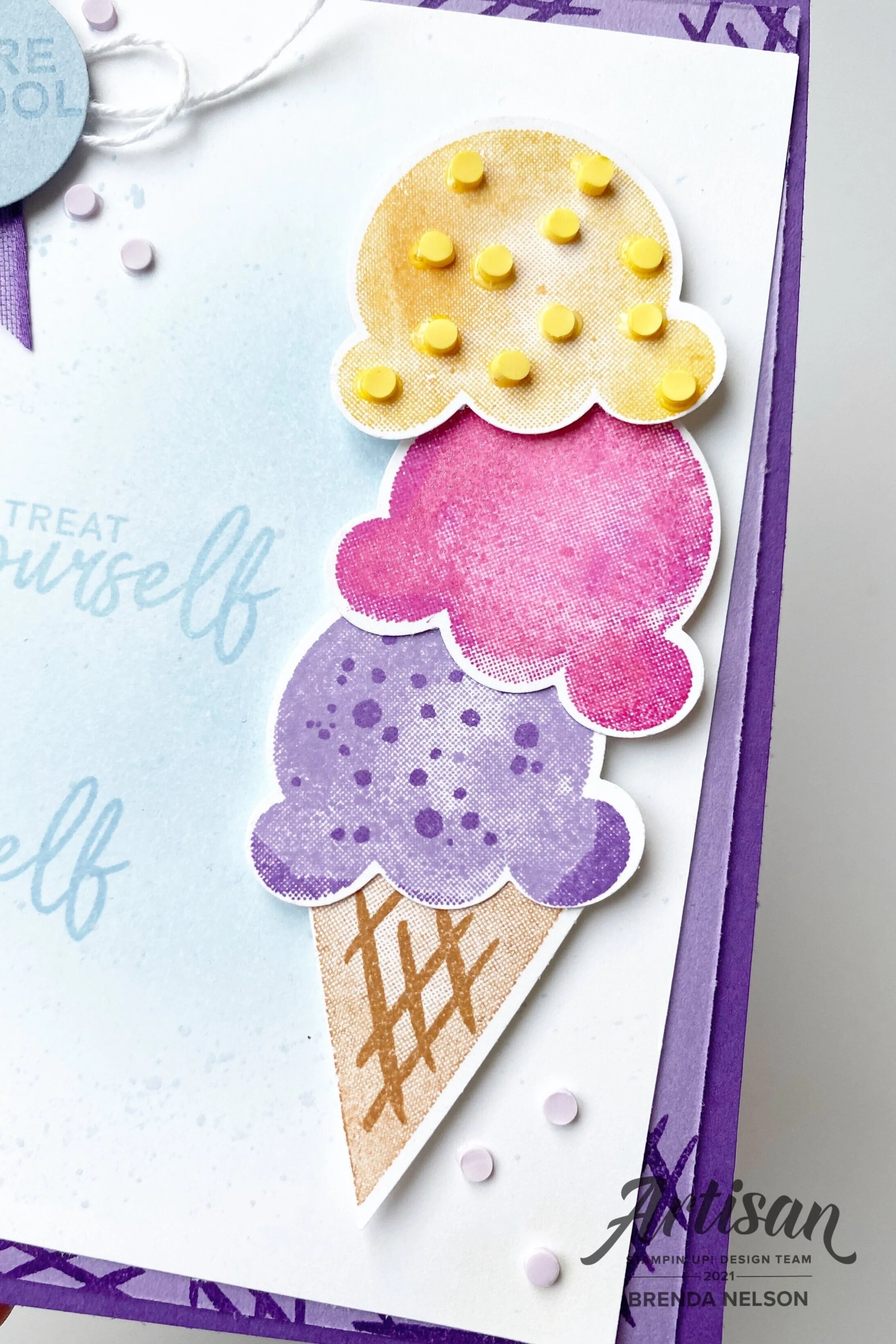
Creating the stacked ice cream cone was alot of fun. I started with the cone and Cinnamon Cider ink. The triangle of the cone is stamped off so it is a tone lighter than the waffle layer added on top. I love to get my icecream in a waffle cone, don’t you?


For each of the ice cream flavors (colors) I used two ink colors and a rock’n roll technique to blend them.

For the top layer I used Mango Melody and then rolled the stamp edges around on the Crushed Curry ink pad.

I added as many of the teeny yellow Ice Cream Corner Sprinkles as I could on this layer!

The middle ice cream scoop is Magenta Madness and Melon Mambo with some Wink of Stella on top.

final+%281%29.jpg

The first scoop is Highland Heather and Gorgeous Grape with some Gorgeous Grape sprinkles stamped on top. I added a few of the Purple Posy Ice Cream Corner Sprinkles around the base of the of the cone. These are easily applied with the Fine Tip Glue Pen.

final (3).jpg

I added a bit of the Gorgeous Grape 3/8 Sheer Ribbon (found in the Hydrangea Hill Suite) to the top left corner of the card. I stamped “You’re Cool” in Seaside Spray ink on the coordinating card stock color. A little bit of white twine from the Snail Mail Twine Combo pack was as added touch along with a few more of the Purple Posy Ice Cream Corner Sprinkles.

I also used the waffle stamp on the HIghland Heather card stock layer using Gorgeous Grape ink. It just gave this layer a bit of added interest instead of leaving it plain. The base of this card is Gorgeous Grape. I hope you love this project as much as I do! It actually has quite a few steps once you break it down.

Can’t wait to see what Melissa (BACK) and Connie (NEXT) have to share with us this week!

Color Fusers-January 2021

Hello friends! Welcome to our first blog hop of 2021! I can’t wait to share in creativity with the Color Fusers Team this year! I hope you leave every hop being inspired to create a project with our featured color combo and to start experimenting with different color combos yourself!

colorfusers.jpg

This month we have a color challenge that features FOUR Stampin’ Up! colors. Now I won’t lie, I did find this combo a little intimidating but I am actually really happy with what I was able to create! The featured colors for this month are Pacific Point, Melon Mambo, Garden Green and Mango Melody!

I knew that the only way I could make sense of this combo was to create something with a floral vibe and with our new January to June catalogue there are so many floral stamp and bundle options.

colorfuserjan.jpg

I wanted to use a set that might not be at the top of your list but may actually surprise you with its potential! I used the Back to Back Blooms stamp set which is a ‘Reversibles’ stamp set. This means you stamp the line image using one side of the photopolymer stamp and then clean and flip it (reverse it) to use the other solid side as a filler. Its actually quite genius!


I actually really love how crisp and clean this card feels even though it has four colors in the design.

I started with a base of Pacific Point and created an second layer in the same color that is 4 x 5 1/2. I then layered Whisper White over top.

The strip of designer paper is actually from the Sale-a-bration paper, Berry Delightful.

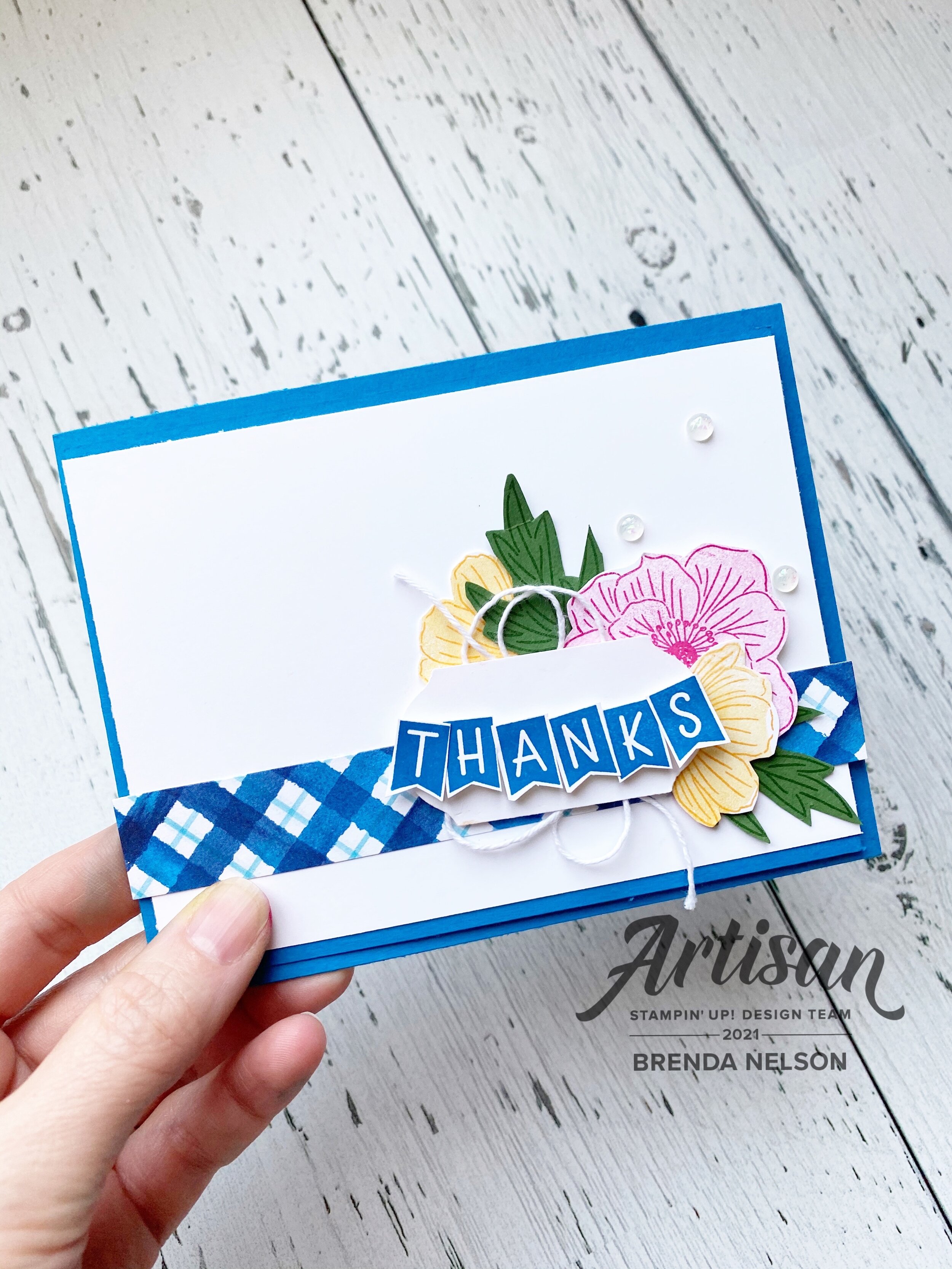
I stamped the Melon Mambo and Mango Melody flowers on Whisper White and hand trimmed them.

final (59).jpg

The leaves are stamped in Garden Green ink on the same paper. But my favorite part of this card is the “Thanks” banner! Its so adorable and so fun! The Back to Blooms stamp set actually doesn’t have any sentiments so I had to bring in another set. One of my new favorites is the You Are Amazing stamp set. This set is the partner set needed to complete the You Are Amazing card kit. However, it has so much potential! You will see it a lot in my upcoming designs.

final (64).jpg

I trimmed the ‘Thanks’ from its original form and used MIni Dimensionals to pop it up on the Label Punch. I added some White Bakers Twine to the back—-I am so happy it is available again in a combo pack with Blushing Bride! Yay! I added a few Opal Rounds (LOVE) to fill in a bit of the white space and add some subtle glitz!

final (61).jpg

I am really so happy with how this card turned out and I decided I needed to add a little something to the inside too! I did some simple and easy masking with the large flower and added another sentiment to the inside. I kept the flowers to their line image only for that fresh crisp feel. I think anyone would be so happy to get this cute card in the mail!

final (58).jpg

I cannot wait to see what Nicolle has created to share with us this month. If you want to go backwards, you can and you will be visiting Melanie. I hope you are able to hop all the way around and please feel free to leave a comment :). Happy New Year!


A Card a Day in December--Day #29

Hello friends! I wanted to create a New Years card that featured my favorite product suite of 2020—Playing with Patterns. I just love the color combo in the DSP and the Playful Alphabet dies basically live beside my Stampin’ Cut & Emboss machine! I use them all time on everything from cards to scrapbook pages to 3D projects.


I also wanted to design a card that was EASY and one that you could quickly make a few of to get into the mail right at the start of the year.

I used one small strip of the Playing with Patterns DSP as this allowed me to introduce all of the colors in the collection.

I went with a base of Purple Posy as I just love this color. I added a half panel of the same color to build my card on.

Happy New Year is cut from Misty Moonlight card stock, the Playful Alphabet dies and Foam Adhesive Sheets (a MUST HAVE combo)!

final (49).jpg
final (48).jpg

I wanted this card to be fun and whimsy (which I am hoping can be my theme for 2021) so I borrowed a couple of stamps from the new Hey Birthday Chick stamp set. The font in the Let’s Celebrate and Hello matched that fun feel that I was going for.

I added a few embellishments from the Playing with Patterns suite and the All the Trimmings (retiring soon!).

I hope you have enjoyed my 29th project in my A Card a Day in December series!

final (50).jpg