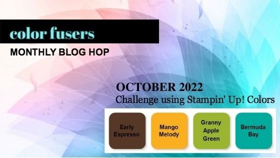
Color Fusers--October Blog Hop!
/Hello my lovely friends! Thank you so much for joining us on our ‘color inspiration’ hop—that is what I like to think of our monthly color challenge. And to be frank, this month’s 4 color combo was a challenge for me!
I really wanted to make a scrapbook page of our last family photo—not last as in forever, but for a while as in September we moved my son into Millar College of the Bible— 8 hours away! So this picture of the 5 of us has some special meaning to me.
I also felt like these colors had a bit of a fall vibe and September is the start of fall after all!
This was such an exciting day for my son! He was so happy to be getting settled in to Bible College that his eyes were just sparkling and you could just feel the happiness coming off of him. I am so proud of him for making such a big decision to leave home!
I actually laid my photo out on all 4 of the colors to see which one suited it the best and I landed on Early Espresso. I cut out a photo mat of the same color and then the real hunt began as I wanted to incorporate some current designer series paper into my design. I finally found this fun pattern from the Celebrate Everything DSP stack that you can get as a host reward in the JJ catty! I absolutely LOVE this DSP stack! So I added a nice wide piece of it to my design to brighten up the base of the page!
To add some texture and interest to the base of the page, I decided to stamp one of the splotch images from the Perched in a Tree stamp set in the same color ink, Early Espresso. I stamped this on a diagonal axis as well so that your eye follows a natural path across the page.
I then die cut a bunch of leaves from the Aspen Tree Dies. I love that these dies cut and dry emboss the veining of the leaves! It really makes them feel more realistic!
The sentiment can be found in the Honeybee Home stamp set and I used one of the dies from the Seasonal Labels Dies to cut it out. Then I just trimmed the right edge to be straight instead of decorative. I added some gold and white twine that I had laying around on my desk—I don’t even know where it originated from!
Sometimes when you are working on such a dark canvas it can be hard to make it have interest. So I decided to cut some flowers and sprigs out in Early Espresso to play off the tone on tone look.
The little sprigs are from the Christmas Banner Dies and they look great die cut in Early Espresso, Bermuda Bay and Mango Melody.
The sentiment “Best of Luck” is also from Honeybee Home and I thought it was sort of fitting as we left my son behind! I know he will work hard but I do wish him the best of luck trying to learn time management and new responsibilities—hello laundry!! haha!
Truthfully, once I got going this page didn’t take too long to put together. Not every event you want to capture needs to be a massive process to complete. Otherwise, you will never get those memories scrapbooked! I also think that this is a “Go To” layout design of mine. It incorporates everything, card stock, DSP, background stamping, and die cuts. You could easily swap out the elements for any occasion—flowers for summer, snowflakes for winter, greenery for Christmas and so forth. If you do use this page for inspiration, please let me know, I would love to see what you create!
Please make sure you go all the way around the Hop and see what the other creatives in the group have shared this month!
NEXT on the hop is my amazing friend Melanie! We often share texts and stampin’ inspiration with each other and I always look forward to her designs!
If you would like to go in reverse and go BACK you will be taken to my fellow Artisan Tami Hewlett. Tami is an absolute gem and such a kind and giving soul. She is a true master and creating water color backgrounds and elements and I am always in awe of her creations!
Thank you so much for popping by the Blog today and checking out our Hop! I really look forward to this each month as these color combinations do get me thinking outside of the box. I hope they leave you feeling inspired as well.
If you want to shop with me in Canada you can click on the button below or any of the product images to shop my online store. Thank you in advance!
Click any image to shop with me--
Product List


