Be Inspired Blog Hop--Creating with NEW In Colors!

Welcome friends to another fantastic Be Inspired Blog Hop! We are so happy you have stopped by and hop you enjoy being inspired with our In Color Collection this month!

One thing I have in my craft room that I do not dig out enough is my Watercolor Paper. So I decided to incorporate it into my design this month!

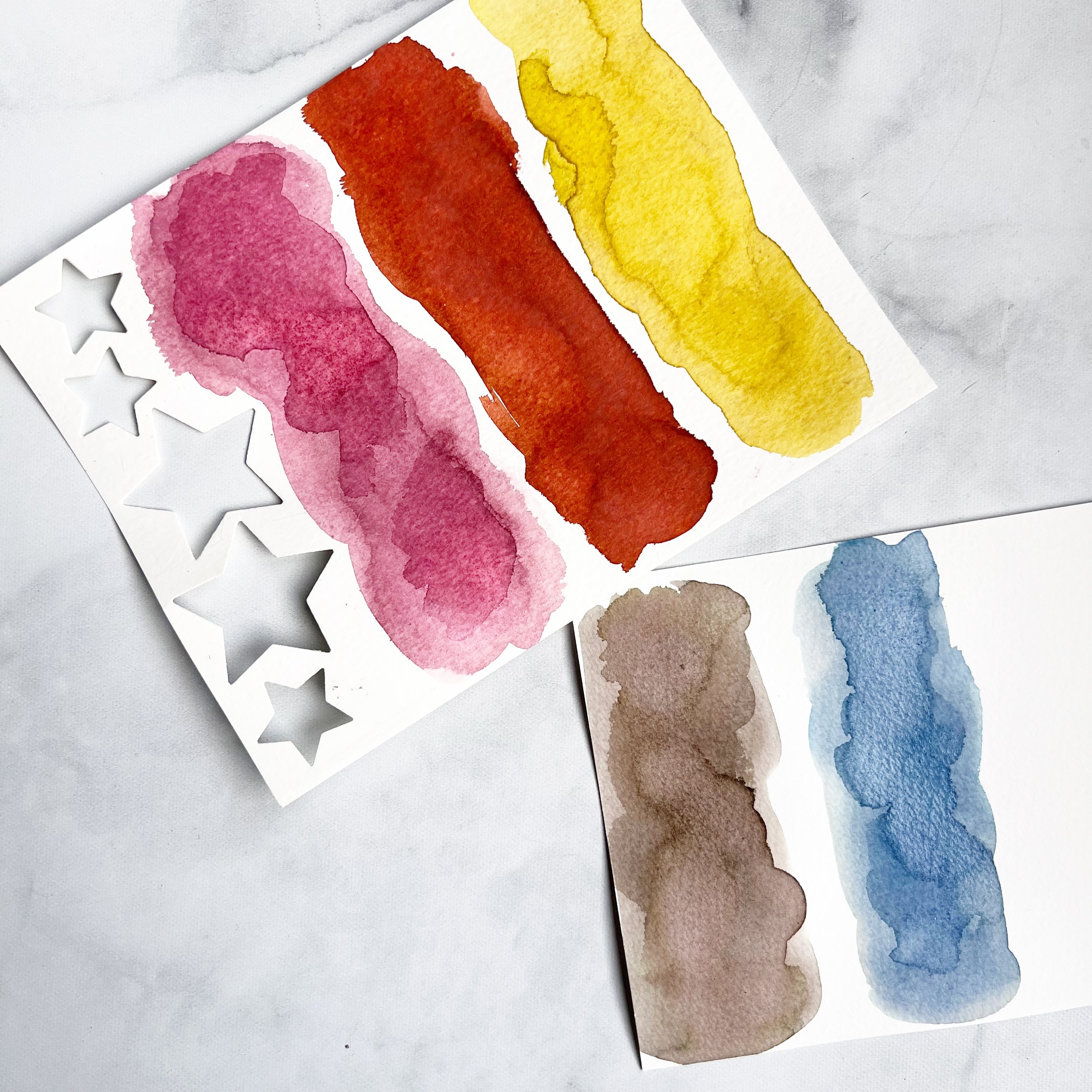
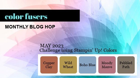
Don't these 5 new colors look awesome as a group!

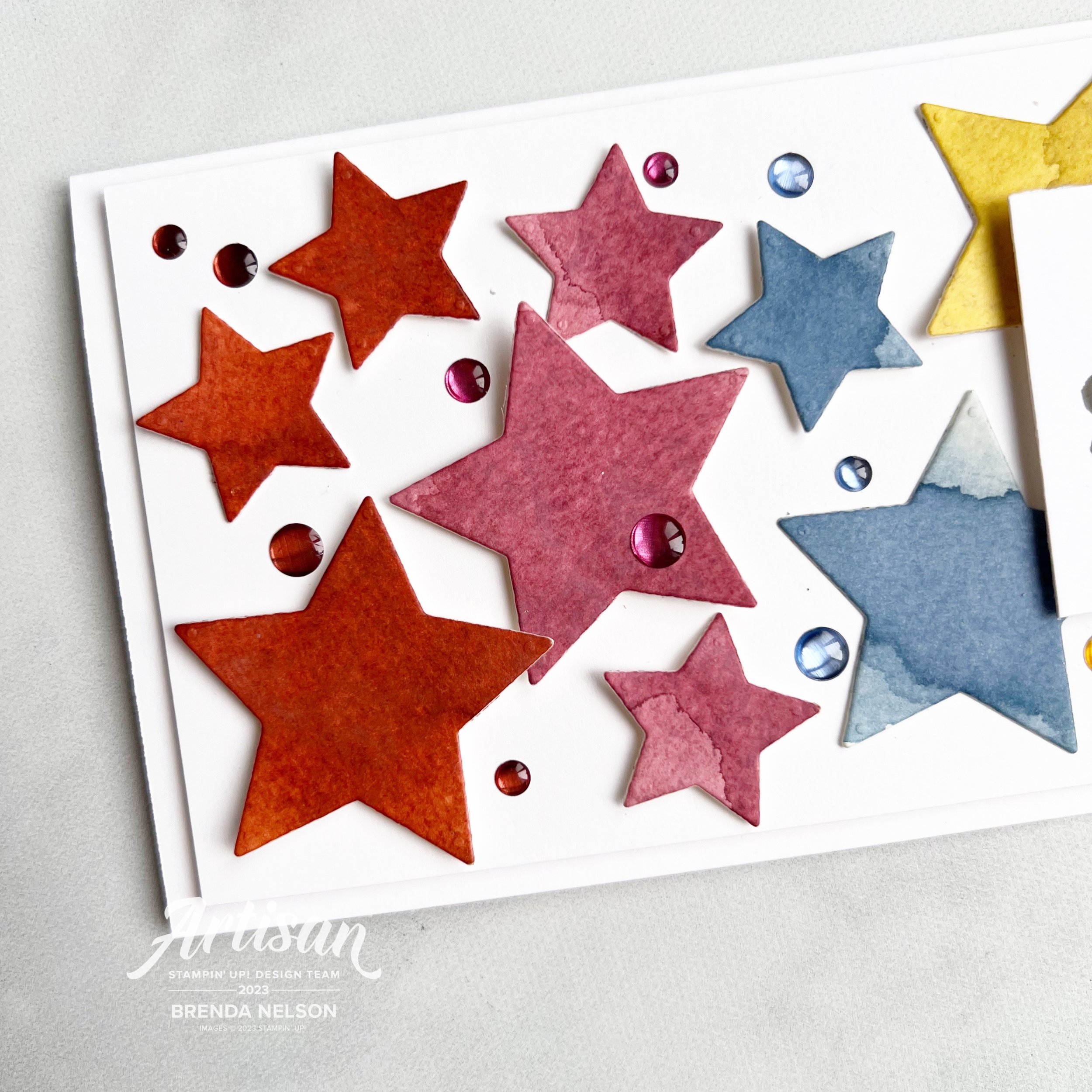
I watercolored little sections of each of the 5 new In Colors—Moody Mauve, Copper Clay, Wild Wheat, Pebble Path and Boho Blue. Don’t they look fabulous?

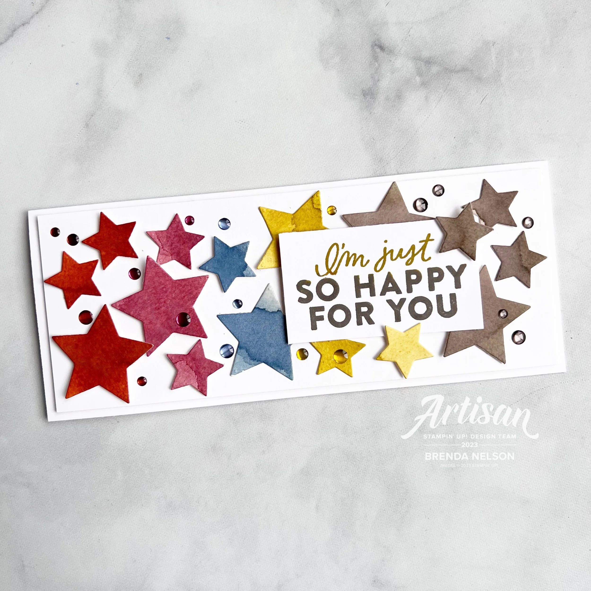
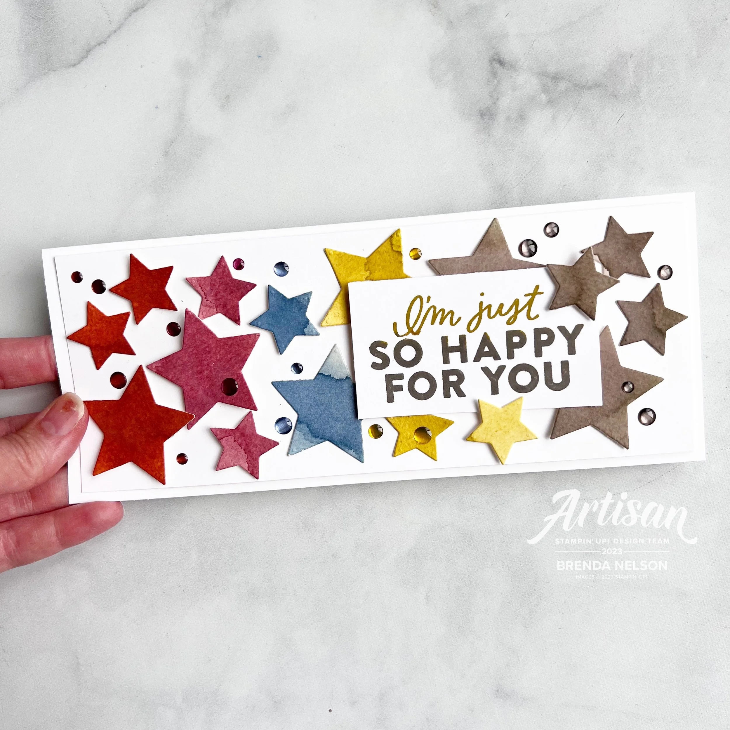
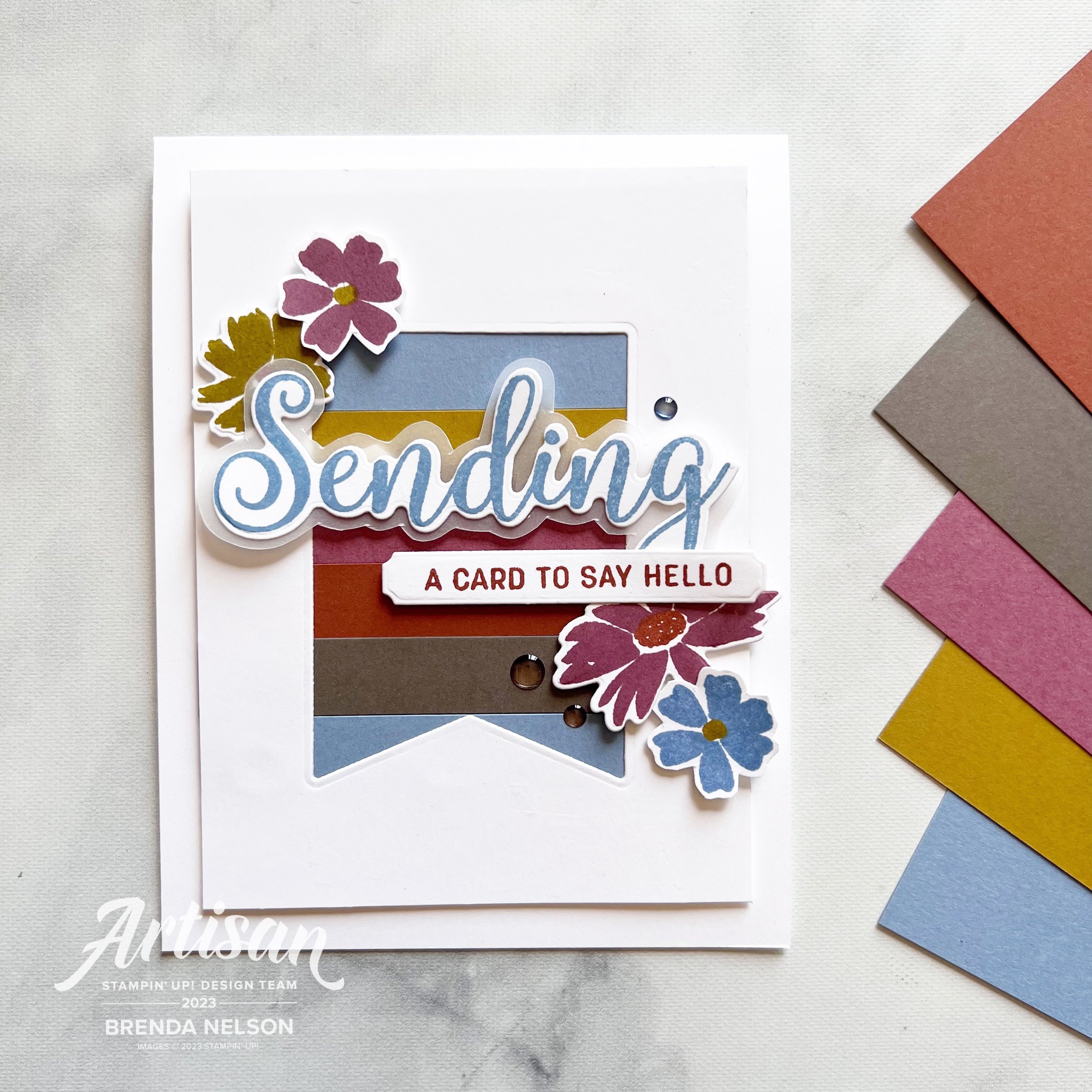
I die cut a whole bunch of stars using the Beautiful Balloons dies—I LOVE these dies! I love stars and I have had this idea for a while! I think they look really fabulous on this slim line card.

For my slim line card I take an 8 1/2 x 11 piece of card stock and I cut it to 8 1/2 x 7, then score at 3 1/2. I then trim the remaining card stock to create a base layer of 8 1/4 x 3 1/4. Its the perfect way to use almost the entire sheet for one card.

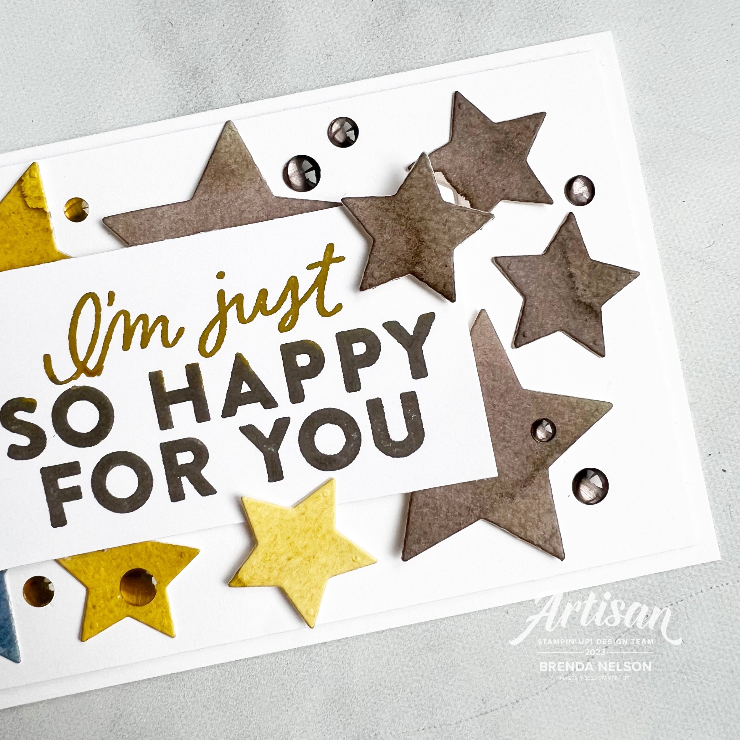
The sentiment is from the Good Feelings stamp set which has really oversized bold sentiments in it. I used both Wild Wheat and Pebbled Path on the sentiment and popped it up with a few Dimensionals.

Then I just started laying and tucking stars all around! I started with Copper Clay, then Moody Mauve, Boho Blue and the Wild Wheat and the Pebbled Path (I wanted those to line up with the sentiment).

I think the stars cut from the water color paper have more texture and interest than if I just cut them all from card stock. And doing stuff with water color techniques makes me feel like a real ‘Artiste’!

After I had all the stars in place I decided to add a bunch of the In Color embellishments…I might have went a little crazy, but then this is an extra special card! haha~I hope whoever gets it one day will really love it as much as I did creating it!

I can’t wait to see what the rest of the team has created with In Colors! I am sure you will be inspired by their creativity, I know I always am.

Next up on the hop is my friend Janneke—we were fellow Artisans together! Click on the image to visit her page! Please feel free to leave a comment, I enjoy receiving them!

And if any of my ideas have inspired you to be creative and you need a demonstrator, please consider shopping my online store!

Color Fusers--June 2023!

Hello friends and welcome to another fantastic month with the Color Fusers! We are so happy you returning again or finding us for the first time!

Our color combination for this month is Pool Party, Pretty Peacock and Bubble Bath and I have to say—they look fantastic together!

I decided to make a card this month and I was inspired to use the new Bold Bouquet Bundle from the Annual Catalogue. I started with a base and first layer of Pool Party card stock for my design.

Along the left edge I stamped four of the large blooms in Pool Party ink and then went over them with a Blending Brush and Pool Party ink, just to add another layer of depth. I also took my dark Pool Party Blend and flicked that all over the front.

I cut a rectangular shape from the Nested Essentials dies and stamped the sentiment in Bubble Bath on top. I then stamped it again on some scrap Basic White in Pretty Peacock and trimmed out the word ‘blessing’. I added it overtop of the main sentiment with a Mini Dimensional. This is such a an easy way to highlight a part of a sentiment that you want o shine.

Underneath the sentiment I added a length of Bubble Bath ribbon from the 3/8 Sheer Ribbon Combo Pack and tied it with some white Bakers Twine. A couple little Pretty Peacock banners cut from the Glorious Gingham DSP is the perfect finishing touch.

The Bold Bouquet Bundle includes these 3 amazing sprig dies that I cut and trimmed the stems down to add behind the sentiment panel. A few Pretty Peacock sequins from the Adhesive-Backed Sequins Trio completed this project.

I hope you are inspired after touring through our Hop to create your own project with this awesome color combo of Pool Party, Pretty Peacock and Bubble Bath!

Next up on the Hop is Bonnie O’Neill—I know she has made something fabulous for you to see!

If you choose to go in reverse you will be visiting my friend Melanie Hockin!

Thank you so much for stopping by my blog today! If anything has inspired you to shop, just click on any image below to visit my store! Thank you!

Be Inspired Blog Hop--Let's Celebrate!

Hello friends! Welcome to the Let’s Celebrate theme for the Be Inspired Blog Hop this month! There is alot for me to be celebrating this month—Mother’s Day, a return to teaching (as a substitute), the Norway Incentive Trip, and my Husband’s Birthday. If you have lots to celebrate this month too, I know you will Be Inspired!

I decided to use the new Beautiful Balloons Bundle and Nested Essentials Dies on my “Lot’s to Celebrate” card to make a birthday card.

The color combination for this card is Misty Moonlight, Flirty Flamingo and Petal Pink. I probably NEVER would have came up with this combination myself. I was inspired by a color combination from the Color Coach Cards. These are resource cards that Stampin’ Up! develops for Demonstrators and I find them so handy! They are a great tool if you are feeling stuck or need an idea. I also reach for this resource if I have to make swaps and I have a lot of one color of card stock I want to use up.

I cut three strips of Misty Moonlight card stock that I ran through the new textured embossing folder—its a part of a 3 pack with the Online Exclusives called the Basics 3D Embossing Folders, and glued them directly to the Misty Moonlight Base.

I used the new Brights 6x6 DSP (I love the new patterns of hearts, dashes, dots and stripes) and die cut a banner from the Nested Essentials Dies and popped this up right in the middle.

I stamped the sentiment from the Beautiful Balloons Bundle in Misty Moonlight and added some stamped confetti in Petal Pink behind. The ribbon is old school and made me feel so good about hoarding things! hahaha! Who can relate? I know you can!

I tied the ribbon with a little Linen Thread before adding it to a Petal Pink circle.

I used the Beautiful Balloons Dies to cut out some stars. I LOVE STARS. These dies will be showing up all over my Instagram (@stampwithbrenda) so be on the look out! I probably won’t even put them back in the package, they will just live on my magnet board I have beside my Stamp Cut & Emboss Machine!

I have to say that Stampin’ Up! knocked it out of the park with the embellishment offerings in our new catalogue! There are 22 options you can pick from! I was, of course, attracted to the Tinsel Gems because I like a little subtle sparkle and I love that there is a Three-Pack and a Four-Pack option! For this card, I added some of the Blueberry Bushel Tinsel Gems to my project. LOVE!


If you are wondering how I store or organize my Color Coach Cards, I use our Basic Black 6x8 Album and a set of the Variety 6x8 Pocket Pages.


TOP TIP: You can use the 4x6 pockets by anchoring your card stock sample and the Color Coach Card with a strip of card stock. This way they don’t slide around in the pocket, its a perfect solution!

Make sure check out my amazing talented friend and former Artisan Design Team member Janneke to see what she has created with our “Let’s Celebrate” theme! And please feel free to leave us some comments, we all love to get them!

If my projects ever inspire you and you are looking for a Canadian Demo, please consider reaching out! You can shop my online store at any time too by clicking any image link below! Thank you so much and HAPPY STAMPING!

Brenda's Top Ten

Brenda N Branding_0021.jpg

Friends! I don’t know about YOU but every year I swear I love this new Annual Catalogue THE MOST. It is almost laughable at this point, but every year I truly do find myself falling in love again! Here are my Top Ten Favorite NEW things coming out!

1.     The NEW In Colors (pg 122) —This is really on my list every year, but how can it not be to have 5 new colors to create with? This is like, my 16th year as a demo, and I am pretty sure these 5 colors are the most original ones we have ever had. They are definitely the most neutral of the bunch for sure. My current fav—Boho Blue. Message me next week, it will probably be different!

2. The Bright & Beautiful 6x6 DSP (pg 129)—I LOVE STARS, like love them. For my wedding my friends and I traced out literally hundreds of stars, spray painted them, and hung them from the ceiling at my wedding. So naturally I am in love with this collection of DSP because it has several star prints AND the most amazing color combinations! Trust me, you will love it too!

3. Level Complete Stamp Set (pg93)—where has this set been all my life? Having two boys, who are into gaming, this set is perfect! Teen boy cards will be so easy with this awesome gaming themed stamp set! I would love to make you some—hit me up! I love to do custom card orders!

4. New and Improved Stampin’ Write Markers (pg 125)—with an increased ink barrel and bullet writing tip, these updated markers are AMAZING! Trust me! And available in all of our new Core Colors, this is the perfect time to give your markers a refresh!

5. Scallop Gift Card Boxes (pg 126)—I give alot of gift cards with having 3 teens and lots of teenage nieces and nephews. I love to spoil my kids on every holiday too so these boxes are perfect for their favorite gift cards!

6. Tinsel Gems (pg 140)—these come in a Three Pack or Four Pack option in a variety of colors that are the perfect size to add a little bling to your projects!

7. Just my Type Stamp Set (pg 69)—over the years we have had a few different type writer sets and I will never stop loving the vintage nostalgic aspect of them. I got a type writer as a birthday present in grade 7 and while I have yet to write my manuscript, I am excited to create cards with one!

8. 3/8 Sheer Ribbon Combo Pack (pg 143)—I’m sorry, but who doesn’t love ribbon? Especially ribbon with a beautiful silver edge in 3 brand new colors?

9. 2 3/8 Circle Punch (pg 147)—This circle punch is a part of a bundle called Circle Sayings and it is a brand new circle size, the biggest one we have seen yet! And I don’t know what SU changed in their punch design, but its definitely more light weight than previous punches which is FANTASTIC!

10. Paper Florist Dies (pg 165)—these are stand alone dies (which is what I refer to them as because they do not have a stamp set attached) are AMAZING! They are the dies used to create the project on the back cover of the catalogue. They have unlimited potential!

Color Fusers--May 2023!

Hello and welcome back friends! You know what this means…our new catalogue has officially launched along with Core Colors and our brand new In Color Collection—which is what the Color Fusers Team is creating with this month! I always look forward to our In Color Collections and this next bunch is really unique and fantastic. Stampin’ Up! knocked it out of the park with these!

Let me introduce you to Copper Clay, Wild Wheat, Boho Blue, Moody Mauve, and Pebbled Path.!


2023/2025 NEW IN COLORS

〰️

2023/2025 NEW IN COLORS 〰️

Who doesn’t love new COLORS? I know I do and all of the new color potential they unlock. I love how this collection has a neutral earthy vibe. Definitely different than others we have seen before.

Each year when we have this release of new colors, I also try and create at least one or two projects that feature all five of the colors working together to make with my card making groups. This is a great way for them to get a sample or little taste of the five colors.

I started with a base of Basic White so that they new colors would have a nice crisp platform. My first layer has a die cut banner cut out featuring a new set of dies called the Nested Essentials Dies. I have been using them so much, they are definitely a craft room MUST HAVE. Make sure to put them at the top of your wish list!

Behind the die cut banner I added strips of the 5 colors in this order:

  1. Boho Blue

  2. Wild Wheat

  3. Misty Mauve (which in Canada rhymes with stove)

  4. Copper Clay

  5. Pebbled Path

For my design element I used the stamp set Sending Smiles and some of the new In Color Dots as an embellishment.

I stamped out “Sending” in Boho Blue and used the coordinating Sending Dies to cut it out. I layered that on some vellum that I hand cut around just for some added dimension. This is then popped up with Mini Dimensionals and centered through the die cut banner.

“A Card to Say Hello” is stamped in Moody Mauve and added slightly offset below. What I love about this bundle is the mix of sentiments and the flowers and greenery you can use to embellish your project.


I stamped out the flowers in a mix of the colors with the exception of Pebbled Path. Instead to bring life to that color I added two of the coordinating In Color Dots to that strip of card stock.

I love how this card turned out and I think these five colors look absolutely fantastic together. I can’t even pick a favorite at the moment! You can also head to my Instagram @stampwithbrenda to see another card that I created with these colors. However, I know you will be inspired by what the rest of the Color Fusers Design Team has created this month. Make sure to hop all the way through and if I have inspired you in a anyway, please consider shopping with me so I can continue to love what I do!

Next up on the Hop is Bonnie O’Neill from the US…go give her all the love!

If you want to shake it up and go in reverse (or if the Hop is ever broken) you can go Previous to see what my friend Melanie Hockin (also from the US) has designed. And in case you didn’t know, I am sharing from Edmonton, Alberta Canada (GO OILERS)!

These supplies are current at the time the Hop goes live…the new Annual Catalogue and all new In Color items I showcased will be available a day or two later!

Click any image to shop what is current at original time of posting< Product List

/p>