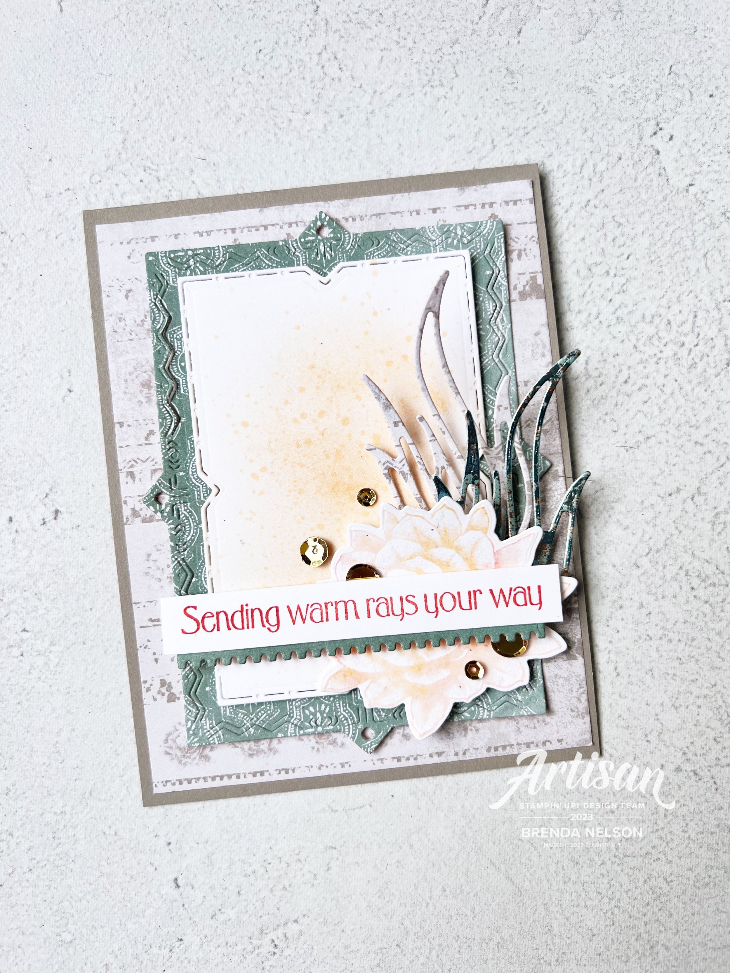
Be Inspired Blog Hop--Let's Get Crafty with the Subtles Family!

Welcome back friends for another edition of the Be Inspired Blog Hop! We are so happy you are here and would love all of your comments on our projects, or to share our hop with a friend or two. If you like my stamping style you can also follow me on Instagram @stampwithbrenda!

This month we are designing with the Subtles family—now I didn’t see a rule about it being NEW colors to the Subtle family so I decided to go that route!

I created a card, yes a CARD, not a scrapbook page this month, although I think my card will be inspiring a future scrapbook layout. My card features the new Lemon Lolly and Bubble Bath Core Colors and the returning color Lost Lagoon.

I started with a base and first layer of Lemon Lolly. I ran my layer partially through the new Twisted Rope 3D folder and a added a fun strip of stripped DSP from the Delightfully Eclectic 12x12 DSP in Bubble Bath and Basic White. I love a good stripe pattern no matter the color scheme!


The stamping on my card features the new Cheerful Daisies Bundle which I am really enjoying creating with.

I like that you can design with 2 Step Stamping or single images that you can stamp and cut out, like I did with larger daisy behind the sentiment or stamp the line image and color in. This set has a lot of creative possibilities!

Isn’t this new lemon lolly color lucious? it reminds me of lemonade!

The ribbon behind the sentiment is Bubble Bath and its one of three colors in the 3/8 Sheer Ribbon Combo pack that is coming out in the new Annual catalogue in May 2023. I love the silver edge on the ribbon.

The daisies are all stamped in Lemon Lolly with the center on the front flower being stamped in Pecan Pie. I did stamp it off on my scratch paper so it was a little lighter. The leaves are stamped in Lost Lagoon which I felt worked because it become more ‘green’ on this project.

And of course I had to add some embellishments in Lemon Lolly. I really love tone on tone embellishments and the variety in our new catalogue is AWESOME! These are from the new Adhesive Backed Solid Gems.

I know you are going to be so excited to start stamping with all of the new Core Colors, especially when you see the members of the updated Subtles family. I hope this color combo of Lemon Lolly, Bubble Bath and Lost Lagoon inspires you to create you own fun project in the future. Happy Stamping!

Up next on the Be Inspired Blog Hop is a former Artisan Design Teammate of mine, Janneke! I love her stamping style and can’t wait to see what she creates! Click on the image below to head to blog.

Thank you for visiting this month! We can’t wait to see you back in May!

Around the World on Wednesday--April Showers Bring May Flowers!

Hello and welcome friends! April is the 4 year anniversary of the Around the World on Wednesday Blog Hop! This was one of the first Blog Hops I ever joined and it was created by the amazing Angie Mackenzie. While as of late I haven’t been contributing each month (there are girls in the Hop that have NEVER missed a month which is amazing) I had to participate this month to celebrate!

Our theme is for this month is anything that makes us think of SPRING—so I created a soft and subtle scrapbook page with a picture of my family from a few years back!

My scrapbook page contains a little bit of everything—current, retired, retiring and Online Exclusive products!

I started with a base of So Saffron which is a soon to be retiring color, I am actually quite sad about this because our new yellow, is NOT the same, so I will miss having a pastel yellow to create with. I added a second layer of Basic White and then a nice big 4 x 12 strip of DSP from the Sale a bration paper Favored Flowers.

I added some stamping straight to the Basic White with the Irresistible Blooms (an Online Exclusive stamp set) in Mossy Meadow. The photo mat is Crumb Cake and adds a neutral anchor to my page.

I used the emboss resist technique on all of the flowers—White Craft ink embossed with White Embossing powder and then using the Blending Brushes add Petal Pink and So Saffron Ink. You can buff the stamped image with a tissue afterwards to brighten up the embossing. The Irresistible Blooms dies were used to cut out all of the flowers and the leaf dies that are added as accents.

The sentiment “You are Amazing” is from the Sentimental Park stamp set and punched with an ancient punch that I believe was called Word Window. I will NEVER part with it!

I added a few Rusted Metallic Adhesive Dots as accents along with some Linen Thread.

What is completely NEW on this page are the Nested Essentials Dies—there are 3 shapes with 4 of each size in this new die set and they have a double stitched detail which is beautiful. I die cut the largest shape with DSP from the SAB Favored Flowers and then added a solid Mossy Meadow die cut.

The sentiment “Nothing Fancy Just Love” is from the Something Fancy stamp set. This set is carrying over which is awesome! Behind the sentiment I added some vanilla Bakers Twine.

One of my favorite things is to cut using Vellum the circle die accent piece from the Irresistible Blooms dies and layer it behind flowers and tags as a subtle accent. It is a different way to think about using this die.

I love how this page came together, it feels nice and soft which is how I think of spring. I am looking forward to seeing some green and flowers over the next few weeks as the snow melts and the new growth emerges.

Make sure you visit everyone on the hop and please feel free to comment! I would LOVE to hear from you! You can also check out my Scrapbook Gallery if you are looking for more inspiration and follow me on Instagram @stampwithbrenda if you are not already!

Up next on the hop is….Tricia Butts from the United States! Click on NEXT BLOG to see what she has created!


If I have inspired you in any way, please help me continue to do what I love by shopping my online store! You can click any image below or the SHOP WITH ME button!

Color Fusers--April 2023

Hello April…I am so happy you are here as it is finally beginning to feel like spring! Our Color Fusers Hop this month is featuring one retiring color, Polished Pink, and two continuing colors—Coastal Cabana and Gorgeous Grape. Now I won’t lie…Gorgeous Grape is a fun color but not one that I reach for alot, so it was fun to incorporate it into my design!

I decided to use a bundle and a single stamp set that are being carried forward into our new Annual Catalogue that is officially live in May. I chose the Quiet Meadow Bundle and the Good Feelings Stamp set. I feel that using the Quiet Meadow Bundle with this bright color combo has breathed some new life into it. And I forgot how amazing these dies are, I am so glad I dusted them off!

I started with a 12x12 base of Basic White to help settle these bright colors down a bit. I added a 3x12 strip of Coastal Cabana DSP to the left edge and I found it in the recent Sale a bration paper stack Dandy Designs. I then used a smaller 1 inch strip of Polished Pink DSP from the In Color 6x6 stack and hid the seam of the two pieces behind my photo mat.

I blended a large area on my page base with my Blending Brush and Coastal Cabana ink pad and added some stamping from the Quiet Meadow stamp set. The set includes some distressed words and spots so I added them on top of my blending.

TOP TIP: Make sure to stamp images off on your Stampin’ placemat to get lighter and different tones

You can see how easy it is to create a custom background for your scrapbook page by layering ink and stamps!

I cut a variety of the wildflowers from the Meadow Dies in the three focus colors and layered them behind the sentiment “You’re on my Mind and in my Heart”. What I love about the Good Feelings stamp set is how big the sentiments are. Perfect for memory keeping!

And if you don’t recognize the die the sentiment is on, it can be found in the Online Exclusive section of the Stampin’ Up! website or my store. The Polished Pink and Coastal Cabana heart are also from this same die set—Radiating Stitches. I also had some Glossy Dots in my stash and they were perfect for this page along with some retired Gorgeous Grape ribbon. #useyourstash

I decided to carry some of the ribbon, wildflowers and the heart over to the top left of my page as well so that the opposing corners of my layout felt connected.

Honestly, this page came together pretty fast and it will definitely brighten up my craft room! I can’t wait to see what the rest of the Color Fusers Blog Hop has created this month!

You can check out what the awesome Bonnie O’Neill has created and make sure you visit everyone to get some inspiration on how you can use up your Polished Pink supplies!

If you would rather go backwards you can do that as well by hitting the Previous tab as it will take you to my fabulous friend Melanie Hockin!

Thank you so much for coming by and checking out all of our projects. It has been a while since I have shared a card as you know I love to scrapbook so I appreciate you letting me showcase my passion, even if you are more of a card lover! Luckily the other members of the hop typically make cards so you will always have inspiration!

Be Inspired Blog Hop--Let's Get Crafty with the Regals!

Ok friends! Hello and welcome to another fun Be Inspired Blog Hop—now I don’t know WHO it was that decided that we should design with the Regals this month, but at first I didn’t like you much. Now I am thankful and grateful because a) I was pushed out of my normal crafty zone by having to use these colors and b) I created a page that literally reduced me to tears.

The universe sent me a gift when it gave me my son Reese, from the moment he was born he just had that sparkle in his eye, electric and boundless energy, and the BEST personality. Every teacher he ever had reported back the same thing and its a gift that will carry him far in life.

Reese went away to Millar College of the Bible earlier this year…so mom’s who have had kids leave the nest, you get why looking at this picture and creating this page brought me to tears. Hands down, the best decision I ever made was to scrapbook my families life.

I think to myself—where would this picture be now? On a camera roll, maybe if I was lucky, in a shoe box somewhere? But now it is living large on this gorgeous scrapbook page and I can pass it down to my son and his family one day. Okay, enough crying! Seriously, here are the Crafty Details!

I started with an awesome piece of DSP from the Delicate Desert 12x12—I was so excited to see this piece designed with Cajun Craze! I cut a piece of card stock down to 11x11 to give the page a solid base. I then matted my photo with another piece from the DSP that had Cajun and Gray Granite. It was perfect!

And then I started to think about my stamp collection. With the end of this catalogue on the horizon I start to think of the sets that I really truly love and I was reminded of the Hand Penned Petals bundle. I have not crafted with it in a while and I am so happy I dusted it off. It really brings this page to life.

I stamped the main floral image from the stamp set in Basic Grey ink. Black ink just felt a little to strong for the look I was going for. I then colored the flowers with my favorite technique, Lazy Watercoloring using Pumpkin Pie, Old Olive, Crushed Curry and Cajun Craze. I was really pleased that I could incorporate 4 colors from the Regals family into my design!

The stitched heart die cut is from the new Radiating Stitches Dies which are a new Online Exclusive product and the sentiment “You are Easy to Love” is from the recent Sale a bration set Beautifully Happy. Its the perfect sentiment for this page and how I feel about my son. I added some gold metallic thread behind it because it was one of my fav embellishments of all time and I have SO MUCH of it!

The best part of the Hand Penned Dies are the amazing flowers they included. I decided to cut them out in Cajun Craze to have that tone on tone textural feel to them. When I dug into my bin of card stock scraps I found a piece of Cajun Craze that had a torn edge. I tried laying it underneath my photo mat and it was perfect—its like this scrap of paper was just waiting to become something special. I think the juxtaposition of the torn paper and the flowers is really special.

TOP TIP: Moms of boys—please use florals on your scrapbook pages! Boys are like nature, wild and free! Embrace it!

The most powerful element on this page is the sentiment “Anything is Possible” that I stamped in Old Olive ink and extended the phrase with ‘Son’, cut in Gold Foil paper with the Alphabet A la Mode dies. Isn’t this the message we want our children to feel?

And I love the mix of the watercolored flowers with the die cuts and some of the gold sequins from the Subtle Adhesive Backed Sequins.

This might be one of my favorite scrapbook pages EVER.

I can’t wait to see what the rest of the squad has designed using the Regals family! I also cant’t wait to see the new and updated Regals family in the 2023/24 Annual Catalogue being released in May! I hope all of the colors I used on my layout will be returning! Fingers crossed!

Please check out what my friend Carolynn has created by clicking on the link below! I am excited to see what the whole team has designed so make sure you hop all the way through!

Artisan Design Team Project featuring Delicate Desert

Hello friends! I could not be more excited to share my projects for March that I created for the Artisan Design Team. I absolutely loved designing with the Delicate Desert Suite especially because I used one of my all time favorite pictures of my youngest son, Shepard.

I recently updated my Scrapbook Gallery on my blog as well—so if you are looking for more scrapbook page inspiration, please check there!

Shep really was the happiest baby and such an easy toddler—I simply cannot believe at the time of writing this he is 12. I wish i had a time machine to go back and cuddle this little guy again.

I decided to make a scrapbook page AND a card for my Team projects this month. I really love the color palette of this suite—Petal Pink, Calypso Coral, Cajun Craze, Pale Papaya, Soft Succulent and Gray Granite look so AWESOME together!

For my scrapbook page, I started with a sheet of the Delicate Desert 12x12 DSP as the base and then I added a layer of Basic White over top that is cut to 11x11. This lets you see a little bit of the pattern behind. I used another piece of the DSP for the photo mat as well and cut out the leaf like shape out of the DSP and the Dry Brushed Metallic 12x12 paper. If you haven’t ordered the Dry Brushed paper yet, you should really take a chance on it. It is really cool and has alot of fabulous texture w the hints of gold layered through.

Seriously, look at Sheppie’s cute face. I can’t even.

Because the Dry Brushed Metallic paper has gold in the design I decided to stamp one of the larger flowers in Versamark and use Gold Embossing Powder. I then used my Blending Brush with Pale Papaya ink to a bit of emboss resist. It is such a classic technique, and I find everyone is impressed with embossing! I also die cut some of the triangular shapes (they remind me of a pattern on a western blanket) to add it to represent foliage. I think it worked really well!

The sentiment could not be more perfect for this scrapbook page! However, the Desert Details Dies do not have a label shape, so I borrowed this one from the He’s the Man Dies. The suite also includes the Pale Papaya Faux Velvet Trim which I cut in half to add underneath the sentiment.

My favorite part of this scrapbook page is actually the base where I used both of the large panels to create interest and texture by die cutting them in Basic White. They are added flat to the page with all of the other elements on top. I also used the Gold Faceted Adhesive Backed Sequins to add interest to the scrapbook page.

The stamp set also includes two longer border type stamps which I used along the right side of the photo. I thought it was an interesting way to bring in those design elements.


The sentiment in the top left, “Your Smile is Pure Magic” was also a fantastic addition to this page. I stamped it in Pale Papaya first and then used my Calyspso Coral marker over the ‘magic’ to make it pop. I added some of the Pale Papaya Ribbon and a die cut element.

TOP TIP: I cut the element horizontally into two pieces so I could spread it out and give the illusion of it being larger than it really is

For my card design, I started with a base of Grey Granite, and then I used a piece of the DSP as a base, with another DSP design die cut with the larger decorative panel. I then cut the smaller decorative panel in Basic White. I love the edge detailing on both of these dies and how they nestle together.

The Basic White panel has a touch of color added by using a Blending Brush and Pale Papaya ink. I also flicked my Pale Papaya Stampin’ Blend over top.

The flower is also stamped in Versamark, then I added ink in Pale Papaya and Calypso Coral with a Blending Brush and finished it off with Clear Embossing Powder. This gives the flower a glossy feel. I used both the Delicate Desert and the Dry Brushed Metallic paper with the foliage die to layer behind the sentiment.

The border die included in the set was used as an accent underneath my sentiment as well. And of course, who can resist bling? So I added some of the Gold Faceted Adhesive Backed Sequins to this project as well.

I hope you enjoyed these projects and all of the other amazing things created by the Artisan Design Team! For more inspo with the Delicate Desert Suite check out on Instagram and Facebook the Stampin’ Up! Official account as well as Heather Thomas @thesongbirdstamper , Karine Lison @karinelison73choupinette, Sandra Herzog @herzerlskreativecke and Tammy Wilson @stamppaperscissors

Please feel free to shop my online store by clicking this button or any supply images! If I have inspired you, I appreciate your support so I can keep loving what I do :)