Color Fusers--July--Hello Summer!

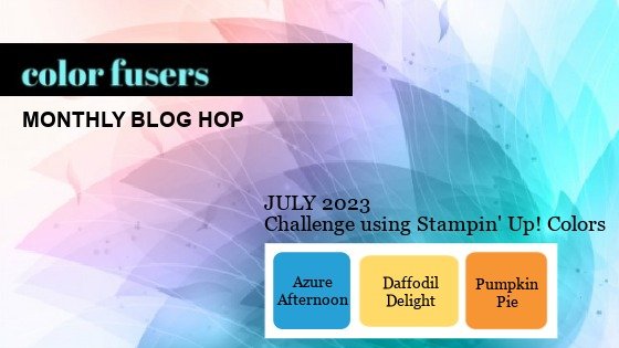
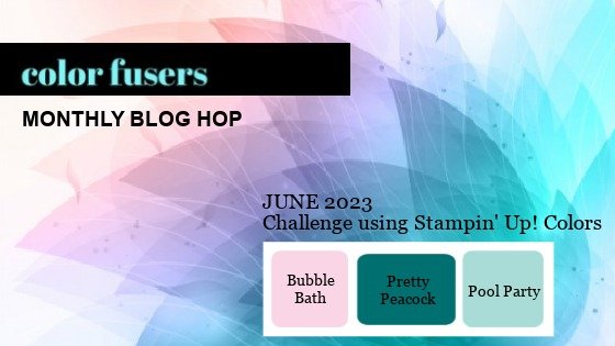
Hello friends! It is OFFICIALLY SUMMER—Whoo Hoo! I love summer time, I love to water my flowers and I see it as a personal challenge to keep them alive ALL season long, which is a challenge as I do not have a green thumb. Our Color Fusers Blog Hop this month is featuring these 3 colors:

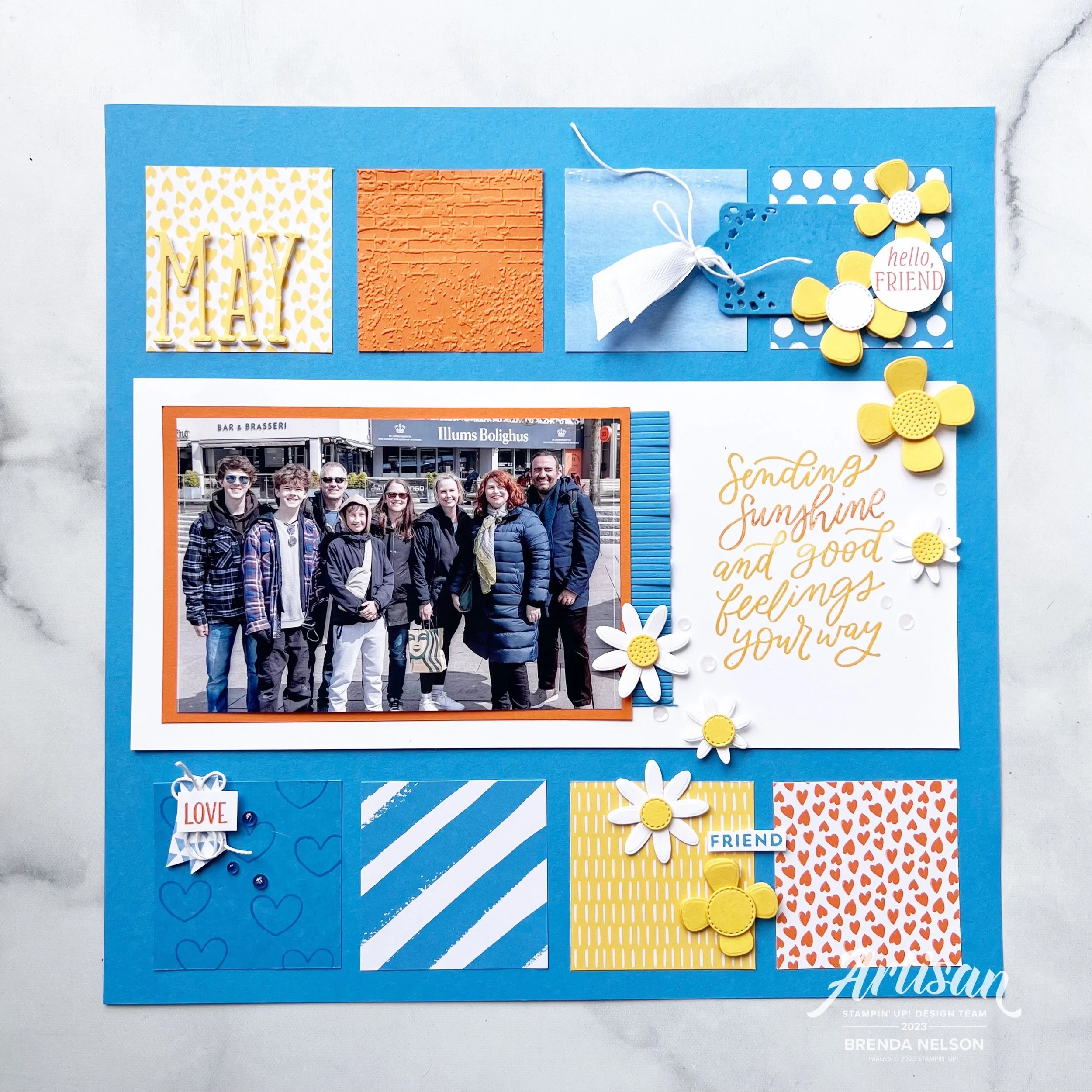
And because I have flowers on the brain, I knew that I had to incorporate the new Paper Florist Dies into my design. I also knew that I wanted to create a scrapbook page with one of my favorite pictures taken on the Norway trip. So here you go!

This awesome picture was taken in Stavanger, Norway

I decided to use Azure Afternoon as my base. Now if you have been following me on Instagram I have made a couple of comments about how this is currently my new favorite blue! I think it looks great paired with two classics—Daffodil Delight and Pumpkin Pie. All three of these colors are also in the Brights Family as well.

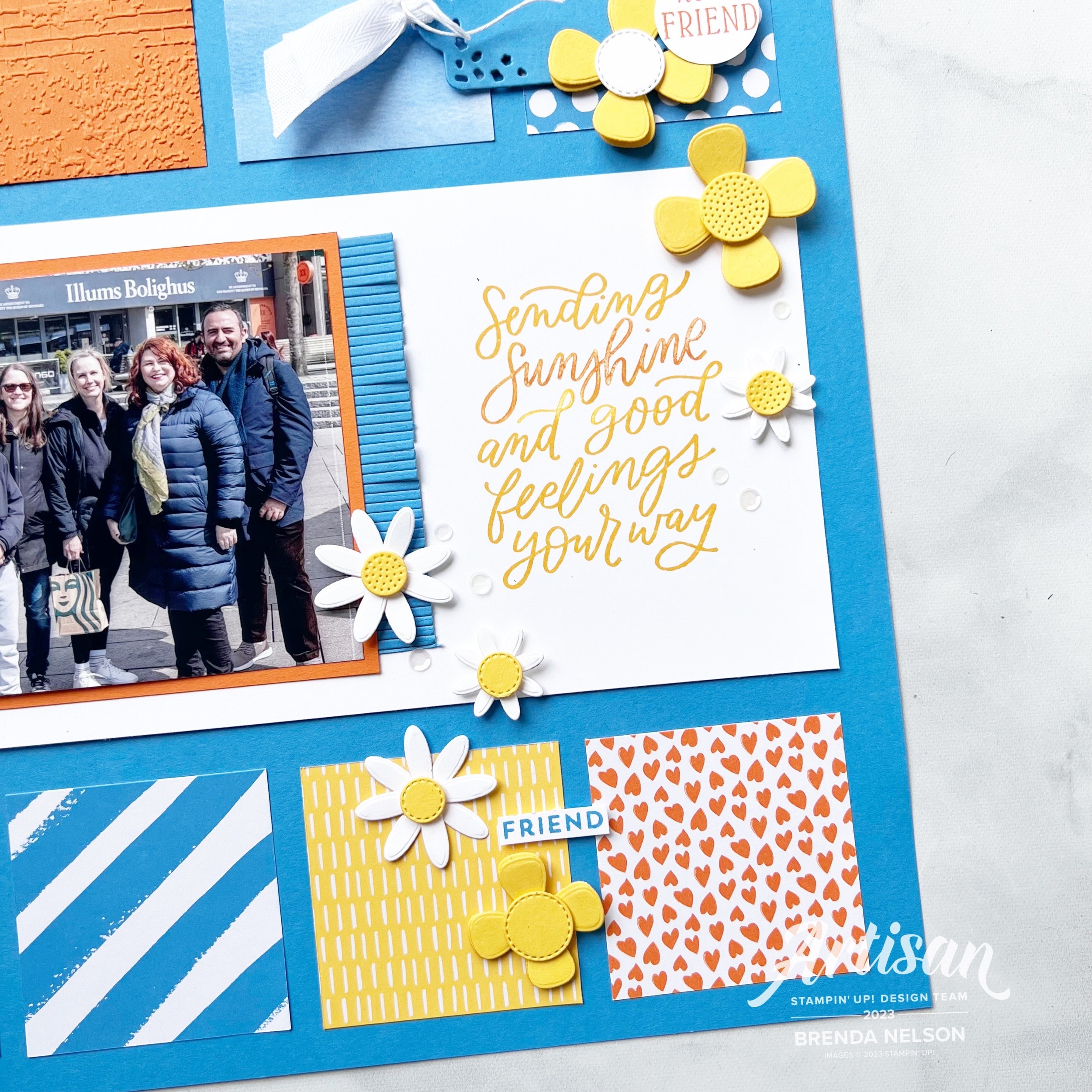
The main sentiment on this page is from the Good Feelings stamp set and I felt it was appropriate because none of us live in the same area in the world. Kylie and Bruno on the right, live in Australia and Alanna and her family, while fellow Canadians, live a couple provinces away from me. So it is true, I do send sunshine and good feelings to all of my friends no matter where they are :)

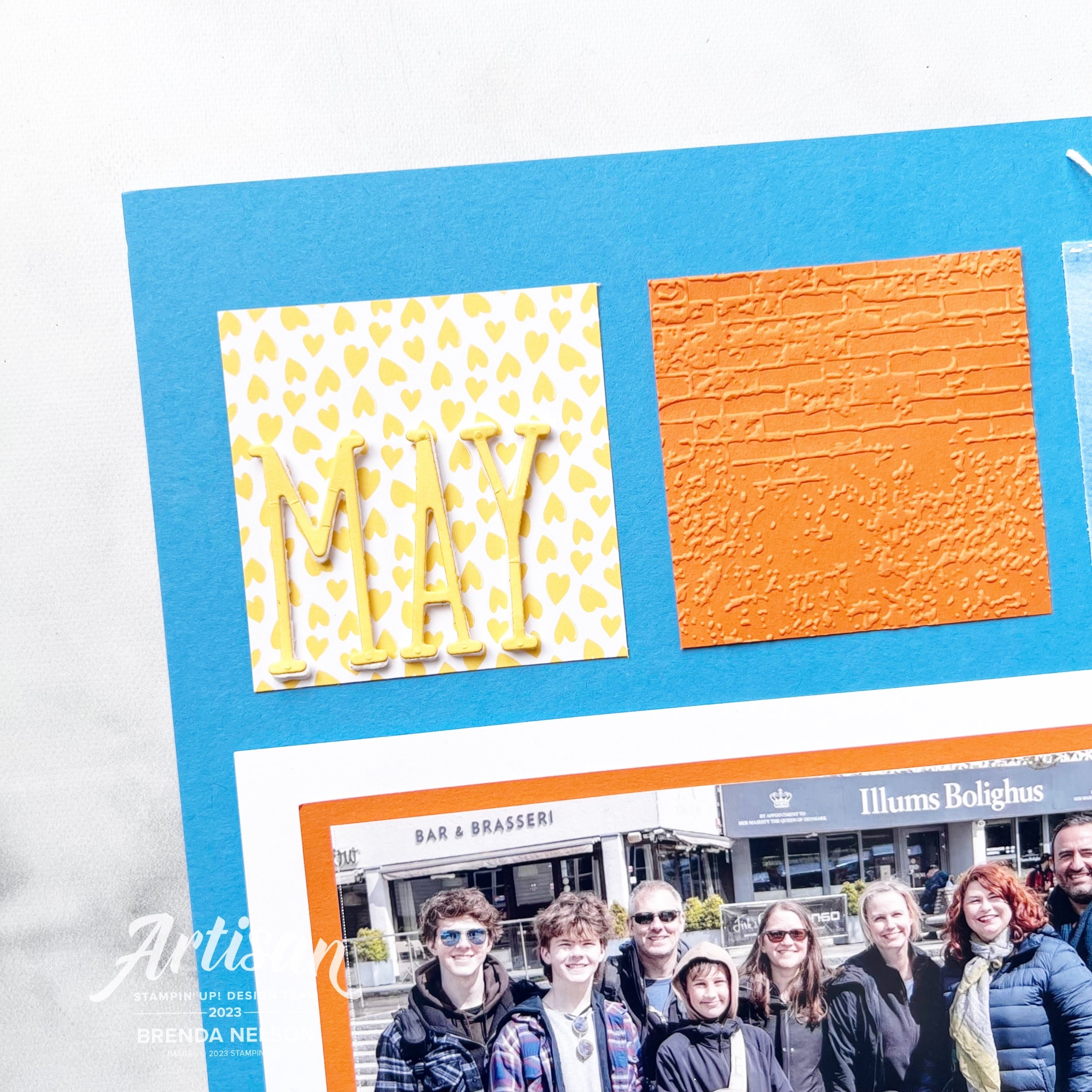
I used Designer Series Paper from the Bright & Beautiful and the Brights 6x6 stack to add interest to my page along with a square ran through the new Exposed Brick 3D folder and a square stamped with hearts from the Little Monkey Stamp set.

The flowers are all from the amazing Paper Florist Dies which you need to serious #addtocart if you have not already!


I found a bunch of single words to add to my page such as ‘Love’ which is from the Seasonal Branches stamp set. A few Tinsel Gems and some Bakers Twine finished off this little vignette.

The cute tag and fringe are from the Beautiful Balloons dies. I love this die set and I thought they made the perfect addition to this layout. I added some of the new white Herringbone Ribbon through the tag and you can find ‘Hello, friend’ in the Inked & Tiled stamp set. The white sequins are from the Adhesive-Backed Sequins Trio and just added a little something to this area.

This page is really quite eclectic, which is what I love about Stampin’ Up! I really disagree with those who say you cannot scrapbook with our products. YES YOU CAN!

May is die cut using the Alphabet A la Mode dies and added using the Foam Adhesive Sheets. Look how awesome the Exposed Brick folder looks beside it! This new folder is definitely a must have.

I can’t wait to see what the rest of the team has designed with these three amazing colors—Azure Afternoon, Daffodil Delight and Pumpkin Pie. I know you will be inspired and if you haven’t purchased Azure Afternoon yet, then I encourage you to give it a go. It is a really lovely blue.

My amazing friend and fellow Artisan teammate Tami Hewlett is up next on our blog hop—you can visit her by clicking the image below.

If you want to go in reverse or a link gets broken, you can visit the uber talented Stacey Marsh by clicking the Previous image.

Please feel free to comment, it makes me happy to hear that you have enjoyed stopping by my blog. If you do not have a Canadian Demonstrator, I would love to get crafty with you! You can reach out to me or shop with me by clicking any link in my supplies section or by using the monthly host code. Thank you in advance!

Color Fusers--June 2023!

Hello friends and welcome to another fantastic month with the Color Fusers! We are so happy you returning again or finding us for the first time!

Our color combination for this month is Pool Party, Pretty Peacock and Bubble Bath and I have to say—they look fantastic together!

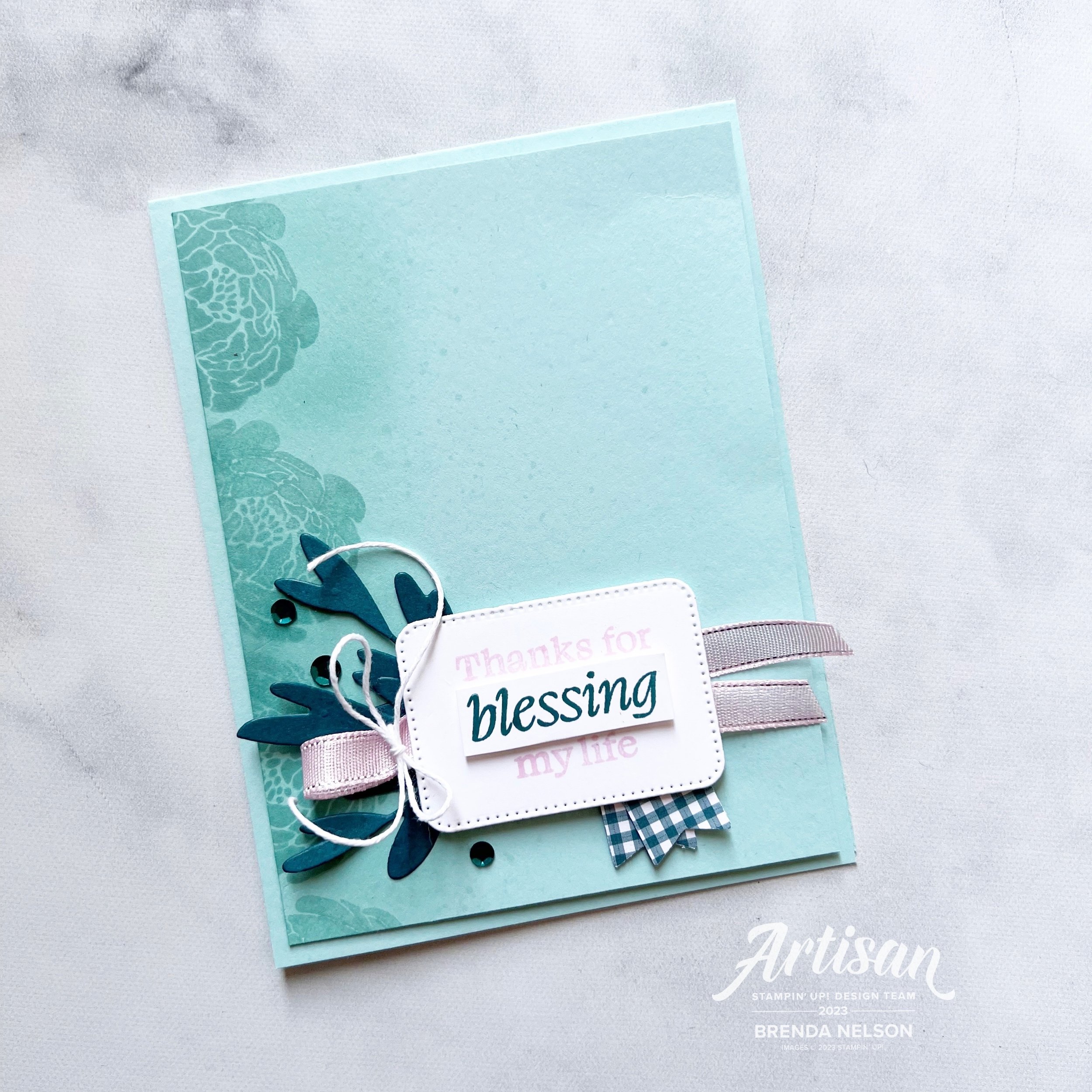
I decided to make a card this month and I was inspired to use the new Bold Bouquet Bundle from the Annual Catalogue. I started with a base and first layer of Pool Party card stock for my design.

Along the left edge I stamped four of the large blooms in Pool Party ink and then went over them with a Blending Brush and Pool Party ink, just to add another layer of depth. I also took my dark Pool Party Blend and flicked that all over the front.

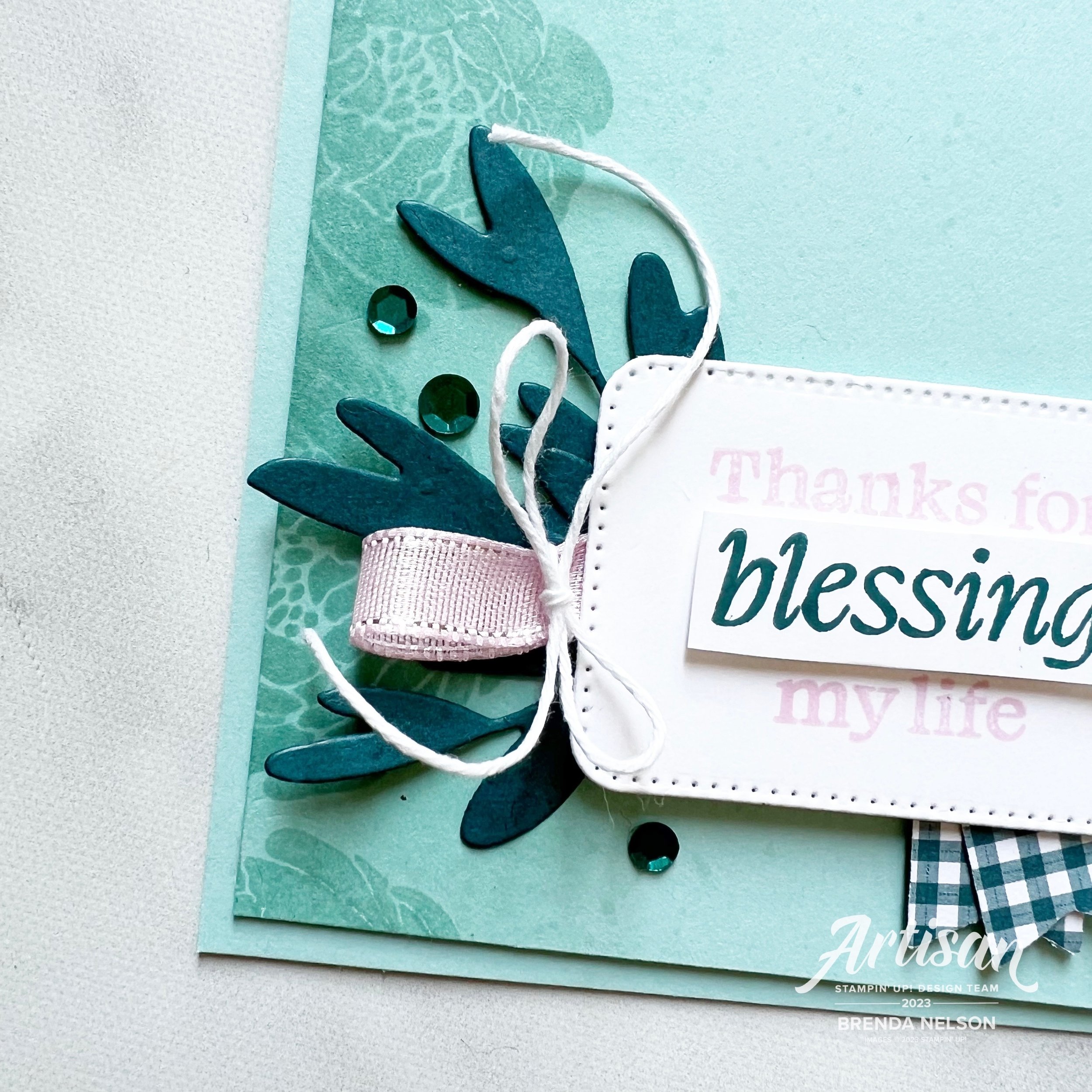
I cut a rectangular shape from the Nested Essentials dies and stamped the sentiment in Bubble Bath on top. I then stamped it again on some scrap Basic White in Pretty Peacock and trimmed out the word ‘blessing’. I added it overtop of the main sentiment with a Mini Dimensional. This is such a an easy way to highlight a part of a sentiment that you want o shine.

Underneath the sentiment I added a length of Bubble Bath ribbon from the 3/8 Sheer Ribbon Combo Pack and tied it with some white Bakers Twine. A couple little Pretty Peacock banners cut from the Glorious Gingham DSP is the perfect finishing touch.

The Bold Bouquet Bundle includes these 3 amazing sprig dies that I cut and trimmed the stems down to add behind the sentiment panel. A few Pretty Peacock sequins from the Adhesive-Backed Sequins Trio completed this project.

I hope you are inspired after touring through our Hop to create your own project with this awesome color combo of Pool Party, Pretty Peacock and Bubble Bath!

Next up on the Hop is Bonnie O’Neill—I know she has made something fabulous for you to see!

If you choose to go in reverse you will be visiting my friend Melanie Hockin!

Thank you so much for stopping by my blog today! If anything has inspired you to shop, just click on any image below to visit my store! Thank you!

Color Fusers--May 2023!

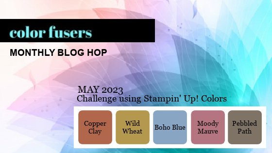
Hello and welcome back friends! You know what this means…our new catalogue has officially launched along with Core Colors and our brand new In Color Collection—which is what the Color Fusers Team is creating with this month! I always look forward to our In Color Collections and this next bunch is really unique and fantastic. Stampin’ Up! knocked it out of the park with these!

Let me introduce you to Copper Clay, Wild Wheat, Boho Blue, Moody Mauve, and Pebbled Path.!


2023/2025 NEW IN COLORS

〰️

2023/2025 NEW IN COLORS 〰️

Who doesn’t love new COLORS? I know I do and all of the new color potential they unlock. I love how this collection has a neutral earthy vibe. Definitely different than others we have seen before.

Each year when we have this release of new colors, I also try and create at least one or two projects that feature all five of the colors working together to make with my card making groups. This is a great way for them to get a sample or little taste of the five colors.

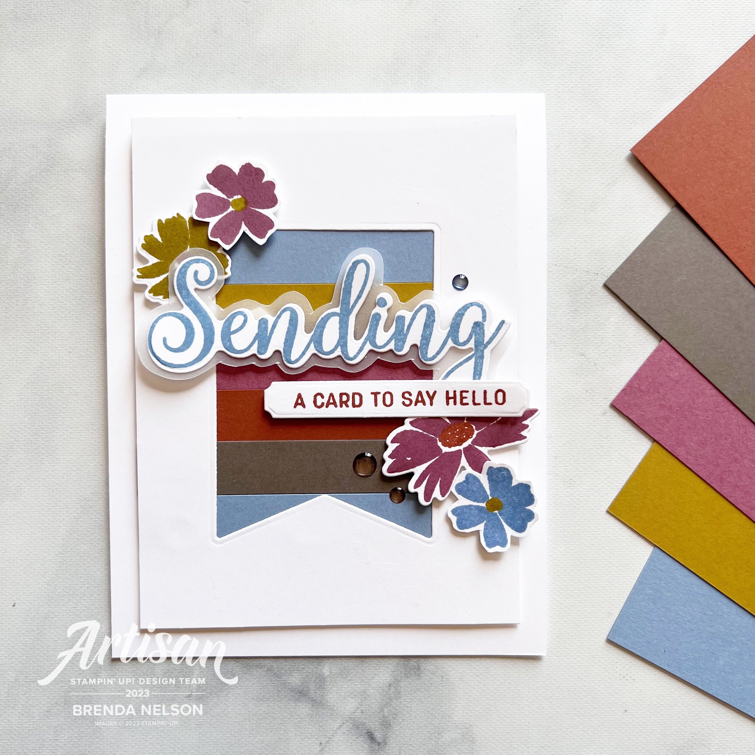
I started with a base of Basic White so that they new colors would have a nice crisp platform. My first layer has a die cut banner cut out featuring a new set of dies called the Nested Essentials Dies. I have been using them so much, they are definitely a craft room MUST HAVE. Make sure to put them at the top of your wish list!

Behind the die cut banner I added strips of the 5 colors in this order:

  1. Boho Blue

  2. Wild Wheat

  3. Misty Mauve (which in Canada rhymes with stove)

  4. Copper Clay

  5. Pebbled Path

For my design element I used the stamp set Sending Smiles and some of the new In Color Dots as an embellishment.

I stamped out “Sending” in Boho Blue and used the coordinating Sending Dies to cut it out. I layered that on some vellum that I hand cut around just for some added dimension. This is then popped up with Mini Dimensionals and centered through the die cut banner.

“A Card to Say Hello” is stamped in Moody Mauve and added slightly offset below. What I love about this bundle is the mix of sentiments and the flowers and greenery you can use to embellish your project.


I stamped out the flowers in a mix of the colors with the exception of Pebbled Path. Instead to bring life to that color I added two of the coordinating In Color Dots to that strip of card stock.

I love how this card turned out and I think these five colors look absolutely fantastic together. I can’t even pick a favorite at the moment! You can also head to my Instagram @stampwithbrenda to see another card that I created with these colors. However, I know you will be inspired by what the rest of the Color Fusers Design Team has created this month. Make sure to hop all the way through and if I have inspired you in a anyway, please consider shopping with me so I can continue to love what I do!

Next up on the Hop is Bonnie O’Neill from the US…go give her all the love!

If you want to shake it up and go in reverse (or if the Hop is ever broken) you can go Previous to see what my friend Melanie Hockin (also from the US) has designed. And in case you didn’t know, I am sharing from Edmonton, Alberta Canada (GO OILERS)!

These supplies are current at the time the Hop goes live…the new Annual Catalogue and all new In Color items I showcased will be available a day or two later!

Click any image to shop what is current at original time of posting< Product List

/p>

Be Inspired Blog Hop--Let's Get Crafty with the Subtles Family!

Welcome back friends for another edition of the Be Inspired Blog Hop! We are so happy you are here and would love all of your comments on our projects, or to share our hop with a friend or two. If you like my stamping style you can also follow me on Instagram @stampwithbrenda!

This month we are designing with the Subtles family—now I didn’t see a rule about it being NEW colors to the Subtle family so I decided to go that route!

I created a card, yes a CARD, not a scrapbook page this month, although I think my card will be inspiring a future scrapbook layout. My card features the new Lemon Lolly and Bubble Bath Core Colors and the returning color Lost Lagoon.

I started with a base and first layer of Lemon Lolly. I ran my layer partially through the new Twisted Rope 3D folder and a added a fun strip of stripped DSP from the Delightfully Eclectic 12x12 DSP in Bubble Bath and Basic White. I love a good stripe pattern no matter the color scheme!


The stamping on my card features the new Cheerful Daisies Bundle which I am really enjoying creating with.

I like that you can design with 2 Step Stamping or single images that you can stamp and cut out, like I did with larger daisy behind the sentiment or stamp the line image and color in. This set has a lot of creative possibilities!

Isn’t this new lemon lolly color lucious? it reminds me of lemonade!

The ribbon behind the sentiment is Bubble Bath and its one of three colors in the 3/8 Sheer Ribbon Combo pack that is coming out in the new Annual catalogue in May 2023. I love the silver edge on the ribbon.

The daisies are all stamped in Lemon Lolly with the center on the front flower being stamped in Pecan Pie. I did stamp it off on my scratch paper so it was a little lighter. The leaves are stamped in Lost Lagoon which I felt worked because it become more ‘green’ on this project.

And of course I had to add some embellishments in Lemon Lolly. I really love tone on tone embellishments and the variety in our new catalogue is AWESOME! These are from the new Adhesive Backed Solid Gems.

I know you are going to be so excited to start stamping with all of the new Core Colors, especially when you see the members of the updated Subtles family. I hope this color combo of Lemon Lolly, Bubble Bath and Lost Lagoon inspires you to create you own fun project in the future. Happy Stamping!

Up next on the Be Inspired Blog Hop is a former Artisan Design Teammate of mine, Janneke! I love her stamping style and can’t wait to see what she creates! Click on the image below to head to blog.

Thank you for visiting this month! We can’t wait to see you back in May!